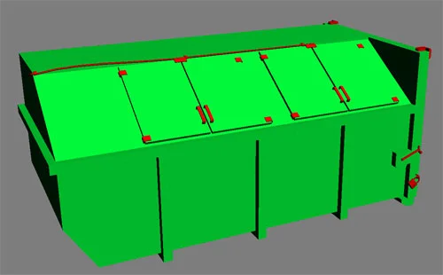
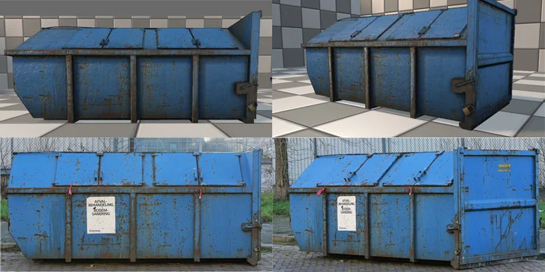
Visually Appealing Building Guide


This is not a tutorial, but rather a guideline that may or may not help with the construction of buildings, depending on what style you are trying to achieve. I will go through the minor details of real world buildings, showing what makes them work and why.

Fig01A.jpg

When you look at an image, the reference is not always your best resource. Google, Altavista, Flickr, and other web sites can only get you so far. The best resource for any artist is the real world itself. Go outside, study buildings, break them down into their individual sections and see what makes them so interesting or bland. Once you do this, you will quickly see why some buildings are interesting to the naked eye, while others look simply boring and dull.

Fig01B.jpg

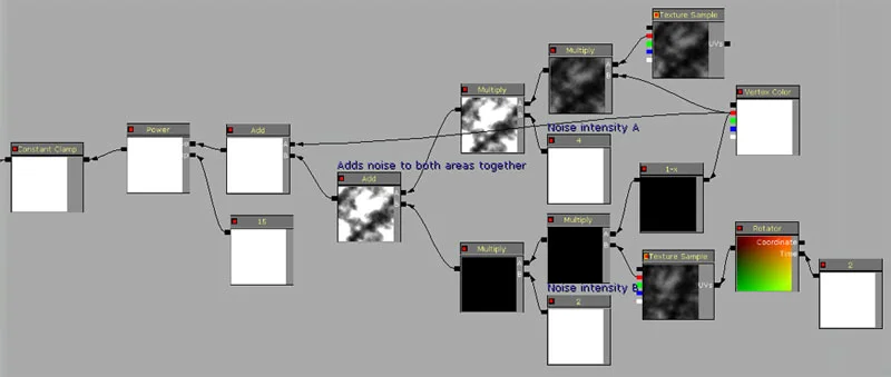
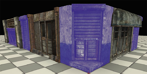
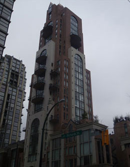
Take this building for example. The primary piece is built out of 3 sections. The base is used for store fronts, restaurants and the lobby (red). Above that is the office or residential area (blue). Above that is the penthouse suite or roof top access area (purple). These 3 sections are separated and are easily visible, especially once you block them out.

Fig01C.jpg

Looking deeper into more details on the building you see the vertical pillars supports (brick), and the horizontal grey blocks. These two really help break up the appearance of the building. Even though this structure is a cube and normally boring, when you break up the surface with color, extrusions and irregularity, you create a building much more interesting to look at.

Fig01D.jpg

And finally you add the minor details such as the awnings and metal fences/railings. In the residential area, every second floor has these railings, the base floor has awnings and store front details, and between the residential and penthouse level there is a strictly decorative awning to help break up the bland look of the building. All of these things play with one another to convert a normally boring building into a more interesting structure.

Fig02.jpg

Here is another example. With this image, we have two similar buildings. The left image is of course the reference, the middle is a grey block of what the overall areas look like, and to the right is what it would look like without these aesthetic touches to break up the consistency of the wall.

As you look at these images, you can easily see how a simple trim on the top or middle can add a much better feel to the building, also bevels on trim and adding awnings help as well. These break up the repetitive (Lego block) feel of the building.

Fig03.jpg

If we go back to the first building we looked at and take a closer look, we see these attributes there as well.

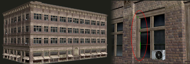
Metal railings, bevels between floors of the verticle bricks, exterior lights, and those two circles connected by a red line shows that not every floor needs to be the exact same. On one transition between floors compared to the next one up, you notice that there is a border on the first, but not on the second. Don't be afraid to experiment.

Fig04.jpg

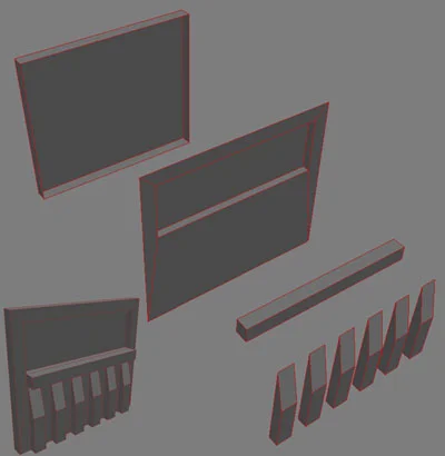
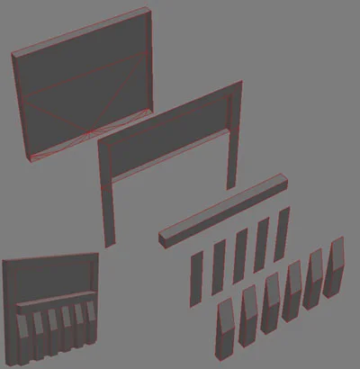
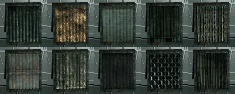
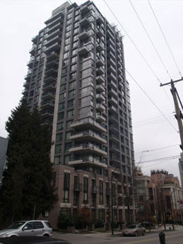
The variety of awnings that you have can be many. In level design, you want to have as much control as you can with the assets, achieving the largest amount of variation with the least amount of assets.

Normally you want everything to fit with one another, so having a standard where each wired support of each awning is a specific distance away from the next wire support is a good practice. This also applies for the windows and supports, so when you have two buildings side by side, you can easily swap the awnings between the two buildings with ease. This will guarantee that any variety of awnings can fit any variety of building.

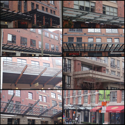
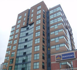
When you look closer at this building, you notice finer details.

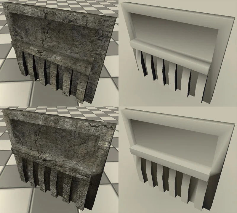
Vertical pipes on the bottom level, support metal braces for awnings, wall lights, grates, and different scales for window tops and window base supports. All of these things help to popular the scene. Also notice the wall texture on the bottom floor is different from the upper floors, and this is separated by the awning. If the awning was not there, put in a dark trim to separate these areas.

There are 5 different buildings here, all of them differ from one another, and yet they all look busy and to some degree, appealing. I will make point form remarks about each one to show what makes them more interesting.

Fig06A.jpg

* The walls are not completely flat.

* There is a variation in the balcony design.

* As the building gets up to the top 4 floos, the structure changes which changes the silhouette.

Fig06B.jpg

* The window textures change from the first 3 floors to the 4th on the left side, and from the first to the second on the right side of the main enterance.

* Every few windows there is a metal railing.

* Two main materials are interchanged as you look across the building.

* There is trim between certain floors, and when the building transitions from wall to roof.

Fig06C.jpg

* This building is a little more futuristic looking. Windows are not consistant the entire way up and it is broken down into seperate levels/pieces.

* Even though this building is tall, it has a rather broad base structure.

* Porches change as you go up the building.

* The roof is not flat. There is a variation to break up the silhouette.

* The base of this building is different from the main highrise part.

* Porches drastically change along the corners to break up the silhouette.

* The roof is not flat. There is a variation up there of some kind.

* Even this building is a little bland in comparison to the others, however it breaks up its dull appearance by changing the middle window structure by the last 3 floors.

* Even the side windows change from a 4 tetris type block on the bottom to a 3X2 window.

I hope this little tutorial has helped you out. i thank you for your time.

 Vertex Welding Issues


This tutorial will cover the basics in verticy  welding. This is a huge issue in games, since any two edges that share  the same location in space with their verts not welded will flicker. I  will go through some methods on either fixing these issue…

This tutorial will cover the basics in verticy welding. This is a huge issue in games, since any two edges that share the same location in space with their verts not welded will flicker. I will go through some methods on either fixing these issues, or hiding them with the rest with the surrounding geometry.

Checking:

Fig02.jpg

The first step is to identify the obvious issues with the mode. It is hard to separate what is modeled correctly, but Max has a tool to help you. This tool is called “STL check” and can be found under your Modifier list drop down.

Fig03.jpg

With your mesh and “STL Check” modifier selected, do the following.

Click “Open Edges”
Click “Select Edges”
Un-check “Change Mat_ID”

Click “Check” to see where the open edges are on your asset. It should look something like this.

Every red line you see in the image above is an open edge. The verts of these edges are not welded, and unless they intersect with a face, the verts are welded, or there is geometry behind it, the geometry most likely will flicker at these sections when viewed at the correct angle.

I changed my 3D Max viewports background to a bright green so it is easier to see these seams (as well as any obvious holes in the mesh).

You can change it by going to 'Customize/ Customize User Interface' click on the 'Colors' tab, and under 'Elements' scroll down to 'Viewport Background'. To the right, you will see a box with 'Color' to the left of it. Here is where you can change your background. It will not update until you close the 'Customize User Interface' window.

To change it back, simply open the same customize window, and click 'Reset' on the far bottom right, or click on the color, and chance the RGB colors all to 125.

When the window ledge is pulled out (Left img.), you see that the vertices are not welded on the window. There are two methods you can take to fix this issue. You can either weld the verts, or intersect the edges into neighbouring faces to hide the seams.

1.) Make sure any edges sharing the same space are split and welded so there is no seam in the geometry.

2.) Intersect the edges into existing polygon faces. (hiding the seam)

The up side to option 1 is that you guarantee no flickering along that edge; the down side is that you need to either weld the verts where they meet the wall (which will increase poly count). In this case, extruding the edges into the geometry (option 2) will save some geometry down the road. The images below will better describe this.

Understanding and fixing:

These image show issues with the window, what to look for, and how it should look in the end.

Fig06.jpg

1.) the horizontal section needs to intersect the surrouding walls to stop any flickering.

2.) Instead of having the windows in 4 pieces, they should be one solid piece, and either be welded or intersect the surrounding walls.

3.) the section that connects with the window frame in this area will flicker. a before and after image shown below will better illustrate how to fix this.

The middle horrizontal edge was moved in so it is not flush with the wall (also gives more geo for shadows to play with) the window is now one sloid piece, and welded to the corners of the wall, and the veritcle wall is split to weld at the corners of the windows.

Tips and tricks:

If you need to split any geometry, or aulter a piece that is already textured, here are a few quick and easy steps to achieve it while maintaining your UV layout. (Refer to image below)

If you need to split any geometry, here are a few quick and easy steps to achieve it. (Refer to image below)

Fig08.jpg

1.) In this example, the smaller wall piece that attaches to the larger wall will have flickering issues.

2.) If you select the edges and select 'Connect' under the 'Modify/edit Edges' menu, or use the cut tool, there is a good chance the edge will notbe even.

3.) If you flatten the edge manually, it will most likely twist the texture and distort it like you see here.

4.) If you move it, it will stretch and squash the texture.

5.) The best way to get around this issue is under the 'Modify/Edit Geometry' there is an option called 'Preserve UV's' this tool works best with 3 or 4 sided faces, so be careful of this small fact.

6.) Now when you move the edge up or down, it does not distort the texture.

7.) Another way of cutting the face which is quicker and more accurate is the following. Select the polygon face you want to cut.

8.) Under your 'Grid and Snap Settings' (right click on the snaps toggle, the magnet with a 2, 2.5 or 3 above it) and click on 'Vertex'.

9.) Under the modify menu/Edit Geometry, select 'Quick Slice'.

10.) On the face, click on one edge you want to create an edge on, and select the other. It will snap the edge created to the vert, and if the face has a vert that it can weld to, it will do so.

11.) On a side note. If you want to quickly flatten any edge, vert or face, this is a good trick to make sure it's completely flattened. When you select any edge, vert or face, you get your orientation tool which shows what direction it is facing.

Red - X
Green - Y
Blue - Z

If you want to flatten your face in say the X axis, make sure you have the middle or bottom button of your 'Select and non-uniform scale' button, located to the left of your 'view' drop down. Also on the bottom of your max, click on the 'Absolute mode transform Type-in'. Once that is selected, the read out for the X, Y and Z axis will all read 100. To flatten on the X axis, type in 0 in the place of the 100, and your edge, vert or face will be flattened along this axis.

12.) And finally, when you have finished cutting your geometry, don't forget to delete the un-wanted face, and weld the verts after. 3D Max does not allow for more than two faces to be assigned to a single edge, unlike some applications such as Maya, so the welding must be done after the face is deleted.

Recap:

Fig09.jpg

1. As long as every vert is welded, this will work just fine.


2. As long as the geometry collides, this will work, however this can give strange shadows on any vertex lit geometry.


3. This will not work all of the time. There are no welded verts, and no edges intersect a face (or blocked by geometry behind the seam). At the wrong angle, this may cause flickering.

I hope this little tutorial has helpd you out. i thank you for your time.

 Complete asset creation process


Image_00.jpg

This tutorial will go through the entire process of creating a simple asset, and what to look out for. I will cover the references, modeling, UV'ing, texturing and normal map creating as well as some theory.

The first step for any asset creating is to find out how this asset will be used in the level, and the level of detail it will require.

This process includes the poly count, whether or not it will be animated or destructible, the level of detail required for the texture and how it will be rendered in the game engine (vertex lighting, light map / shadow map lighting, dynamic lighting. This step will affect how the model will be modeled) for this example, I will assume this model will be lit dynamically which will allow us to keep the poly count low.

The next step is to figure out the dimensions of your model. First step is to acquire references which will be used both for the modeling and texturing of the asset. Also, lining up these models to figure out the scale of the asset.

With this image, we can roughly estimate the shape in 3d of how this model will look like. A little research will be required to find out the original size of this particular dumpster, as well as how units in your 3d package will copy over to your games engine. For example, 96 “Generic” units in max is the height of a 6 foot human being in UT3 (16 units to a foot). If this dumpster is roughly 6 feet tall, then make it 96 “Generic” units in max.

The dumpster in the image above is measured “relative to itself”, Height: 1, Length: 1, Width: 2.2.
Since the height of the dumpster will be 6 feet (96 units), the length will also be the same, but the width will be 211.2 units.

Since I want this model to be able to snap easily to different assets in the level, I will have to round up the measurements to make things easier. Unreal can snap easily to 1, 2, 4, 8 and 16 units. The increments go higher, but unless you're making something large like a building, these should be fine. If I round up the width to 212, it can be divided by 4 evenly.

When rounding out the measurement numbers, you want to keep the units as large as possible without compromising the overall scale of the asset too much.

This “blocked out” version of the model is currently 121 polygons, fairly low at its current state, but will soon go up in count as we add detail. For right now, this is simply the 'base' model.

The next step is to add the doors, panels, hinges and pipes (details). Keep in mind that the doors on this model will not be opening, so the door model should be built directly out of the current geometry, placing a polygon plane over top will simply waste texture space further down the road.

Image_LightBulb.jpg
Image_05.jpg

At this stage, the poly count is 850. The basic shape of the dumpster has stayed the same with a few minor tweaks, but details have been added.

Doors, Metal holders, Hinges and Locks make up for the extra 739 polygons. This might seem like a lot for such small details, but depending on how close you get to the model and how detailed you want the textures to be, all of these details can add a lot of character to an otherwise dull model.

First off, you will need to make sure there are no open edges on the mesh. If you have polygons with a gap, even if it looks like it is closed, there is a chance it is not, and this can cause some serious issues later on down the road.

Most large objects in games now a days 'occlude' the objects behind it, which means that if an object is hidden, it is not rendered. The problem with games is that the negative side of faces are not rendered by default, so if there is a gap in your mesh and the object behind it is visible in any way, it will render out the entire mesh. This is not a huge problem for smaller assets, but when you're dealing with a building hidden behind another building, then you will be drastically affecting performance.

This image shows the gap in a very simple model. Even though models inside max, Maya and other 3d modeling programs do support n-sided faces (more than 4 edges to a polygon), the left image gives the illusion that that's what's going on, where in fact it is not.

This model can cause some serious issues when occluding objects behind it as well as 'in game flickering'. There is a tutorial I covered about this which I strong recommend reading if you have not already.

In 3D Max, there is a function located under the Modifier List called 'STL Check'. With this tool you can locate any double faces, multi edges or open edges on your model.

You can also choose to view the edge or the face of this problem.

In order for these to show up, you must click the “Check” option.

Secondly, you need to work with your smooth groups. This can easily be mis-understood by artists.

If you noticed, most, if not all of the surfaces on this model are hard edges. Dumpsters in the real world have relatively smoothed out corners, and that is completely possible to do with this model, but a lot of issues can come up because of it.

For those of you who have a good grasp of smooth groups, feel free to skip this section.

Smooth groups do not have an (in-between) value set. They are either on, or off. By 'on or off' I am referring to the edges of the model, not the faces. Smooth groups smooth out the model between at least 2 faces to give the illusion of it being smooth, or in contrast, it hardens a single face to make it stand out from the other polygons. The following simple models will illustrate this.

The top row has 2 smooth groups, the bottom has only one.
The first and second columns are the max models, and their renders. The third is the highlight of the lights themselves, and the fourth is the colour separation of the smooth groups.

As you can see above, the light highlights change when the smooth groups are altered. This plays hand in hand with normal maps if you choose to “correct” this visual issue. If you desire the entire model to be one smooth group and be smooth, that is fine, but a problem arises. Look at the farthest left side of the image above. The top model looks fine, and for the most part, so does the bottom; however there are a few things that need to be clarified. The bottom model should NOT have a dark, nearly black area on the top. The reason for this is because the model is trying to smooth out from the lit side and the un-lit side, and this causes problems such as this to arise. If you create a high poly model and back out a normal map, this WILL correct the issue.


When you create any model, always keep in mind what parts will be seen from which angle, and how detailed they need to be. How big the textures will be and the amount of detail desired.

There are ways to create rounded corners on sharp objects without getting this un-desirable artefact, but the quality of this depends greatly on the model as well as the area of the texture the UV's take up. The texture size itself is not as important as the amount of pixels the faces will use in the model itself.

This is the basics of smooth groups and hi-poly models. This was borrowed from

http://wiki.polycount.net/Normal_Map

If you choose to create a high poly version of a low poly model, keep this diagram in mind. Depending on where you create your details, and where you want things to be, different smooth groups will give different results. This also applies to models that you are taking over. Do not assume you know how it was created or modeled. Study the model, as well as the normal maps you have.

For the sake of this model (the dumpster) I am giving each side their own separate smooth group to allow for overlapping UV's, which increases the detail applied to the model when the texture faze is started.

When I work on the smooth groups of any model, I set the smooth 'value' anywhere from 45 to 85 (not 90, because if my model is slightly off, it will create one smooth group where I want 2). I Then manually select faces and start to make smooth groups where needed. Do note that any series of connected faces that are completely flat should always share the same smooth group to make sure there are no un-wanted hard edges.

In the model of the dumpster, there are a total of 7 smooth groups. On a side note, do not make too many smooth groups where they are not needed. If you have a cube, to make it perfectly black, only 3 smooth groups are needed, not 6 (one for each side). If 2 faces never touch, they can share the same smooth group, also faces can have 2 smooth groups assigned to it, allowing for blending of one face into another.

Thirdly you will need a high-poly model to smooth out all the corners where needed, But these details will be applied on only a few selected areas (hinges, pipes and other small areas). The normal map created out of this high poly model (depending on the texture size you are using, the size of the texture, and the level of detail you want to add in) can really 'pixolate' your model in the long run, so use it wisely. The way I will be creating this model is through a single 1024X1024 texture. This might be a little high depending on how detailed you want it to be, so I will create it in 2048X2048 and down size it later on to show the difference between a 2048X2048 1024X1024 and 512X512 for the normal map. The level of detail is entirely up to you, but as a rule, games should share a 'texture size' rule based on how detailed you want your texture to be based on its size.

After everything is set up, the next step would be to UV your model. This depends on a few things, and some were discussed prior to this section.

  1. Will the UV be used for Light Map textures in the engine?

  2. Will there be an ambient occlusion baked into the model.

  3. Will the front and back be different, or will they share the same uv space.

  4. Will there be a high poly model made based on the low poly which will be used to create a normal map for the entire thing.

  5. What sides of this asset will be visible.

  6. How many UV channels are allowed for this model?


All of these things play directly with how the asset will have its UV's laid out, how you will create the diffuse, normal map or ambient occlusions, and how the shaders will be laid out...


1.         If the UV's will be used for a light map, and you are only allowed a single UV channel, then none of the UV's can over lap. If you are allowed 2 UV's, (this will increase the rendering time slightly) then the same rule applies, but on the second UV channel instead of the first. (The second UV channel usually holds the light map UV's. This is not always the case. If you need the second UV for a different texture for some reason, the light map can take the third, or even fourth UV channel.) Also, all the UV's must be within the 0 to 1 UV space if used for light maps.

2.         If there is an ambient occlusion, it is possible to have overlapping UV's, but it can be VERY tricky at times to bake out a good ambient occlusion and remove any artefacts you do not want. Not every model needs this option. Also, the UV's also need to be in the 0 to 1 space when you bake out the ambient occlusion pass. Because the light map also needs to be in the 0 to 1 space, and have absolutely no overlapping, quite often it is a good idea to use the light map UV channel for your ambient occlusion pass if you are overlapping your original UV's. If you are not overlapping your original UV's, and every piece of geometry has its own coordinates, then it is much more convenient and cheaper to have the diffuse, ambient occlusion and light map all sharing the same UV space.

(Depending on the game engine, this option can be a different texture all together at a lower res, and can be placed over top of the original diffuse all together to add that 'ambient occlusion' feel. This will increase the memory size when dealing with textures, but you can share a texture color for something like a spec map. If you create a spec map that is simply black and white, then you only need one of the red, green or blue channels. If the RED channel is your spec map, then your GREEN channel can be your specular power, and your BLUE channel can be your ambient occlusions. This will increase rendering slightly, but increase the overall look of your model, as well as save texture space.)

  • I will be showing this in a “RGB spec” tutorial.

3.         If the front and back of the model are the same, then they can share similar UV's. Depending on the model, this can greatly increase your texture detail since the back side will not take up any more UV space, but share it with another part of the object itself.

4.         If a high poly model is used to bake out a normal map, the UV's need to be within the 0 to 1 UV space, and nothing can over lap when the baking takes place, however, UV's can be moved later on. If you have overlapping UV's, the normal map will double its value in that spot.

5.         If you are creating a model where the bottom is never visible (no explosions to move the model, no animation or scripted scenes) it is still best to have the geometry there, but the uv's can either share other uv space, or be scaled WAY down in size. Doing this will allow for more detail in the texture to be used on other parts of the model.

6.        If multiple UV's are allowed (try not to go over 2 or at the max 3) then a second channel can be used for normal maps, ambient occlusions or Light maps. This does increase rendering, so try to use it only when it is needed most.


Now to lay out the UV's for your model. I will create 2 different UV's, one for the diffuse and specular texture (over lapping) and a second for light maps and an ambient occlusion.

In this image, the green represents geometry that is flat and does not require a (corrective) normal map, as where the red areas do.

I say 'Corrective' normal map because normal maps have different functions. If you create a model and slap a normal map created from Photoshop on it, all it does is add detail to the overall model, making it look bumpy, but a 'Corrective' normal map corrects how the normals of the geometry appear and how they pick up spec maps. This is almost always created out of a high poly model which is baked on to a low poly model. (This is all covered in the normal map tutorial)

A rule for creating normal maps is that if you want smooth specular highlights, if your geometry bends a lot, then chances are you will need to create a high poly to create a normal map and smooth it out. Keep in mind that this directly depends on the size of the model, and the detail put into it.
If you are creating a small model, or if your texture is small itself, creating a normal map with lots of detail can be lost or extremely distorted. If you want to create something like a car paint or shiny metal that has a reflection, a pixolated normal map (due to size) can cause a lot of strange 'reflections' on your model and blobby normal map details.

Let’s create the UV's. Personally I create the light map first if I will be overlaying UV's later on for the diffuse. The reason for this is so everything is neatly laid out and evenly scaled, so placing setting up the UV's for the diffuse, spec and normal map can go rather smoothly.


This is the result of the Light map UV space.

When creating the textures for any model, I always start out with the diffuse map first. The reason for this is so I can use the contrast and details of the diffuse to add details on the specular channel and the normal map. Also, if you separate the diffuse in layers, you can mix and match whichever details you want, making it easier to achieve the look inside the games engine. It saves time in the long run.

I will not go through the details of creating the diffuse because that should be straight forward, as well as specs and normal maps, however, I will talk about some details in those textures starting with the diffuse.

Diffuse:
The dumpster's diffuse was taken directly from the reference images, however I did have to copy over a different reference image and tweak the color, the reason for this is because a part of the top, one side, back and bottom are not visible at all. Details such as the lock are not important because the details would be so small, any reference image would be useless due to the small UV space it takes up. When I copied over the front diffuse onto the texture, I painted over the metal extruding pipes. The reason for this is so I can use the entire bottom part of the texture elsewhere on the model and not worry about dark protruding metal slabs; those details were elsewhere on the model.

Specular:
Most people use a black and white specular channel, and although this works at times, I would not recommend it. Specular maps are GREAT for giving metal that true metallic look, and if all you get is a white (or light color) highlight, it can contribute to the lowering realism of your assets creation. Color is our friend, and should be used wisely. In the Unreal Engine, you can even use the diffuse at times as a specular map if the colors fit, or are close enough.

Normal Maps:
The normal map is quite often the trickiest texture to create. This can cause your model to look even more real, or extremely fake. Experiment with when and where to use the details to optimise your model creation. At times you will have to re-uv a few areas to find out where you need detail in the normal map, and where you can share the same details to optimise your assets details.
For this model, the asset was created with overlapping UV's. The extruding metal pieces (around the top and the extruding rim) are all sharing the top left UV area which allows for a lot of saved UV space. Thinking about these details ahead can save you time and details.


Look at your model and break it into pieces based on what type of texture they are. In this case, there was the body, trim, sides, top (doors) and details. The areas that are the same can at times share the same uv space. The front, top (very top, not the doors) back and bottom can all share similar UV's. The two sides can share UV's, and lastly the trim can as well since most of it has similar rust all around.

This top image is the basic diffuse on the model. By itself, no normal map detail or specular highlights will be visible, and as a result looks very flat, however, depending on where your asset will be used, or what it is, eg. Small stones, you can have only the diffuse. This causes the engine to process this asset VERY fast in comparison.

This image has the diffuse and specular channel applied. Right away you can see a big improvement with the visual improvements with having a spec map. A spec map in games unites the object with the world, allowing it to play with the lighting around the scene. If you do not have a spec channel, the only thing that gives your model shape is the shadows.

This image has a normal map applied to it. The details in this image are hard to see, but in some areas it is noticeable. The images below will illustrate this much better. Normal maps are an amazing way to add very fine details to your model. Scratches, Dents and bevelled corners can be added without the use of polygons, providing a much more visually interesting asset.

This image has an ambient occlusion texture baked from 3ds Max and tweaked in Photoshop applied to it. If you look above at the textures, you will notice that the ambient occlusion does not match the other 3 textures; This is because it is taking advantage of the 0-1, non overlapping UV's of channel 2 which is used for the light map. This can add a lot of realism in your model, but increases the render time. New versions of 'UT3/Gears of war' have an in game ambient occlusion system implemented, removing the need to manually bake out this texture.

Image_14.jpg

Depending on how the lighting is set up, different angles will give you different specular highlights. The specular parameters of the model are what give the normal maps their detail. Without spec, the normal maps are not as noticeable.

Image_18.jpg

This image is a close up of the front side of the dumpster. The red box illustrates what the images below are (this is for scale purposes so you can see how detailed things should be) The dumpster you see now is as close as most people will get in the game, so if it looks good from this distance, then it is fine.

If you look closely, there is not a huge difference between the normal map of 2048 and the one of 1024, however when you go down to 512, you really do notice the difference. Keep in mind that there is a 'details' normal map placed over top of the original normal map, so if we take this out, this is the result we get.

Without detail normal map applied

With detail normal map applied

Diffuse:          1024x1024
Spec: :           1024x1024
Normal:         2048x2048


Diffuse:          1024x1024
Spec: :           1024x1024
Normal:         1024x1024


Diffuse:          1024x1024
Spec: :           1024x1024
Normal:         512x512

With the images above, you can see that adding a detailed normal map to your model at times can hide blurry textures.

* Important

When you re-scale your images to find out what the best proportions are for the model, make sure to sharpen your texture AFTER you scale it down. Remember that you can get rid of detail by scaling down, but you cannot grab detail out of thin air by scaling up, so always create your textures AT, or ABOVE the detail that you will require, and then scale it down. IF you scale down, make sure you sharpen it, but only sharpen ONCE. Over use of the sharpen tool gives very dotty, multi colour artefacts which are not ideal.

The top image has the scaled down textures WITHOUT a sharpen filter applied.

The bottom image has the scaled down textures WITH the sharpen filter applied.

Also note that this image has the following texture measurements in the final version.

Diffuse:                       1024X1024
Normal Map:               1024X1024
Specular:                     512X512
Ambient Occlusion:    256X256

UT3 has a different camera focal length than real cameras which gives this 'fish eye' appearance when close to certain assets, that's why these images do not match up exactly.

The image above is the 'in-game model' on top and the 'original' reference below.

The good thing about how the texture was laid out with this model is that it can be used on different containers as well, an oil drum for instance.


Finally we will need to create collision for the model. This method changes from engine to engine, and many times you can create this either in your 3d modeling software, or in the games engine itself. Both have their ups and downs. In this case, we will be covering the UT3 method of creating collision geometry.

Firstly, you need to understand what the engine can work with. Usually there is a wiki online you can refer to. For UT3, their collision wiki is located here. http://udn.epicgames.com/Three/CollisionReference.html#Collision_Models

The most basic collision types are cube, cylinder and sphere. Out of these 3, the cube has the least amount of verts making it the cheapest collision object. This will be used the most out of any collision.

To view your collision in UT3, double click on your model in UT3 and on the top left, select the 'Show Collision' button.

Creating collision inside UT3 gives the following results on this model.

Image_28.jpg

As you can see, with the exception of '6DOP simplified collision', every other engine generated collision has a lot of geometry to calculate and will greatly slow down your game play. You may be wondering about the last one 'Auto Convex Collision'. At times you can get a pretty good collision with this function, but it is not ideal. Collision boxes can never be concave, they must always be convex, which is why the last model has multi colour collision boxes. Each color represents a separate collision box, removing any 'concave' geometry.

What we want is a blend between the first one '6DOP simplifies collision' and the 'Auto Convex Collision', but to do this, we will need to create them ourselves inside max.

This bit of information was taken from the following web site. http://udn.epicgames.com/Three/CollisionReference.html#Collision_Models

You can create collision model in a 3D Modeling Program (3D Studio Max or Maya).
Simply create boxes, spheres or convex objects and place them around your mesh appropriately. These shapes will be converted to collision models in Unreal if they are named properly.
The naming convention (which is case sensitive) is as follows:

UBX Box Primitive

USP Sphere Primitive

UCX Convex Mesh Primitive

    • Boxes are created with the Box objects type in MAX or with the Cube polygonal primitive in Maya. You can't move the vertices around or deform it in any way to make it something other than a rectangular prism, or else it won't work.

    • Spheres are created with the Sphere object type. The sphere does not need to have many segments (8 is a good number) at all because it is converted into a true sphere for collision. Like boxes, you shouldn't move the individual vertices around.

    • Convex objects can be any completely closed convex 3D shape. For example, a box can also be a convex object. The diagram below illustrates what is convex and what is not:

Note that currently spheres are only used for rigid-body collision and Unreal's zero-extent traces (e.g. weapons), not non-zero extent traces (e.g. Player movement). Also, spheres and boxes do not work if the static mesh is non-uniformly scaled. In general you probably want to create UCX primitives.


Once your collision objects are set up you can export both the graphics and collision mesh in the same .ASE file. When you import the .ASE file into UnrealEd it should find the collision mesh, remove it from the graphic, and turn it into the collision model.
Note: In the case of an object whose collision is defined by multiple convex hulls, results are best when the hulls do not intersect with one another. For example, if the collision for a lollipop were defined by two convex hulls, one for the candy and one for the stick, a gap should be left between the two as in the following illustration:

Breaking up a non-convex mesh into convex primitives is a complex operation, and can give unpredictable results. Another approach is to break the collision model into convex pieces yourself in MAX or Maya.

To do this, you use the bOneConvexPerUCXObject option on the Static Mesh importer. With this option checked, each UCX_ object in the file will be turned into exactly one primitive. If the object is non-convex, it will just have a convex hull wrapped around it to make it convex. This gives you a lot of control, and is a good idea for complex meshes.

I strongly recommend you read that page listed above. It will advise you with all your collision needs.

The pink and green boxes are the collision pieces, both with the name 'UCX' (case sensitive).

When you export the geometry, simply save it as a regular .ase file. When you import it into unreal, do what you normally do, and in the 'static mesh editor', you will see this.

The image to the left is the in-game geometry with custom collision. The red and green boxes are the custom collisions imported into the game. This is all you need to do for it to work.

The next step is to create an LOD model for this asset. Most of the details we added after the boxed in model will be removed for this as well as changing the material the engine uses. At a distance, you can quite often get away with having no normal map, that plus the removal of the 'details normal map' and possibly even the spec channel will greatly improve the engines speed. Let’s get started.

To import your LOD models into unreal, open up the 'Static Mesh Editor' and select 'Mesh/Import Mesh LOD'. Inside max, export the LOD models just like you did the original, but only the model, no collision geometry. Create 2 different files for both LOD models. You will be asked which LOD the imported file should be placed in when you import the files. Link up the material to the model, and you're done. (A new LOD version of the material should be created for the LOD's which exclude normal maps)

These models show the difference between a “LOD Distance Ratio” of 1, vs. a ratio of 1.5.

The two models relatively equal in size show the transition point. The top image of each is the higher res, as where the lower image of each is the lower res. The value of 1.5 causes the transition point to be placed between the two transition points with the setting of 1.

This value determines how far away the next LOD model will kick in. Not every model should kick in at the same distance. Changing this value has both its ups and its downs. The further away the model transitions from the high res to one of the LOD's, the less likely you will be seeing any 'popping' of models, however it does increase the distance that the engine calculates the highres version, increasing the processing power required.


I hope this little tutorial has helpd you out. i thank you for your time.

 Texture Density


Game Texture Density: This tutorial will cover whether it is always necessary to always use a 0 to 1 UV space for your UV’ing of assets. This does not apply to every engine, but in this case, i created this Trebuchet for UT3. I will cover the pros and cons for each UV'ing method used.

If you create an asset with all the UV’s in the zero to one UV space, some issues can arise. This example shows such an asset.

This asset from a distance looks fine. The image above is simply a screen capture the 3D Max scene, so normal maps, spec and lighting are not visible. What you see is simply the geometry and the base diffuse.

This image to the left is the UV’s of the Trebuchet shown above.

Every single piece has its own destinct space within the zero to one space with no over lapping what so ever.

This is extreamly handy for the simple fact that if your asset needs a lightmap baked in the editor, it is ready to be used.

If you will be using this UV layout for that purpose, you must concider the textures required for giving a good looking shadow, and the spacing between your UV’s to allow for bleeding. Remember that no UV's can over lap.

As i mentioned earlier, from a distance this looks fine. With the UV’ing done this way, the ambient occlusion can be baked in directly to the diffuse, allowing for more realistic shadows, however, it all comes at a cost.

The image below is a close up of the asset at roughly eye-level. The diffuse used is a 2048X2048 texture, typically the max you should use for an asset. Terrain can use different texture sizes, and of course, depending on the engine you are using, there are different texturing methods, but for UT, try to keep everything at 2048X2048 and below.

Image_03.jpg

0 to 1 UV space diffuse texture. Because the asset is so large, you do not retain enough quality in the texture to allow for realistic results. Typically UT should have a 512 for every 3 to 4 meters or so. (roughly the height of one floor.) Of course this size can varie depending on the engine and project you are doing, so be sure to ask your superviser which is best suited.

This image shows a much higher quality texture. The texturing method for this is MUCH more wild, but before i go into details about it, i must stress how important the 0 to 1 UV layout is.

Firstly, if you first create your UV’s within the 0 to 1 UV spac, you will have a UV ready for light mapping. Unreal can do it for you, but the results are no where near the quality an artist can do.

Secondly, you will have a UV which you can use for ‘masks’ on specific areas for the material editor (this will be covered in another tutorial)

Thirdly, you can bake out your ambient occlusion to this UV set.


The image below is a screen capture within Max to illustrate how ‘kaotic’ it seems, but there is a structure to it.

Everything that looks ‘messy’ on the left is the larger wood areas, in the middle is the area where the ammo is dragged on, below that is the ‘counter weight’ and ‘tree stump braces’. The large black area is teh net (this is alphad out), the stone is above that and even above that is the ‘ends’ of the wood chunks. The right side holds the ropes and the metal.

Now, the advantage of texturing your asset this way is that you can get a MUCH sharper image wtih the same resolution of a texture, the down side is that you can’t bake out any specific textures to this to isolate a specific polygon face, Nor can you use a ‘corrective normal map’ (baked high poly to low poly normal map) since you have over lapping UV’s. That being said, there are ways around all of this.


Before we go any further, i can not stress enough how good it is to lay out everything in the 0 to 1 space. This will be required for the ambient oclusion and for the ‘lightmap’ lighting in unreal (unless this trebuchet will be animated that is). On top of that, it gives you a great starting place for laying out your UV’s and keeping everything even. If everything is uniform and even un the 0to1 space, then you just need to scale up your UV’s and move them around instead of scaling each one to fit each other. If you have un-even UV’s, you can have some very un-realistic and odd looking texture densities.


A good example of this is a screen shot from “The Lord of the Rings: The Battle for Middle Earth 2: Expansion Pack: The Rise of the Witch-King”

The image on the left shows a screen capture. The image on the right shows teh texture details. In games with characters, usually they are the main focus, so texture density does not always apply to them, but to unify the rest of the world with everything else (assets are built in pieces, and if they are not the same in style and detail, they will not fit with one another) then some areas of the game may just look strange.

The blue in this image represents the characters, so they can be ignored. The bright red represents the more detailed texture as where the dark red represents a less detailed texture. When you look at the image on the left, you can see blatently why it does not look right in the end result. This is why texture density is important.

This tutorial will be continued in another section which will cover how to optomize your materials and textures. I will show you how to have a single diffuse (2048X2048) a normal map (2048X2048) and a specular color, specular power and ambient occlusion (512X512). 3 textures instead of the traditional 4 2048X2048 textures.


I hope this little tutorial has helpd you out. i thank you for your time.

 Normal map creation process


This tutorial will cover nearly everything you will need to know about creating normal maps; This includes the low oly model, high oly model, correctly laying out your UV's, how to mirror a normal map with an object, baking the texture, adding details in photoshop and much more.


Normal map basics:

Let’s start very simple. A box, it doesn't get much simpler than that. Let’s place texture pattern on it as well and place some lights around the cube so we can see how the lighting works with the geometry, and how the textures change. With a simple 6 cube and all the faces laid out in the 0 to 1, this is what you will get.

This is as simple as you can get in 3D, but it is by NO means exciting or interesting. We will get into more complexed objects, but for now, let’s start at the basics and work our way up.

To create a high poly model and bake it to a low poly, you need to follow these steps.

  1. Create a high poly model based on the low poly version.

  2. Keep both models in the exact same position.

  3. Have your UV's laid out in the 0 to 1 space. Anything that is outside the 0 to 1 will not be calculated. (There are ways to overlap, and we will get to that soon enough.

This is a very simple (high polygon) version of the box. The poly count is 492 tris, WAY too high for a simple box. For this example, I laid one face of the low poly to the full '0 to 1' UV space, and moved everything else outside of the renderable area. The reason for this is so only one face will be calculated which will be applied to the other faces soon enough.

To bake out a normal map from a high poly model to a low poly model, select the low poly and press 0, not on the number pad, but the zero located above the o and the p keys. Doing this will bring up this screen. I shrunk all of the sub-menus except one so it won't take up too much space

Image_03.jpg

There are 5 sub-menus in this option screen; the first is “General Settings”. Usually leaving this the way it is gives good settings, but in this screen, you can tweak the rendering to better suite your normal map rendering needs. Pressing the 'Setup' button brings up your max' 'Render Setup' screen (same as pressing 9). In most cases; if not all, it is best to use 'Default Scanline Renderer' located under 'Common/Assign Renderer' within the 'Render Setup' window.

The second 'sub-menu' is called 'Objects to Bake'. Here is where you pick the high res object to use as a reference.

(Please note that this menu is also used for baking out other things such as shadows, diffuse, shadows, height maps and many more. Because of this, not all of these options are required all of the time.)

If you do not see what is on the screen to the left, don't panic. If it is all greyed out, simply select the low poly model. One thing that will always appear different is the 'name' of the object, in this case I have 'Box05' selected to bake out, your object will most likely be name differently.

The 'Selected Object Settings' should almost always be enabled, and the 'Padding' refers to the amount of pixels that should bleed out on the edge of every UV edge. This should always be set to at least 2. The reason for this is so every edge lines up with the correct details and will not have line artefacts in the final render.

'Projection Mapping' is where you select the high poly model. Click the 'Enabled' check box, and click the 'Pick' button. A menu will appear showing the visible geometry in the scene you wish to bake a texture based off of. Please note that you must have your high poly version visible in order to see it in the menu.

After selecting your high poly mesh, choose the UV's you wish to use, this will usually be set to 1.

The third sub-menu is called 'Output'. This is where you choose which type of texture to bake out. All of these options can be used to copy textures from one UV space of one model to another UV space of the same or different model.


Complete Map:
Specular Map:
Diffuse Map:
Shadow Map:
Light Map:
Normals Map:
Blend Map:
Alpha Map:
Height Map:


Each one of these options has a specific purpose, but I will leave it up to you to explore with them and see what does what. For this tutorial, I will only be focusing on the normal map option.

Press 'Add' and select 'Normal Map' from the list. A few things will automatically fill out for you. First you will see the name of your object, next to it will be the texture you will be baking out, and finally the texture size you are looking for.

Below, you will see an option beside 'File Name and Type'. This is where the location of the texture and its name will be baked out to. Click on the triple dotted box [...] to the right of it if you choose to chance the location.

Below that is where you choose the size of the texture. I will get into the importance of this later on, but for now, 512X512 should be fine.

Once you have filled everything out, press the 'Render' button on the far bottom left. You will see a rendering screen pop up. This is only a preview window, not the actual normal map itself. The reason for its lack in color is to visually show you where information was lost. I will go into detail with this later on, for now, this asset is too simple to demonstrate this functionality.

Before I show you any rendered images, I should go into a bit of theory behind normal maps.

This is the basics of smooth groups and hi-poly model baking. This was borrowed from http://wiki.polycount.net/Normal_Map

This theory is important to understand before you start to bake out high to low poly models. Without this foundation, you will run into many issues down the road.

The image on the left is a model with hard edges. This will cause some serious problems which you can see in the yellow and blue stars. These areas either calculate the normal details twice, or not at all.

The image on the right is a model with smoothed normals throughout the entire model. This will allow for much closer resembling details when you bake out your normal maps.

If you choose to create a high poly version of a low poly model, keep this diagram in mind. Depending on where you create your details, and where you want things to be, different smooth groups will give different results. This also applies to models that you are taking over. Do not assume you know how it was created or modeled. Study the model, as well as the normal maps you have.

For the sake of this model (the dumpster) I am giving each side their own separate smooth group to allow for overlapping UV's, which increases the detail applied to the model when the texture faze is started.

When I work on the smooth groups of any model, I set the smooth 'value' anywhere from 45 to 85 (not 90, because if my model is slightly off, it will create one smooth group where I want 2). I Then manually select faces and start to make smooth groups where needed. Do note that any series of connected faces that are completely flat should always share the same smooth group to make sure there are no un-wanted hard edges.

In the model of the dumpster, there are a total of 7 smooth groups. On a side note, do not make too many smooth groups where they are not needed. If you have a cube, to make it perfectly black, only 3 smooth groups are needed, not 6 (one for each side). If 2 faces never touch, they can share the same smooth group, also faces can have 2 smooth groups assigned to it, allowing for blending of one face into another.

Different assets can take advantage of normal maps in different ways. For me personally, there are regular normal maps, and then there is what I call “corrective normal maps”

 The reason I call them “corrective” is because these colors correct the normal direction of the low poly model to represent the surface of the high poly model.  Allow me to illustrate on the cube we were talking about earlier.

High poly, no Normal map

Low poly, no Normal map

The image to the far left is the default, simple cube with 6 sides, all having their own 'smooth group' causing the asset to have hard edges.

IF we then bake a normal map using this high poly model, (all the corners are bevelled) the idea is to bevel the corners of the low poly making them smoother.

close up render, With Normal map

Low poly, With Normal map

Image_08.jpg
Image_09.jpg

When you look at the model on the left, you can't see that the corners are hardened; however, if we zoom in and remove the diffuse color, you will see a few issues. The reason we are removing the diffuse color is so there won't be anything to hide details.

If you look closely at the image to the top right, you can see small lines where the corners of the low poly cube was. Depending on the size of your normal map and the size of your asset, you can get away with this, but look at the following images where we soften the entire model instead so the cube is one large smooth group.

High poly, no Normal map

Low poly, no Normal map

Image_10.jpg
Image_02.jpg

Close up render, With Normal map

Low poly, With Normal map

Image_11.jpg

If you compare the 'hard edges' version of the cube to the 'soft edges' version, you can see that the line artefacts have been removed from the final render. To understand why this happens, you need to understand how normal maps work, and what they in fact do. The diagram shown above illustrates that with hard edged geometry, there are gaps in the reading of high poly geometry, or they are read twice. This follows positive and negative sides of the polygon faces; Meaning that any 'high poly' model you have that conforms around a bend of a low poly model, you must pay close attention to the smooth groups of those faces to assure correct and precise normal mapping.

Because these two models have different smooth groups, the normal maps are different. Below are the two normal maps created from these renders. The left image was created from the 'Hard Edged' low poly model, and the image to the right was from the 'Soft Edged' low poly model.

Image_13.jpg
Image_14.jpg

It almost looks like these two images are rotations or flips of one another, but this is not the case. What a normal map does is it uses the red and green channels of a colour map to distort and transform the surface of a model to suit the artists need.

A blank normal map uses an RGB color of 128, 128, 255. The blue channel is 100% blue, this is because blue controls the areas that are flat. The Red and Green channels are set to 50% by default, causing them to be neutral.  The RGB colors stand for the X, Y and Z axis' of the surface of mesh it is applied to.

Like I said earlier, the Red and Green by default should be grey to represent no change in height, and the blue channel should be mostly blue to represent 100% flat. All of these colors play hand in hand. I also said that RGB represent the axis of X, Y and Z. This may be tricky to understand at first, so I will do my best to describe how they work with one another.

Image_18.jpg
Image_19.jpg

The far left image is the max geometry used to bake out a normal map on a flat plane. The result from this is the normal map on the right which will simulate a round bulge on anything it is placed on.

To best understand how this works, I have taken a tutorial straight from this web site.
http://www.bencloward.com/tutorials_normal_maps11.shtml
If you have time, I strongly recommend you read through this quickly.

Creating a Normal Map Right in Your 3D App
Did you know that you can create a normal map in ANY 3D program? You don't need any special plug-ins or exporters or extra tools at all when you create a normal map with this technique! I'll explain how to do it, but first there are a few limitations:

  • Your low res model must be a flat plain.

  • The low res model must have a planar UV projection (flat texture coordinates).

  • You can't use this for characters that have specific unwrapped texture coordinates.

This technique is really good for environment normal maps like bumpy ground, rock walls, bricks, metal panels, etc. I'll explain the steps to set it up for 3DS Max, but you can do the same thing in ANY other 3D program. Here's how to do it:

  • Open 3DS Max and create a directional light. Rotate it in world space to 0,-90,0. Set the light's color to 255,0,0 (red). Set the multiplier to -0.5.

  • Create another directional light. Rotate it in world space to -180,-90,0. Set the light's color to 255,0,0 (red). Set the multiplier to 0.5.

  • Create a third directional light. Rotate it in world space to 90,-90,0. Set the light's color to 0,255,0 (green). Set the multiplier to -0.5.

  • Create a forth directional light. Rotate it in world space to -90,-90,0. Set the light's color to 0,255,0 (green). Set the multiplier to 0.5.

  • Create one more directional light. Rotate it in world space to 0,0,0. Set the light's color to 0,0,255 (blue). Set the multiplier to 0.5.

  • Select each of your lights and check the "Overshoot" box under Directional Parameters so they'll light things that are outside of their cone.

  • Choose "Rendering->Environment..." In the Environment panel set the Ambient color to 127,127,127.

  • Create a free camera. Set the camera rotation to 0,0,0 in world space. Click the "Orthographic Projection" check box so that the camera becomes orthographic (so it has no perspective).

  • Now you create a high resolution model. Apply a material to the model that has a white diffuse color. When you render your model from the point of view of the camera, you'll get a normal map!

Here's what the scene looks like when it's all set up:


This process is here to illustrate how the lighting works in creating normal maps. Lights are used to lighten and darken areas depending on the direction they are facing. If you have something bump up on the right, usually it will appear as a 'peachy' color, the bottom will be purple, left will be light blue and top will be greenish. These lights tell the engine how the geometry needs to deform, and the intensity of the color determines how much. Keep in mind that when I say right, I am reffering to the positive X axis. The image below illustrates this rather well. From the top view (right side of the image) you can see that it illustrates the rendered out version perfectly. This file was created from the tutorial above to illustrate this function on a much simpler model.

Image_20.jpg

Let’s use a cylinder to illustrate something different to look out for while creating normal maps, as well as explaining more functionality of the baking tool.

Image_22.jpg

This image is the low and high poly version we will be using.

After you do the first back, you may get a 'cage' that looks like this.

A cage is what 3d Max uses to calculate how far to process information for creating normal maps. By default this one looks wild and way too far for us to create an accurate normal map with.

This is the normal map texture it created.  You may notice the wavy appearance of the model which will give very strange results. These waves are not wanted at all. Also notice the blobby top in the middle. This will also give strange results.

This is a render of the normal map on the low poly geometry we just created. As you see, those distortions transfer over directly onto the low poly and give it this terrible result.

The red lines to the left are how the engine calculates the normal map. The image is distorted because the cage is. The easiest way to fix this is to 'reset' the cage. As a rule of thumb, I do this every time I bake out a normal map, the only problem is, if you have geometry that is located outside of the cage, you get red marks on your render screen. This is why the render inside max is not the blue colourful image that normal maps are. This is what the cylinder gives me when I reset it.

To reset your cage, select the low poly model that is set up to bake, and on the right under the 'Cage' option, select 'Reset'. This moves the cage back to match the low poly model vert for vert.

Image_26.jpg

The red from this render shows up as pink and does not give an accurate normal map at all.

To make a good normal map, change the value under 'Amount' until the cage is outside the high res model. If you are not sure if the entire high res is within the cage, do a quick render, any red will show up if there is a problem.

Once you get the cage at the right distance, you will notice again that the image is distorted, although not as badly as it was originally, to fix this, you will manually have to move the top and bottom parts of the cage so they're flush with the original model. Simply right click inside of max and select 'Cage'.

The cage is flush at the top, and pushes out at the sides. Doing this forces 3d Max to render straight out in the direction of the face normals.

The left image is the old wobbly render created from the default cage, but the image on the right is much cleaner due to the corrected baking cage.

his is the resulting normal and the final render.

Custom cages are vital for creating the quality that you desire with certain assets.

Image_31.jpg

This final render shows the normal map applied to the low poly without any lights in the scene. Once you apply a diffuse, spec and more normal map details, it will look much more believable.

With the understanding of how normal maps work, we can take a look back at the cube we did earlier. To optimize the normal map, we created a cube with only one face filling the 0 to 1 space. When we baked out the high-res, a single face was the only information calculated. Because of this, when we placed the other faces exactly over top of that square UV, they matched perfectly and created the cube that you see, however this is not always the case. It only worked with the cube because every side was exactly the same, and only curved at the corners, but let’s create a dice instead with the numbered dents in them to illustrate why this doesn't always work.

This is the low and high poly dice models. Since each face will have unique details created for the normal map, I laid out everything in the 0 to 1 with no overlapping.

Even though the UV's are not fully used, that space can be used for another asset, so instead of distorting the UV's, I kept them how they are to assure accurate texture scale.

If you encounter a problem where every face of the dice (or whatever asset you are working on) renders out with those red dots indicating an issue, first reset your cage and push it out. In this case with the dice, the problem wasn't the cage, but rather the geometry itself. Many times when geometry faces share the exact same coordinates, Max has a very hard time calculating the normal map. To fix this simply push (or scale) your object slightly so there is a gap between the high and low poly models, then tweak the cage appropriately.

Another problem you might run into is a very strange result with your normal maps. Rendered at 128X128, this is the result I got for this dice.

With the image to the left, you can see how the lines in the final render (far left) correspond to the highlights in the low poly model inside max.

To fix this problem, render out the normal map in a higher resolution such as 256X256 or even 512X512. Take the texture into Photoshop and scale it down to 128, then apply a sharpen filter to it but only once.

Quite often at VERY small texture size gives a similar result, however with certain models, a pixelated normal map can be fixed this way. In this case it will not work, mainly to do with the extreme normals of the low poly that the normal map needs to correct (corrective normal map). Try changing the smooth groups of the low poly to something more like this and try again.

Image_37.jpg

The very first thing we went over was the difference between hard edges and soft edges, but in the first example every face was the same and the model was a perfect cube, this example is much different. With the normal set to 'hard' you won't get a distortion in the normal map aside from the holes. Here is a comparison between the normal map created on a soft model vs. a hard model.

Image_36.jpg

The difference is noticeable when comparing the two. If we zoom in with the renders, we can really see the differences.

The left image (soft edge) has lines that conform to the normals of the low poly model and where the right image (hard edge) does not. Also notice now much smoother and un-grainy the image on the right looks.

These are the normal maps rendered from each version. You will see how the low poly with the hard edges has a LOT of blue compared to the other one. As discussed earlier, this shows the lack of information trying to deform the surface of the model, and because of this, the result is much smoother.

(Left) soft edged low poly.

(Right) Hard edged low poly.

The reason for this is not to confuse you, especially based on the first part of this tutorial, instead it is used to show you how different situations call for different normal maps. If your normal map does not work the way you wanted it to, chances are you will have to either:

A: change the cage
B: Chance the model (adding in or taking out detail geometry)
C: Change the normals of your low poly model.

Image_57.jpg

In time you will be able to predict how the normal maps will work on the asset you have.

In  creating this asset, I laid out half the UV's in the 0 to 1 UV space and used the 'symmetry' modifier to make sure both sides are identical geometry and UV wise. In this example I will create a normal map using the right side, so those UV's were laid out in the 0 to 1.

Image_41.jpg

Next I selected the left half (the mirrored side which has inverted UV's (due to the symmetry process) and moved them out of the 0 to 1 uv space. The reason for this is because we do not want to double the normal map information generated. If you ever over lap UV's, offset all but one of those overlapped UV's out of the 0 to 1 space so the engine only calculates one set.

When you bake out the normal map based on the high poly, the normal map (even though the UV’s on are reversed) will appear correctly on the negative side.

We need to look at the normal map and UV's to understand how the normal maps works on both the right and left side.

When we create a normal map, it deforms the surface using RGB values. For the right side, this is correct since the normal maps were generated from these faces, but for the left side, these normals are reversed because the geometry was flipped from the right to the left using the 'symmetry' modifier. Because of this, when you have a normal map that causes the surface to bump out, the geometry that is flipped should cause it to bump in, but since the uv's are reversed in relation to those faces, it bumps it back out; it's like having 2 negatives.

The geometry is flipped (reversed), the normal maps are now reversed in relation to the faces, and both cancel each other out causing the normal map to work on both sides correctly.

(Please note that the in-game render has a spec applied to it)

Quite often when creating normal maps, you may need to render out multiple passes and comp them together, at times you may even need to manually paint out some visual issues. You should NEVER overlay a texture baked out from a high poly version onto itself to get a deeper normal map; this will cause some serious problems with the way your geometry is rendered.


Inside Photoshop, you may be required to combine normal maps to get the look you desire. One common misconception is that all normal map details need to be baked out from a high to low poly model, but this is not always the case. If we take an example of a tire, it doesn’t make sense to model out every single detail when we can simply use a high poly to add the rough outline of the tires and their treads, and add other details inside Photoshop such as smaller tire details, scratches and words.

The low poly tire is modeled at 108 polygons.

The UV's where broken up in a few sections.  A third of the tread area is layered on top of one another and the outer wall of the tire is split in half to allow for better UV use.

Image_44.jpg

The low poly tire is modeled at 108 polygons.

The UV's where broken up in a few sections.  A third of the tread area is layered on top of one another and the outer wall of the tire is split in half to allow for better UV use.

In order to convert this into a normal map inside Photoshop, you need to download a Nvidia plugin located here.

http://developer.nvidia.com/object/photoshop_dds_plugins.html

This tool is very easy to get the hang of, but for this tutorial I will cover just the basics.

  1. This is the preview window which shows you roughly what your normal map will look like.

  2. The samples represent how soft or sharp the normal map will be, 4 samples being the sharpest. Most of the time the invert options should be turned off. Scale refers to how much the normal map bumps out. Experiment with this to fully understand which number best suites your needs.

  3. Average RGB will usually give you a good result, but if you turn on any options in #4, this will be disabled.

  4. You are given more control with these options about which colors should be used if using an RGB texture.

  5. When previewing your render, these options can assist you in ways such as a moving light to see how it plays with the normal map.

  6. Height is almost always what you will be using with this option. Very rarely will you need to use this.

  7. The preview window. Be warned that this function has been known to crash Photoshop.

When creating your normal map, everything has to be flattened to one layer. I strongly suggest flattening it, copying out the layer, un-doing the flattening then paste the saved layer back into Photoshop on top. The reason for this is because quite often these layers can assist you with your diffuse and spec maps, and having layers gives you MUCH more control over the values.

When you have everything all done and your black and white texture converted into a normal map, it is time to overlay it onto your normal map.

Image_49.jpg

To overlay your texture, place the original on a bottom layer and the new normal map on the top. Under 'layers' with the new texture layer selected, you will see a box which reads 'Normal', change this to 'Overlay'.In order to finish this overlay, flatten the layers and copy it out, undo the flattening and paste the texture onto a new lay as done before. Since we placed another normal map over the original, we need to use the 'Normalize only' function located under option #4.

Pressing this option deactivates every other settings in the plugin. When you hit 'OK' you will notice the colors of the normal map change slightly, this is normal.


After that, you're done. Save out the texture and see your results.

Image_44.jpg
Image_52.jpg
Image_51.jpg

The diffuse texture was very quickly done, but this gives a rough idea of how you can use a highres model to create details on a low res model

Image_53.jpg

This render is in UT3 so we can see how an engine actually processes the picture.

I hope this little tutorial has helped you out. i thank you for your time.

 Fire Hydrant: Texturing Tutorial


This tutorial will show the breakdown of the model and the methods of achieving the quality in the model that you see above with the use of baked out high res models, and the breakdown of the diffuse, spec and normal texture.


Like any tutorial, here is a quick step by step of the models construction

FireHydrant_Modeling.jpg

The next step would be to lay out the UV’s; the basics apply to this asset with one exception. The two smaller nozzles on either side are identical. To save texture space, I laid out the UV's for the left side, and mirrored it to the other. This will keep the UV's exactly the same for each one. Even though the UV's for the right nozzle will be reversed, the normal map will not be flipped, and for the following reasons. Since I mirrored the geometry, the faces of those polygons are now facing the other direction, in a sense, they're flipped. Since the UV's of those faces are flipped, the resulting normal map texture will appear correctly. Long explanation short, two negatives make a positive.

Following this would be blocking out the base colors for the model, but before that, I will cover the normal mapping process.

Fallowing this would be blocking out the base colors for the model, but before that, i will cover the normal mapping process.

Inside Max, there is a baking tool that is rather easy to use.

Click #0 on your keyboard, or navigate to 'Render / Render to texture'.

  1. Once the window is loaded, select your low poly geometry, and check off the 'Enable' box under the 'Projection Mapping' sub menu, click the 'Pick' button, and select the high poly version in the 'Add Targets' menu that pops up.

  2. Make sure that you select the correct UV channels to bake to (default is channel 1).

  3. Further down you will see an 'Output' sub-menu. Click on the 'Add' button and choose the texture baking option you desire.
    A list of options should now become available; Name, File name and type (this is where max shows the destination of the baked texture), and UV width and Height.

  4. Make sure you place your baked texture in a location that you will not lose track of, and named something you will remember. usually when you bake out textures, there will be multiple pieces that will be baked at separate times, so it's always good to keep the old ones just in case.

  5. If you are modeling something with a 512X512 normal map, it is a good habit to bake out the texture at least twice the size, or if you want to make sure everything works correctly, do 4 times as large. For this asset, I baked it out at 2048X2048. The reason for doing this is to make sure that every piece of geometry is baked out correctly. Quite often if a normal map is baked out at the final resolution quality, you will have artefacts hiding all over the place, and unless you want to hang paint them out (which is never fun) you can simply increase the texture size, and down size it in Photoshop. The texture will be much more accurate to what the high poly will look like in the end.

  6. And lastly, click the 'Render' key. Different settings bake out in different ways, so make sure the texture itself works before you close the rendering window.
    If red dots show up in your render, this means that the 'cage' was not large enough, or there is something wrong with your high or low poly model. With your low poly model selected, scroll down in your 'modifier' list until you see a sub title called 'Cage'. Click the 'Reset' key, and move the 'Amount' up until the cage itself covers the entire high poly mesh. This should fix any problems you have.

These are the high and low poly models side by side, just to give you an idea.

The following is a step by step render of the fire hydrant in the stages I tool. First is the diffuse texture with the spec value turned up slightly to get an idea of the highlights it will have. Next comes the diffuse with the normal map slowly layered in. Lastly is the final product with 3 stages of spec. this might not be quite as noticeable between the 3 renders, however spec should not be too obvious and overly bright for this asset.

These are the scaled down versions of the textures.

The following image is a step by step break down of the beginning to end diffuse texture process. It reads left to right, top to bottom.

FireHydrant_Diffuse_breakdown.jpg

Once the diffuse texture is complete, I copied the layers into a new folder in Photoshop and used them to create the specular color as well as minor details on the normal map.


I hope this little tutorial has helped you out. i thank you for your time, and wish you all 'Happy Modeling'.

UDK – Unreal Development Kit

Example scene of a single room


Here is a scene for anyone who wants to check out an example scene. There is a package that will need to be loaded and a level itself. This is just an example of what a level can look like. Some aspects of the existing packages were duplicated and tweaked, so feel free to explore the changes and tweaks i have done to the shaders.

World position offset, lightmass, lense flare, global position texture offset, mist materials... all of these things have been included in this scene so please check out what can be done in the engine.

This is by no means a 'final product' of what a game should look like or the settings that should be used, but if you want to test something out in a scene, by all means, use this as a 'testing ground' to see how things work.

The zip file can be downloaded from this location. Download Example Scene Here

Here are a few screen shots.

UDK: Unreal Developers Kit


UDK is here. With it come a huge ammount of improvements, everywhere from SSAO (screen space ambient occlusion) Dynamic interactive water, vertex painting for indevidual objects, Global illumination, Emmisive lighting, the new speed tree 5. The aditions are great, but can be rather daunting, Thankfully Epic has provided a web page with a list of improvements and links to descriptions and tutorials for these new features.

http://udn.epicgames.com/Three/DevelopmentKitBuildUpgradeNotes.html

Everything on this web page is worth reading over. In time, i will be adding to my tutorials including many of these functions.

If you do not already have this but wish to download it, the web site is linked below.

http://www.udk.com/


Happy creating everyone, i hope you enjoy the new unreal.

 UDK – Unreal Development Kit

::: Lightmass / Global Illumination :::


This tutorial will cover some basics for getting you started with global illumination based around the 'world Properties' and the 'light option' sections. I strongly recommend you read Epics 'new features' located here.

http://udn.epicgames.com/Three/DevelopmentKitBuildUpgradeNotes.html

Lightmass information can be found at this site
http://udn.epicgames.com/Three/Lightmass.html


Lightmass/Global Illumination:


This will simply be a visual representation of where to change the settings, and what different values give you visually.

The scene below is very simple with 3 BSP's for the floor and two walls, and a few assets placed around the scene. In this scene is a single directional light with a default value and color.

You can see a few issues with this already. There is no 'bounce' light, so everything that falls in shadows is black, including the transparent fence.

You can see a few issues with this already. There is no 'bounce' light, so everything that falls in shadows is black, including the transparent fence.

With this simple check box, this is the visual difference it gives you.

As you can see, it lightens up some dark areas which is nice, but it flattens the entire scene. Normal map details on the walls are the most noticeable 'hit' visually speaking. This is mainly because this is a 'global' lighting effect. It depends on how covered something is. If I pull the camera back, you will see that there is no roof, nor is there a third wall to the left.

If I place a 'roof' into the scene as well as a third wall, let’s see how this turns out. Remember that i am using a directional light, so the roof will be blocking the light.

This is a distant shot to show the full lay out of this corner. Let’s take a closer look.

For comparison, here is the same shot without 'global illumination' enabled.

All you can see is emissive materials and a hint of light on the bottom right corner.

What this scene would need in any previous version of unreal is a 'fill' light to give the illusion of global illumination. That being said, the global illumination we saw prior to this sort of washes out the image a bit. This can be fixed by tweaking the values such as the bounces, the color and the intensity.


Let’s take a look at some of these settings and their corresponding results.

Let’s start again with the 'default' settings once it is enabled.

When you go outside, most of the light you see is from the sun, however the tint comes from the world around you, mostly the blue sky, that's why some shadows have a blue tint to it on a sunny day. By changing the 'environment' color, you change the value the shadows pick up.

Do note that this also changes the color of the light slightly as well. Everything is connected.

The next thing we'll look into is the 'num indirect lighting', or better known as the amount of times the light bounces.

To illustrate this best I can, I will provide the two extremes, a bounce of 1 and a bounce of 4. The reason why I am not showing the in-betweens is because the change is so little. Below these two images is another with the breakdown of 3 sections of the images with a bounce of 1, 2, 3 and 4 from left to right.

If you set the value to 0, it is the same as turning it off completely.

12.jpg

Even though it may be hard to see, the effects are there. What this function does is the light bounces off geometry and lights the rest of the room accordingly. The bounce light is very subtle however, so the dark areas are only slightly lighter.

The next section is the 'environment intensity'. This by default is 1, but the higher you make it, the lighter the scene becomes. Likewise, the lower you make it, the darker the scene becomes.

The effects are subtle, but they are all relevant to achieve the look and feel you are aiming for.

We will skip down just slightly and take a look at “Indirect Normal Influence”. By default this value is set to 0.3, and this is the result you get.

However when we bump this value up to 0.8, we get a much more dramatic result.

18.jpg

This is a small value tweak, but a big visual change. Too high and you lose the believability of the scene, too low and everything can appear flat, so finding the right value with this is important.

Diffuse boost simply amplifies the scenes diffuse map. Very straight forward. This does affect fully lit areas as well as shaded areas.

Likewise, 'Specular Boost does the same thing.


Light Lightmass Settings:

Everything up to this point has dealt with the settings within “World Properties” but the light sources themselves have 'Light Mass' settings. Below is a scene with the same directional as shown above but with a value of 0.1 and a point light with a green hue and value of 1.0.

This is here to show the light placement.

This scene had its lighting baked with the 'Global Illumination' settings turned off in the 'World Preferences'. This is the result you would normally get out of UT3, but if we turn the 'Global Illumination' back on, we get this.

The edge of the light in the first image is the edge of the 512 light radios, but as you can see here, the green light value continues throughout the scene giving a much more natural look and feel.

Instead of going into the 'World Properties' to turn on the 'LightMass' setting, if you click on the 'Build Lighting' button, the option to bake it with lightmass will be there, simply turn it on, and you're set.

You may have noticed that unreal does not deal with Vertex Lighting by default; rather everything is set to lightmap. Vertex lighting is still possible, but it requires you to change the settings for each mesh.

Inside the options for your lights, there is an area called “Light Mass” which is where the:

* Indirect Lighting Saturation: How much the light loses as it bounces around the level
* Indirect Lighting Scale: the strength of the light itself, similar to changing the light strength
* Light Source Radius: This controls the yellow ring which represents the 'source' of the light. In real life, not a single point is a source of light. Even the sun has a HUGE amount of light coming from all around it, but it is so far away and it appears so small that the shadows are almost parallel to one another. (Broader light base location instead of a single point)
* Shadow Exponent: This tweaks the gradient fall off of the shadows.

The image below illustrates how 'Shadow Exponent' affects your scene.

28.jpg

Each time you bake the scene, you will see an error message reading “No importance volume found”.

An “Importance volume” is a volume created using the 'brush' tool that instructs the engine where the most light detail should be baked too. Distant objects are of course less important (outside of game play area) so they can be outside of an 'important' volume.

35.jpg

Each time you bake the scene, you will see an error message reading “No importance volume found”.

An “Importance volume” is a volume created using the 'brush' tool that instructs the engine where the most light detail should be baked too. Distant objects are of course less important (outside of game play area) so they can be outside of an 'important' volume.

Higher Resolution Shadow Baking:

Lastly, I will address the issue of 'blobby shadows'. Most of the screen shots you have seen in this tutorial have blobby, non realistic shadows. The reason for this is because the 'light baking' setting was set to preview to help speed up this process. Once you have an environment you are happy with, increase this setting to get a much smoother, much more natural looking image.

Where you change this value is shown in the image below. Right click on it and you will receive 4 options. Preview, Medium, High and Production. All the images you see above are using 'preview', but the image below shows the difference between Preview and Production settings.

22.jpg

I hope this little tutorial has helpd you out. i thank you for your time.

UDK – Unreal Development Kit

Ambient Occlusion


Lightmass: Ambient Occlusion customization for UDK through the world properties settings.

This tutorial will cover some basics for getting you started with Global Illumination based around the 'world Properties' sections. I strongly recommend you read Epics 'new features' located here.

http://udn.epicgames.com/Three/DevelopmentKitBuildUpgradeNotes.html

Ambient occlusion information can be found at this site
http://udn.epicgames.com/Three/Lightmass.html

If you go up to the 'Window Properties' section of the map located under 'View' you will find a 'Lightmass' section. Ambient Occlusion is a part of the lighting process in unreal, and consists of 2 parts. to activate the 'baked' ambient occlusion, check off the option that reads 'Use Ambient Occlusion?"

If we compare an existing shot of the shadows to a new one with 'Ambient Occlusion' enabled, you will notice a change, but there are 2 main types of ambient occlusion at work here.

On the left is the default image, and on the right is the new one with ambient occlusion enabled. The bottom images illustrate the shadows in the scene, but there already seems to be some sort of 'ambient occlusion' already present in the scene on the left which is the one with ambient occlusion turned off. What Unreal is doing is it bakes in the ambient occlusion with the shadow map for the image on the right, but the dynamic ambient you see on the left is still being used in both shots.

What the default (dynamic) ambient does is it gives objects from a distance shadow detail. The further you move away from it, the more pronounced it becomes up to a certain point then it stays there, but when you move closer, it slowly fades away, and this is only for geometry that is close to one another such as right angles.

What is happening when you enable the 'ambient occlusion', you get a more accurate representation of what a real ambient occlusion is, and it becomes a part of the light map or shadow map itself. Because of this, it is not 'animated' in any way, and cost a little bit more for the baking of lights, but not by much, but the game does not run slower because it's a part of a texture that already exists.

For the next two options, (Direct Illumination Occlusion Fraction) an (Indirect Illumination Occlusion Fraction), the best way to understand these options is to understand occlusions. When you shine a light on anything, there is very little ambient occlusion on it because the light fills everything in, however if you shine a light on a chesterfield from above and you look below, you will notice a 'fade off' of light, this is because the light bounces around the room, and the more it bounces, the less intense it becomes until finally there are some areas the light will not reach. Ambient Occlusion is the function to mimic this shaded area. In games, light can reach every inch of any model unless it is fully shaded, but to mimic this limit of light, ambient occlusion is used.
For these two functions, the “Direct Illumination Occlusion Fraction” refers to how much ambient occlusion you see in direct light, and the “Indirect Illumination Occlusion Fraction” refers to how much you see in shaded areas.

“Occlusion Exponent” reffers to the fall off or 'contrast' of the ambient occlusion.

A higher flue increases the contrast, tightening up the occlusion; a lower value makes it more broad and soft.

The 'Max Occlusion Distance' is simple to comprehend. If this value is set to 200, and there are two walls located 205 away from one another, neither will receive ambient occlusion from one another. If the walls sit 185 from one another, they will receive ambient occlusion, but the value will be very small. This option is here to help have more control over your scene and the items within it.


I hope this little tutorial has helpd you out. i thank you for your time.

 UDK - Unreal Development Kit

Static Mesh Emissive Scene Lighting


Emissive Lighting: Static mesh lighting the scen ethrough the emissive variable.

This tutorial will cover some basics for getting you started with Emissive light baking function inside UDK.

http://udn.epicgames.com/Three/DevelopmentKitBuildUpgradeNotes.html

Lightmass information can be found at this site
http://udn.epicgames.com/Three/Lightmass.html


Static Mesh Emissive lighting of scene:

Right off the bat, I must make it clear that Light maps do not animate when you bake them, so any material such as this engine I have been using will not cause the scene to 'pulse' or 'flicker' as the emissive part animates.

To get around this, place a point or spot light with the same animated rhythm in the desired area and set it up correctly. If you go to my 'animated clouds', the method is the same. This will 'animate' the lighting to suite the scene. That being said, if you DO have an animated asset, the emissive areas will still light the scene if you so wish.

To make this happen, it is as simple as check marking the 'Use Emissive For Static Lighting' button in your objects options menu shown on the left.

There are 5 options in this menu with the exception of 'use emissive' at the bottom.

Diffuse Boost: Scales the diffuse contribution of all materials applied to this object.
Emissive Boost: Scales the emissive contribution of all materials applied to this object.
Emissive Light Explicit Influence Radius: The default is 0, which means the influence radius should be automatically generated based on the emissive light brightness values greater than 0 override the automatic method.
Emissive Light Falloff Exponent: Direct lighting falloff exponent for mesh area lights created from emissive areas on this primitive.
Specular Boost: Scales the Specular contribution of all materials applied to this object.

Since this scene does not have a 'steady' emissive light source, i placed a chandelier in the scene to illustrate this better.

When i baked the scene, this is the result it gave me.

If we simply tweak the “Emissive Light Falloff Exponent”, it tightens the lights influence on the rest of the scene, giving a much more natural feel. The image below has had its 'falloff' bumped up to 10.

If your scene is not bright enough at the start, you can simply increase the value for “Emissive Boost' to pump up the strength of your light, Likewise, if it is too bright, you can use this to lower the strength as well.

If you choose to control how far off the lights will affect the scene, this is where the “Emissive Light Explicit Influence Radius” comes into play. This is the same scene with a value of 200 set for this 'Radius' option.

Combining the emissive intensity with the fall off and the radius will give you the desired result, it just takes time to play around and find out what works best.

BPS objects also support this functionality. If you go into the BPS options (F5), there is a new section called “Lightmap Settings”. The functions are the exact same as covered in static objects.

Each time you bake the scene, you will see an error message reading “No importance volume found”.

An “Importance volume” is a volume created using the 'brush' tool that instructs the engine where the most light detail should be baked too. Distant objects are of course less important (outside of game play area) so they can be outside of an 'important' volume.

To create this, select the brush and pick a size (this can be re-shaped later on). Right click in the “Add Brush” section and scroll down until you see “LightMassImporanteVolume”


I hope this little tutorial has helpd you out. i thank you for your time.

 UT3 / UDK – Unreal Development Kit

::: Prefab :::


Creating and using Prefabs

Have you ever constructed a building that you want to instance around the map which is constructed out of modular pieces? Or have you ever put together a physics asset with an “RB_BSJointActor” to connect multiple assets to one another? Selecting and moving all of these pieces can be a pain at times. What a ‘Prefab’ does is it connects everything that is selected in the scene into a single group, and it is VERY easy to use.

First off, we need something to create a prefab from.

To create a prefab, select all the pieces you want to be in it, right click and scroll down to 'Create Prefab'. It will ask you which package, group and what name you want it to be created.

When you create this, make sure your perspective view is lined up since it will be used to make a 'screen shot' for the icon in the general browser window.

It will then ask you if you want to 'replace these actors with an instance of the new prefab'. I generally select yes for this option.

It will then ask you if you want to 'replace these actors with an instance of the new prefab'. I generally select yes for this option.

When you create this, it does not duplicate every piece of geometry in the General Browser again, it simply contains information to group these pieces with one node, Because of this, the original pieces are still required within the general browser.
If you duplicate the same asset around the scene, everything will work correctly, however if you want to change any visual aspect of the asset, it can easily be done.

At the top of your editor, there is an icon with the letter P on it. By clicking this, it allows you to select the individual pieces of the prefabs. Individual pieces can be changed, materials can be altered, positions moved and settings can be tweaked for the joints holding them together. The assets can still be moved by selecting the P icon itself, but selecting an individual piece of geometry and moving it will only move that one piece. Turning the 'P' back on will group everything back into a single selectable piece again.

The best thing about prefabs (aside from grouping large amounts of assets together into a single group) is the ability to update them. You can have a 'place holder' asset and place them around the level, and update that one prefab, and in return update every other prefab in the scene.

To do this, turn off the 'P' button so the individual pieces can be tweaked. Change it to what you want, and turn the 'P' button back on. Right click on the prefab and select “Update”

prefab 'Name' from this instance” This will update the prefab in the general browser and take another screen shot as well, so make sure your perspective view port is lined up.
Prefabs keep an individual account of what each prefab setting is changed, so if you have 10 prefabs and you change the material of one and then use another to update the prefab instance, that change done to that single prefab will stay intact, but the rest of the prefab will update along with the rest in the scene.
For this example, if I tweak the materials of the sign for each prefab, but have another default prefab in the scene with tweaked physics settings, when you update that the Prefab by using the physics tweaked version, the physics will copy through to all the others, but because your originally tweaked the materials of the signs themselves, they stay intact. So individual aspects of the prefabs can be tweaked and updated or maintained, depending on your personal requirements.
This is an extremely powerful way to unify all assets, physics or whatever else throughout your maps.

If for whatever reason you want to remove the prefab setting so the individual assets are there and no longer 'grouped', right click on the prefab and select “Convert prefab Instance to normal actors” and the 'prefab' function will be removed.

06.jpg

If you want to reset the prefab so any changes you have done for that individual piece are removed, right click and select “Reset Instance from Prefab 'Name”.

Since prefabs reference the original assets, as long as there are no tweaked materials applied to the individual prefabs, any changes done to the original assets themselves will follow through to the prefabs placed all around the map.
This allows for EASY testing such as a place holder sign or lamp with physics applied to it which consist of multiple assets. Create one, make a prefab, place it around the levels and update it later on.


I hope this little tutorial has helped you out. i thank you for your time.

 UT3 / UDK – Unreal Development Kit

::: Physics Asset: Tutorial 1:::


This tutorial will go through a simple setup for a physics asset which can be done in both UT3 and UDK. This particular one will be an old medieval street light dangling from a rope which is attached to a wooden support. This will focus only on the rigging and physics construction side of the asset.

First we need a model.

We need only 4 joints to make this all work. Two for the rope, and one for the lamp.

The joints used to deform the mesh are shown below. The 4th joint is simply placed above the rest of the joints which will be used as an anchor for everything else.

Just for an idea, after the weighting is done, if you rotate each joint, this is the result we have.

The rope is low poly, but there is enough detail there to give a believable dynamic feel to it.

The rope requires at least 2 joints to make it function like a rope. Once it is in the engine, the joints will not have any collision for the rope itself, but the lamp will, and the mass for the lamp will be set up in such a way that it will pull the rope down, giving it the appearance that it bends slightly when you shoot it, but straightens up right away, so twisting, bending or looping of the rope is not required, this is why we can get away with such low poly geometry.

To export these assets, you will need 'Actor X'. the link can be found below. This site also shows you how to install and use this tool located at the very bottom of the link.

http://udn.epicgames.com/Two/ActorX.html

When you are ready, select the location you want to export this to and the 'mesh file name' and hit 'save mesh/refpose' Since we are not animating anything, the 'animation file name' and 'sequence' or 'range' are not important.

Export the 'street pole' mesh as a “.ASE” format like any other mesh. Apply collision to it if you want the dynamic light to interact with the pole and so you can't shoot or walk through it. In this case, 3 simple collision boxes should do just fine.

Importing the assets is the same as importing anything else.

You will notice that when the 'lamp' is imported, it seems to be transparent. Double click on the 'lamp' asset to open up its 'AnimSet Editor' properties. Since this mesh has a skeleton in it, this is the screen that will come up.

To remove this 'transparent' look, navigate to the 'mesh' menu on the far bottom left and click on the plus button beside the 'materials' section. This will place a [0] material slot, causing the asset to be solid and no longer transparent.

To remove this 'transparent' look, navigate to the 'mesh' menu on the far bottom left and click on the plus button beside the 'materials' section. This will place a [0] material slot, causing the asset to be solid and no longer transparent.

It will then come up with a window giving you different options for your new mesh. These options all stand for different things obviously, but for now, these are the settings I will be using.

Minimum Bone size: This is not an issue here, but if your bones are too small, you may want to change these values

Orient along bone: This i keep checked.

Collision Geometry: For this, you have 2 options. Box or Sphere/Pill. Both have their purposes, but for now, i will only be using the box collision. Characters generally use the pill shape to make for easy and quick collision and rag doll effects.

Use Verts with: Dominant Weight or Any Weight. I keep this at default 'Dominant Weight' and it works fine for this asset.

Create joints: This will create a joint based on the current joints in your imported file. CHECK!

Walk past small bones: This will ignore any bones smaller than the 'Minimum Bone Size' value talked about earlier. If you have an issue with your asset not bringing in your bones correctly, play with these values.

Create Body For All Bones: By default this is un-checked, but what it is asking is if we want ocllision geometry created for all of the joints we are importing, and yes we do.

Open in PhaT Now: just asks if you want to edit it right away.

The 'UnrealPhaT' window should appear, if it doesn't simply double click on the newly created physics asset. This is what it should look like.

Image11.jpg

To get a better grasp on this window and all the functions, take a look at Epics forum site located here.
http://udn.epicgames.com/Three/PhATUserGuide.html

The 'Tree' on the lower right hand side is where the joints are displayed with the names given to them in Max. Setting these names up in max will greatly help you better handle them once in the Unreal engine.

The menu above that is where the options for the asset are located. These settings change based on which joints you have selected, allowing for complete individual control.


These are the main functions we will be using and their function described beside it.

1. Editing Mode: Toggle between editing physical bodies or constraints.
2. Movement Space: This is where you change between world and local space
3. Translate mode: The option you use to translate an asset
4. Rotation mode: The option you use to rotate an asset
5. Scale mode: The option you use to scale an asset
6. Snap: Snap to increments of 1 when translating and 15 degrees when you rotate.
7. Copy: There is no 'paste'. Press this, hold C and select what you want it copied to.
8. Play: This plays the simulation, allowing for you interact and see how it is.
9. Collision: This cycles through the 3 types of collision. Solid, wire and off.
10. Hierarchy: This toggles the graphical hierarchy of the joints in the scene.
11. Bone Influences: This will show what geometry your bones are controlling.

There are of course other functions, but for now, these are what we will be using.

To get started, we need to understand what is shown in the screen on the left.

When you select a bone under the 'Tree' menu on the lower right, you will see that it selects the collision in the editor to the left. The reason why naming these bones come in handy is because on ocasion, these 'collision' boxes will move down around the joint chain, making it look like it belongs somewhere else.

The X, Y, Z illustrates the orientation of the collision box itself.

The Pink cross shows where the connection of joints are located. You can see this better by turning on the “Toggle graphics hierarchy”

First thing we should do is run a test to see what happens.

As you can see, barely anything happens. The collision geometry of the rope collides into each other, making it impossible for anything to animate correctly. If we re-scale these collisions by simply selecting them and choosing the 'scale' function, we get a much better result.

Remember that you can 'copy' the scaled value by pressing the 'Copy Properties', holding C and selecting a new collision.

Before we scale everything to fit the ropes and the lamp itself, we need to set up the 'Fixed bone'. Remember that 4th bone i talked about earlier, well, it is used to hold everything in place so everything doesn't fly around the level but rather it will stay with the asset you assign it to.

To set this up, Select the main bone (In this example, it is labelled 'Bone01' and check off the 'Fixed' and 'No Collision' options. This will make it stationary, and the collision box will not be calculated .

After that is done, let’s play back the animation. When you do this, holding Ctrl and left clicking will allow you to 'hit' the asset to see how it will animate, and holding Ctrl and right flicking will allow you hold onto it and move it around the scene.


This is what it should now look like.

If you notice, the collision boxes of the rope do not collide with one another at all, making it much harder to see any deformation. Most of what you see is simply swinging, but we want 'bouncing' and 'distortion' of the rope.

Since the ropes will not be intersecting any of the mesh, we can make the calculations easier and turn off the collisions by checking off 'No Collision?” for each of the rope collision boxes.

Now lets tweak the scale of the ropes and see the difference.

There is much more freedom for the ropes to contort and 'jiggle' around, but some assets will want different mass, resistance and limitations for these individual parts. To achieve this, I will be creating a 'physics material' for the rope and another one for the light itself so any 'rope' based dynamic assets i have in the level will all react the same way. If you go in and change the 'Physics Material' for the rope later on, it will effect everything that has it assigned to.

To create a 'Physics Material', simply right click in the 'General Browser' and select “New Physical Material” Open up its properties and this is what you will see.

The only big changes i have made in it are the 'Density' and the 'Linear Damping'.

I won't be going into much detail about these settings, but the reason why I'm changing the Density is because by default, Unreal gives every asset a Density based on the scale of the asset, and since rope is so small, it has an extreamly tiney density, bumping it up will just give it a better look and feel.
In this case, i gave it a Density of 25

The 'Linear Damping' helps slow down the linear animation the ropes take on.


To apply this to the ropes, select the rope in the 'Tree' menu inside the UnrealPhAT editor, scroll down to 'Phys Material', select the 'Physics Material' in the general browser and press the green arrow to assign it

Do this for both the rope bones. I also created another physics material for the lamp and assigned that.

All of these values will change based on your model, and it will take some trial and error to get it looking the way you want it to.


This is what it looks like after the physics materials have been applied.

As you can see, there appears to be much more weight to the lamp, making it much more believeable. Physics is a touchy thing to get looking right, so to make it look and feel the way you want it, you have to be careful with the settings.

Here is the lamp in the scene running in game.

You may notice that the rope goes straight through the wood beam, which is not realistic, but if you create the rope with collision on it, they will get stuck on this wood and jitter terribly. Keeping it all separate is the easiest and cheapest way, and unless you're paying attention, you will not notice it.


I encourage you to experiment with the different settings and how they effect the physics assets in your scene in different ways.

Enjoy


I hope this little tutorial has helped you out. i thank you for your time.

UDK – Unreal Development Kit

Mesh Paint Mode / Vertex Painting


Vertex Painting: Within UDK, there is a new function which allows you to paint vertex colors.

The practicality of this is the same as any vertex painting materials you might do within maya or 3D Max, however you can see a real time representation of what it will look like in game and tweak it real time.


This web site covers the new features in UDK, and i strongly reccoment you to brows through it quickly.

http://udn.epicgames.com/Three/DevelopmentKitBuildUpgradeNotes.html

'Mesh Paint Tool' information can be found at this site
http://udn.epicgames.com/Three/MeshPaintReference.html

The web site above has valuable information, but this tutorial will go more in depth as to what can be done with this function.

This tutorial will cover a few different ways you can 'offset' the time or pattern for a flickering material. This method will allow you to use a single model and a single material node, the offset is done through vertex color, and the colors are painted onto the individual geometry, so each piece can have a different appearance to them while in actuality they are the same.

Let’s start out with a simple blink. We have an orange arrow with an emissive orange blink, however at the start; they are all blinking at the exact same time. With earlier engines, if you wanted to 'offset' this, you would have to create individual materials and tweak the settings. The more variation you wanted, the more materials were required, resulting in more memory being used up.

Let’s take a look at the shader network.

01.jpg

There is a 'Param' node with a value of 1, 0.2, 0 to give an orange tint to the mesh. This is the basis for the diffuse, and can't be any easier to set up. There is also a spec with a value of 0.7. The rest is where the magic happens.

To get the flickering effect, we are going to use a 'Sine' node. Sign nodes start at 0, peak at one, back to 0, bottom out at -1 and back to 0. It is a complete loop.

The biggest problem with this is we'll be using the 'Sine' node and multiply it by the orange color, but if we do that, the negative will push the 'orange' to the other side of the color spectrum, so we need a 'constant clamp' to limit this value.

In order for the 'Sine' to animate, it requires a 'time' node to make it progress over the time in the game.

Next we need to 'Add' a vertex color to the 'time' before it is plugged into the 'Sine' node. By default, the sine node, no matter its 'period' setting loops every '1' unit. This might sound confusing, but hang in there, I’ll try to explain.

Sine waves loop, when you plug in 'time' to the 'sine' node, it loops once every '1' (any given period of time). The frequency of this repetition (how quickly it will repeat) is controlled by the sine’s 'period' variable. The higher the variable, the slower it repeats, but no matter the value it is given, the 'time' is always '1'.

Vertex colors in this case will deal with a 0 to 1 value, so when it is 'added' to the 'time', if the vertex color is painted 1white or black, the 'time' is offset by '1' which is a complete loop, so in this case, you will not see any change.

If we break this down into quarters, if you paint your vertex geometry with a value of .25, the pulse will be offset by 25%, a vertex value of .5 will offset the pulse by 50% and so on.

Remember that the color you plug into the 'add' is the vertex color you need to paint. If this is the only thing you have going on in your material that is fine, but you can set up a vertex color of red to control a diffuse texture, the vertex color of green to control the flickering offset, and the vertex color of blue to control a normal map addition. Multiple tweaks can be done to a single material, so be careful of this. Study your material first if there are no 'notes' included in it.

This is the current 'blinking' that should come out of your new shader update. The speed might be different, but they all blink at the same time.

The next part is to add variation to your model. In this case, everything is emissive, but if you have a different model, only the 'emissive' sections need their vertex colors painting out.

To paint your models vertex colors, go to the “Mesh Paint Mode” located on the top left of the editor.

With your model selected, choose which colors you want to paint “channels” and the strength “Paint Color”. The value of the 'Paint Color' is the max color that vertex can be. You hold Ctrl and left click to paint that value. Likewise, the 'Erase Color' is the lowest color that vertex can be. You hold Shift + Ctrl and paint to erase that value. This is where choosing to paint a single channel 'Color' comes in handy, because only that selected value will be affected.

If you keep the first arrow the way it is, paint all the verts of the second arrow with a value of .25, paint the third with a value of .5 and the forth with a value of .75, this is the end result.

Once these changes have been made (making sure that every vertex is even, otherwise you will get some bad results) this is what you should get.

But that's not all. This currently only shows an offset to the blinking material, but we can actually animate this pattern per asset by painting a single piece of geometry with a gradient vertex color.

Since we know how to 'limit' the colors painted, make the base of one of these arrows (or your asset) Red while the tip is Black. Be very careful to do this accurately because any slight offset will drastically distort the 'animation' we are looking for.

A way to see your vertex colors is by clicking on the RGB under 'View' in the vertex painting menu at the very bottom. This shows all the RGB colors for the entire scene. You can isolate these to only show the desired color, in our case, the red.

If we take a look at the gradient of a single arrow, it may be hard to see, but the base to the tope flows from 100% red to 100% black.

The final version of this arrow has this result.

An animated material for an asset with a 'blinking' material. This can allow you to use a single material for multiple purposes, giving you MUCH more freedom to use that memory elsewhere.

If you want to play around with the speed of the flicker, the same method applies, but instead of 'adding' the vertex color to the time, you'll need to 'multiply' it. Remember that when you multiply anything, the value of 1 has no change (anything times one is itself) and the lower you go, the slower the 'pulse' becomes. Absolute black (or the value of zero) is a bad idea since it will equal zero in the end and nothing will animate.

This is the material that you'll need to use.

And this is the result you get when you tweak the vertex values.

timing.gif

These arrows have the exact same values as shown earlier. The lower the red value (closer to black) the slower the pulse becomes because you are cutting down the 'time' by whatever value you paint the assets vertex.

These methods can be used for painting in a direction you want a terrain texture to take (Add in the vertex color into a rotation of a texture) or how fast you want something to pan (Add in the vertex color to a pan variable). The possibilities are endless.


Have fun!


I hope this little tutorial has helped you out. i thank you for your time.

 UDK – Unreal Development Kit

::: Advanced Vertex Painting :::

Click here for  Youtube link.

Click here for Youtube link.


Here is a video to show the functionality of the shader in relation to the painting of the geometrys' vertex'. enjoy.

Vertex painting can be a powerful thing, but a large piece of what makes it powerful is the material you create.


A vertex blend between two different textures is common knowledge, but if you’re un-sure about how to set this up, here is a very quick tutorial on the basics. This is essential knowledge for making this material. I will start at the most basic and work my way up explaining what every node does to make the final version of this material work.


First we will need a shader. This image is a VERY basic representation of what a vertex shader may look like.

What this does is the ‘vertex color’ (red) controls which texture is visible based on the Lerp.


A Lerp node has 3 inputs and one output. The inputs are channel A, channel B and Alpha. The alpha is where you will plug in black and white variable (either a red, green, blue or fully desaturated texture). The black value of this texture represents channel A, and the white value represents channel B. What this means is whatever vertex has a red vertex value of 100% (fully white) you will get a texture plugged into channel B, but the more you paint this value so the red vertex is closer to a value of 0% (fully black) the more of the texture plugged into channel A will appear.

Every single object you import into the scene will have a default value of 100% white for all the red, green and blue vertex colors, so by default, if you want a certain texture to show up first, make sure that is plugged into channel B of the lerp.

Now, you will need 3 lerps, and the images plugged into them should match. Usually, you have a diffuse, specular and normal map texture, so in the image above, i have a lerp for each one of these. There is a wall texture plugged into channel B; Likewise, there should be a Lerp with the spec of the wall texture plugged into channel B and the same goes for the normal map. The brick will be painted in, so that should be plugged into channel A of the lerp along with the matching specs and normal maps. Make sure you have the red vertex color plugged into the alpha of each of these lerps.

And there you go, a functioning vertex shader. Now, lets see it on a model.

First, the model needs a bit of extra geometry than usual. Typically, anything in unreal that is less than 500 polys isn’t much of a performance hit the lower you go, so adding a bit of geometry to support this shader isn’t usually a big issue. Lets take this geometry for example.

image_02.jpg

With this model there are 28 polys on one side instead of the typical 1 poly. Without this extra geometry, you won’t have any verts to paint, so they are required.

This screen shot is here to show the model in the engine and the vertex’ that are painted. Bright red represents 100% red vertex value for the red channel, the darket it gets, the closer it becomes to 100% black.

This is the same geometry with the same vertex painted values with the shader we just made.

As you can see, it’s not the best result, no where near what I want it to be. What this needs is variation. To get this variation, i will be adding a ‘vertex variation’ shader setup i covered in another tutorial. I will go over it again since it has been changed slightly from my last tutorial which covered it.

This is where it gets a little more ‘advanced’. Regardless, if you follow the instructions closely, you should achieve the same results.
First we need a ‘cloud’ texture which is as easy as pressing a button in photoshop. Under the filter menu, select ‘Render’ and ‘Clouds’. This will create a repeating texture based on the two colors you have available for painting on the left handed menu. Make sure you have 100% black and 100% white so there will be no confusion.


Normally, ‘filters’ are not the best thing to use for realistic textures, but in this example, it is being used as a mask, so it will work just fine. Usually i create 3 different versions of clouds and put them in a single texture, since we will be plugging this into the lerps, we only need a black and white value which is what any red, green or blue value are. This is what the texture will look like.

image_05.jpg

Only one of these textures needs to be used.

This is what the final version of the shader looks like.

image_06.jpg

The main addition to this shader is on the bottom right side. Here is a close up of just that section.

Lets break this down, shall we.

First, we need to bring in the texture located on the top right and multiply this by the vertex color.

If i show this ‘multiply’ plugged into the diffuse, this is the result we got. This will help better understand what this shader is actually doing.

Where the vertex is 100% red, the ‘cloud’ texture remains the same, however where it is painted closer to 100% black, it gets darker.

Next we need to multiply this by a constant variable of 4 so the white areas are much whiter than before. If you paint the black areas closer to black, since we are multiplying, the black areas will remain black.

This is what that change will look like.

Since we are using the ‘multiply’ variables, we will need to invert the values coming out of the ‘vertex color’ node for this next part. With the original ‘vertex color’ node, you need to plug that into a ‘OneMinus’ variable. This will flip the black and white values. To add a different variation to this, we need to ‘rotate’ the texture; Because of this we will need to duplicate the original cloud texture, create a ‘rotator’ node and add a ‘constant’ variable with a setting of 2 plugged into the ‘time’ variable.

This is what that change will look like.

image_10.jpg

YES! It looks ugly, but lets ‘add’ this with the original step, and this is what you’ll get.

Again, ugly, but there’s more. We then need to ‘add’ the original vertex color to this.

This is what that change will look like.

We then need to insert this into a ‘power’ node with an exponent of 20. This is then ‘clamped’ so you are only left with 100% white and 100% black.

This is what that change will look like.

THERE we go. THAT’S what we want..... This is what will be inserted into the ‘alpha’ of the lerps in place of the ‘vertex colors’ covered earlier.

We then need to duplicate the ‘constant clamp’ ‘power’ and ‘constant’. Have them set up in the same way, but change the ‘constant’ to 75. You then need to create a ‘multiply’ node and plug in the ‘wall’ texture the recently duplicated ‘constant clamp’ node into either of the A or B channel of the multiply. This multiply will then plug into channel B of the diffuse lerp node.

I know in word format this can be confusing, but if you refer back to the original shader screen shot, it will help.

This is what that change will look like.

THERE ya go. The shader’s complete. You can do more by painting in burned marks, grime, whatever else. Use different vertex colors connected into different lerps either placed before or after the existing lerps to control dirt, grimes or scratches.


I hope this little tutorial has helped you out. i thank you for your time.

UDK – Unreal Development Kit

Mist or Fog tutorial


Here is a video to show the functionality of the shader in a scene. To make the effect easier to see, it has been sped up 4 times, so for me, the end result is much more subtle. enjoy.

This shader consists of a single texture which is added, multiplied and 'bump offset' in different ways to give this effect.

Here is an image of the shader itself so you can have a basis to follow the tutorial.

Image_01.jpg

First off, we will need a texture to work from. As i stated in a previous tutorial, when i want to make a 'cloud' i use the 'cloud' filter in photoshop. Usually photoshops are a TERRIBLE thing to use, but when dealing with clouds, this gives a effect that will work just fine. This is an image of the texture i will be using.

The far left image is a combination of 3 different cloud textures. Each cloud texture takes up a different RGB channel, this will allow you to have 3 different texture options in a single texture.

First i need to talk a bit about what geometry this shader will be applied to. If you want this to be placed directly over top of geometry, you can either duplicate geometry and scale it up, but since this will be a single floowing 'fog/mist' shader, the UV's have to be laid out in a way so they're fully connected. What i mean by this is so there are no breaks in the UV layout, otherwise you'll have obvious visual gaps.

Secondly i need to talk about the texture density that it needs to be. If you will be placing this on a flat BPS plane, the UV's can be scaled directly in the editor, however if you are creating geometry in an exterior program (maya, max) you might hace some 'back and forth' to get it looking how you want it to be.

For this example, i have a simpl polygon plane with the UV's scaled to the size i want. If your UV's are different than mine, the end result will not look quite the same in the end.


ok. we need to set up a very simple shader with animated clouds to see which direction and speed we want the fog/mist to travel based on the UV layout.

Image_02.jpg

this is a simple simple shader. two textures with a panner node applied to each of them and a 'tex coord' to change the scales. The green channel of one is plugged into the A channel of an 'add' node, and the red channel is plugged into the B channel of the same 'add' node. This is then plugged into the diffuse.

this is the result that we get. a fairly flat, non distorting animated texture.

Now we need to add 'variation' in it. to do this, we will need to place the same 4 more cloud texture into the scene set up the same way we just set up the previous cloud. two cloud textures, with different panning and a 'tex coord' set to 0.3 0.35 0.4 and 0.45. the panning needs to be slightly faster than the original cloud textures so there is an obvious distortion.

Here is a close up of this section of the shader and the variables used.

Image_03.jpg

Each of these 'add' nodes need to be plugged into a 'bump offset'

Image_04.jpg

This is what that effect gives.

What this now needs is to be transparent. if you click on the root material and change the 'blend mode' to 'Blend_Additive', it will then cause any black value to be transparent, and the white is visible.


to add move contrast, if you connect the 'add' to the 'base' node of a 'power' node with a 'exponent' of 1.5, it will tighten the contrast between white and black. The Power node then needs to be 'clamped' so no values with be higher than 100% white.

This is what this section should look like.

Image_05.jpg

Now we need to create the 'alpha' aspect of the shader. this will blend the transition where the mist/fog connects with any geometry, removing the hard edge it normally creates.

This is what that section should look like.

Image_06.jpg

This will change the collision of the geometry from this:

Image_07.jpg

to this:

Image_08.jpg

The seam is removed, and the visual quality of the mist/fog is where i want it to be.

There you have it. the shader is done.


I hope this little tutorial has helped you out. i thank you for your time.

 UDK – Unreal Development Kit

World Position Offset

Click here for Youtube link.

Click here for Youtube link.


This tutorial will cover the 'world position offset' node located at the bottom of the material editor. I have a 'YouTube' video with this tutorial to make it easier to grasp, so please check that out. If you need 'step by step' instructions on how to set everything up in detail, that's what this tutorial is for.

http://www.youtube.com/watch?v=cfTzUwDeUbM

This is an idea of what this function could be used for. Previously i created a 'fog/mist' tutorial, however it was placed on a flat plane and looked rather dull. I could create a rigged mesh, but that would require more calculations than just the simple plane. A way to get this 'mist' to wave is by setting up your material in the right way so the vertex colours cause the geometry to animate in a certain way.

Here's an idea of what it could look like.

In order to get this 'wave' effect, we'll need to have a polygon plane to work with. Something very simple is all you need. The example above consists of only 16 polygons. Here's a screen shot of that geometry inside the editor.

Image_01.jpg

The next step is to create the material. Here is a brief description about how the material works.

This materials variable (World Position Offset) controls the distortion of the vertex' of the mesh you have selected. Offsetting this means that you will either have to paint out the vertex colours inside of max, or inside of the editor.

Here is the first shader we will be creating.

If we start from the right, we have a 'time' variable multiplied to the 'vertex colour' node. This will cause time of each vertex colour to be controlled by the colour value itself. If a vertex is painted black, there will be no 'time' added to it, however the stronger it is painted white, the more powerful it will be.

The reason why we want to cancel out certain vertex colours is because each vertex colour corresponds to the axis' of the world. Red Green Blue = X Y Z. Because of this, if we paint out the red and the green value to black and leave blue white, with this shader the geometry will oscillate in the Z axis.

Because this is 'multiplied' by time, the time will vary based on the duration of time, meaning each vertex will loop, but the entire mesh will not loop perfectly in sync with one another. This of course is dependant on the white values painted on each of the RGB vertex colours.

Next the multiply is 'added' with the vertex colours, this is only to add more 'offset' in the time of the mesh' wave effect.

The sine node causes the vertex' to oscillate (loop) in both the X, Y and Z axis, without this you will not have a 'wave' appearance. In the video example above, this value is set to 2, but the higher you make it, the longer the oscillation period will become (the animation slows down), and like wise, the lower the number, the faster the animation.

This is then multiplied by 25 to make the height values much stronger. Since a vertex colour has a limit to the value it can be painted, this 'multiply' will increase these values, causing a more intense wave.

Also for this to work correctly, we need to make the shader 'transparent'. I will explain this a bit more later on.

That's the basics of the shader. For now, lets keep it 'opaque' and apply it to the polygon plane.

Place your geometry into the scene and move it to a relative height. Make sure that it's not only inches from the ground because it will be 'waving' and if it IS too close to the ground, it will collide, giving it strange results.

Once you apply this to the geometry you will have an animated material, however since new geometry automatically has white vertex colours, it will animate in all 3 axis', X Y and Z.

If you place geometry into the scene, and it's too large to paint, simply scale it down so the vertex' are closer together, making it easier to paint.

For a quick walk through about the 'Mesh Paint Mode' since it is what we'll be using, visit the epic web site located here which will explain how everything works.

http://udn.epicgames.com/Three/MeshPaintReference.html

First off, if you are going to paint something that has a transparent material, you will not be able to view the individual RGB colours, This only works if the material is set to opaque. So if nothing shows up for you with these settings applied, that is why.

Image_03.jpg

Now, with your geometry selected, press the 'Mesh Paint Mode' button located on the top left of the Unreal Editor.

Now, with your geometry selected, press the 'Mesh Paint Mode' button located on the top left of the Unreal Editor.

I will keep my material transparent so i can see the direct effects the vertex painting has on it without any visual artifacts.

First lets paint down everything with a black vertex colour. This will remove any animation that the geometry has.

Once you have this, paint up the 'blue' vertex colour so it's 100% white. If you view the perspective as well as the top camera and hit the 'real time' button (top left of the view window) you will see the animation. With the blue vertex painted white you will see that it animates in the Z axis. Bringing the blue down to a black value and painting in red, you will see that it animates along the X axis, and likewise the green animates along the Y axis.

RGB = XYZ

with this in mind, paint the red and green vertex colours so they're black and give a variation to the blue. Once this is done, you will begin to see a wavy animated effect with the geometry.

If you duplicate this geometry and move it around the level, you will not notice any change in the animation, this is because it's based on 'time' and there is no other variable that changes how it animates.

This next material will change that issue where if you duplicate the mesh, depending on the direction you move it, it will animate at a different offset, making it look like the animations do not match exactly.

This is what the new shader should look like.

The left side of this shader is basically the same as before, so lets zoom into the right side to get a closer look.

The 'object world position' is an information node that pushes out the location of the geometry this material is applied to and is independent for each piece of geometry, meaning if you have 4 pieces of geometry with this material applied to it, and each one is animated, they would have different 'object world position' information plugging into this shader. Each piece of geometry would animate with an offset to one another.

This is then multiplied by 0.01 because the value is very large at times and we only need a slight change in the value, not a large one.

Since an environment deals with XY and Z coordinates, the object world position contains all 3 of these values, so we will want to multiply the vertex colour by this so just as before, anything painted black will be disabled. The multiply is then added to the 'time', the 'add' is then multiplied by the vertex colour and then goes into the 'sine' node. Again, the 'multiply' that the sine is plugged into only amplifies the save strength.

With this material change, if you move the geometry in the positive of the X Y or Z axis, you will see the wave effect speed up, and like wise, if you move it in the negative axis direction, you will see it slow down.

There is another way to use this 'world position offset' option. This example basically offsets the geometry as the mesh moves. This is perfect for something like bubbles, where you have a blobby piece of geometry that will distort as it moves up.

Here is what the material looks like.

In this example, we removed the 'time' variable from the shader, so the only 'offset' information is given through the assets world location. What this does is the geometry will only animate when the mesh moves.

I should note that a 'moveable' actor will not contain the vertex painting that you paint on that mesh, so painting it then converting it will not work. However, if you paint out the vertex colours in 3d max, maya or a different 3d software and import that, it will keep that information because you export it with the vertex information in tact. It's stored within the mesh itself and is not based on the individual asset in the scene.

This shader is useful for something that's transparent that you want to have look different when you instance it around the scene because it's the actual location that gives the variant information.

Now, the reason why i mentioned making your material 'additive' or 'translucent' is because using the 'world position offset' option creates some strange results. In the image below, there is a solid piece of geometry 'opaque' on the left and an opaque version of these 'world position offset' materials on the right.

The sphere on the right side of the the image is filled with black areas. These are not shadows, they are the base frame work on the original geometry before the vertex' are animated. Because of this, you get this black clipping plane to deal with and the visuals are nowhere near ideal. This is why in these examples the material needs to be translucent or additive.

This only touches the tip of the ice berg in regards to what the 'World Position Offset' is capable of doing, so i encourage you to experiment and explore with UDK to see what other effects it is capable of doing.

I hope this has helped.

Enjoy.


I hope this tutorial has helped you out. i thank you for your time.

UDK – Unreal Development Kit

Mesh Position Offset the Materials Texture


Object World Position: This function can be used to translate your textures based on their worlds position.

This web site covers the new features in UDK, and i strongly reccoment you to brows through it quickly.

http://udn.epicgames.com/Three/DevelopmentKitBuildUpgradeNotes.html

UDK: How to offset a secondary 'detail' texture when the asset moves around your scene.

If you have ever created a game before, you are failure with the terrible repetition of assets around a scene. Either you need to create a new mesh, new material or place a decal or object over a section to hide the repeating texture when you duplicate the asset around your scene, but no longer is that the case.

This method works best when you break up your repeated assets with some sort of object such as a pillar, beam or other method. If you have a long wall, BSP's are the best way to go, but if you have a wall that you want to place with 'supports' between them, and you have 2 models to work with, this is the problem you run in to.

This is alright, and with decals you can hide the repeating details, but we can break this up. I will focus just on the walls, not the 'supports' in-between them.

If you look at the material for this shader, it is very basic.

A diffuse, dull diffuse for spec and normal map.

If we wanted to add another texture to this shader to add more detail, we get a more interesting wall, but still the same problem.

03.jpg

A simple texture with the red multiplied by a large amount which is in tern multiplied by the original texture. The result looks nice, but now the repeating base texture is more noticeable, so this just won’t do.

This next step will change based on the scene, the UV method and the geometry used, but it will help break up that repeating pattern so apparent in so many of today’s games.

If you create an 'Object World Position' node, mask that by red and green (Component mask), multiply that by a very small number (This is where things will change based on your models), in this case it was 0.00115 and 'add' that to the texture coordinates, this is the result you get.

As you can see, the overlaid pattern is offset for each peace, this is based on the relative position of the wall itself. The base diffuse and normal maps stay the same so you have to make sure there's no noticeable area there to pick up the 'repeating pattern' from.

It is best to make the secondary diffuse texture repeat less than once per object to give for more variation when you offset the textures. In this example, the “TexCoord' is set to 0.3, 0.3 so for every 3 walls, the pattern will repeat. This can be set to anything you wish, but when the texture is repeated more or less, the “Object World Position” multiplied value needs to be tweaked to fit it. If you repeat the texture less (U and V values are decreased) the 'OWP' number also needs to be decreased by roughly the same ratio.

You will notice a small issue with this. When you place a new asset in the scene and move it around, through the blue highlight color, you'll see the secondary texture staying behind (provided you have it set up as accurately as i do), however when you rotate the mesh, this secondary texture will move in a slanted direction. For a grime texture, this is perfectly fine, but if you want to keep 'lines' of variation visible, creating a mask for the second layer would be your best choice.

animated.gif

Here you can see the object and the base diffuse and normal map moving, but the overlaid texture stays stationary.


Have fun.

I hope this little tutorial has helped you out. i thank you for your time.

 UT3: 3Ds Max settings for Exporting to Unreal


UT3: Unit/grid setup for 3ds max

The best way to describe the understanding of unreal units is found here:
http://wiki.beyondunreal.com/Legacy:Unreal_Unit
One UU doesn't actually mean anything; it's just something within the engine. An arbitrary scale is used for game programming because the scale may change from one game to another, one game may be an FPS, while another may be a space sim with several planets on an entire map. Each game picks a scale to work at: the size of players and objects, which means there is an effective conversion factor between UU and real physical units. In the Unreal series of games, this is generally held to be roughly:

• 256 UU = 487.68 cm = 16 feet.
• 1 meter = 52.5 UU
• 1 foot = 16 UU
• 1 cm = 0.525 UU
• 1 UU = 0.75 inches.

Because of the fact that each game is different, you will have to find a scale that works best for you based on your world scale, but to match the grid size in unreal with 3DS Max, it is pretty easy.

Inside Max, click on 'Customize/Unit Setup'. When the 'Unit Setup' window pops up, click the circle beside 'Generic Units'.

Next, right click on your 'snaps toggle' button in your top tool bar to open up your 'grid and snap settings'.

Click on the 'Home Grid' tab, and make sure your grid spacing is set to 1.

To show the comparison between max and unreal, I am using this simple box with these dimensions:

L – 40
W – 80
H – 50

When you import anything into unreal, the grid may not match. The small X you see at the base of the red square to the left is a 14 unit wide grid. Let’s see it in unreal.

The left side of the image is the box in game. The right side of the image is the top view in wire frame mode showing the grid below; however instead of being 80 units, it appears to be only 5.


The 5 units you see here are a visual representation of the unit snapping the UT engine has.

Inside the UT engine, click on 'View/Drag Grid' and check to see what unit grid setting you have. Currently it is set to 16 for me. If you times 16 by 5, you get 80, which equals the units you modeled it inside max.

The average human Unreal Units (UU) height is roughly: 90-96 uu

96 UT units, divided by 16 (16 UU = 1 Foot) = 6 feet in game. Average height of a man.

If you select 8 and then 4, you can see the grid becomes more detailed. This directly ties into grid snapping and modular building, and why they are so important.

On a side note, if you're not too sure how far two pieces are from each other, or the overall units of some geometry, simply middle click and drag, and a ruler will measure from point A to point B.


I hope this little tutorial has helped you out. i thank you for your time.

 UT3: Modeling tips


This tutorial will go over the basics on modeling for UT3, and the theory behind why models need to be built in a certain way.

To understand how we need to model for UT3 (or any engine for that matter) we need to understand how lighting works in the engine, and see which settings we will use. Understanding these things will allow us to save polygons, or save visual quality. First let’s break down the different types of lighting an engine can use.

Dynamic lighting:  

Pros - Shadows are very accurate based on what geometry casts shadows and where the shadows fall.
- Dynamic objects cast moving shadows, adding to the believability of the game.

Cons - Dynamic lighting is very expensive in comparison to the other lighting methods.  

 Vertex Shadows:  

Pros - Since every piece of geometry contains vertex coordinates, the shadow values are in a sense there, just turned off, because of this, the engine can calculate the shadows based on vertex coordinates VERY easily and at low cost.

Cons - Compared to the other lighting methods, this is the most inaccurate calculations, and the visuals may suffer because of it.
- The shadows are static, meaning there is no movement at all.  

 Lightmap Shadows:  

Pros - You can control the visual quality of your shadows, how sharp they are or how soft.
- The shadows are MUCH more accurate than vertex shadows.
- Shadows can fall on a large polygon plane with variation, as where other lighting methods (vertex lighting in this example) cannot, since it requires geometry to control the fall off of the shadow.

Cons - Lightmap shadows require a baked texture to indicate the complexity of the shadow detail, because of this, the more detailed you want your shadow, the large the texture, the more memory is used, the longer it takes to load and the less memory the engine had to handle every thing. Be careful to only use this option where it is needed. Light mapping everything will make it look great, but lower the overall performance.

Let’s break down the good method for UT3 vs. the bad method. Remember, every engine handles things differently, so the image you see below might work great (especially if you have dynamic lighting); you save polygons, and maintain the visual quality. However, with UT3, you cannot model things this way, especially if you are using the default vertex lighting. This is why.

Bad modeling method for UT3:

In this model, the two large pieces are only separated to illustrate how it is fully modeled.

The window sill is not welded into the geometry itself, it is simply placed on top of the large polygon surface.

The 6 extrusions at the base of the model are also simply placed on top of the polygon surface.

Over all, the poly count for this model is 49, (98 tris)

The result of this modeling method in the UT3 engine with the default vertex lighting looks like this.

Good modeling method for UT3:

In this model, every piece that you see extracted, when put back together will have no seams or un-seen edges. Everything in this model is merged, welded and one solid piece with no wasted space.

Over all, the poly count for this model is 84 (142 tris), nearly 50% more than the previous model.

Look down at the images below.

The top model is the vertex lit version with the incorrect modeling method.
The bottom model is the same lighting but with the correct modeling method.

The image to the right is simply a shadow preview option inside UT3 editor to visualise how the shadows fall on the objects in the scene.

Note: The textures are off just because changing the model required some re-uving.

The first image has a solid gradient the entire way across the back bottom face, also notice how the insides of each extrusion is extremely dark when in the shaded view.

The bottom image has more unity in the shaded areas. Even when the lighting may be a bit off on the far right compared to the first image, in the lit mode, effects are hidden in the textures. Also notice the window ledge is more clear compared to the first image. There are pros and cons for each modeling method, but on a whole, the one with the better results is the bottom image (correct modeling method). In the right lighting, you can get individual shadows for each extrusion instead of having an even gradient the whole way through.

Below are 3 models; the good model and bad model as shown above in the break down images, and another model that is 'OK'. It will work, but the shadow results are different. I will show the examples and explain why.

The only difference between the 'OK' model and 'Good' model is that there is a split in geometry half way up. I put this detail in to help support the surrounding geometry. Since on the front face, there is a lot of detail the entire way up (most vertical detail is in the middle) I placed a split in geometry to support that detail on the edges. It does not add too much geometry, and the fall off shadow effect is more accurate to what would happen in the real world.

In regards to the 'Sub Division Step Size', it is covered under the 'vertex shadow tweaking' tutorial. In a nut shell, it helps control the fade off of vertex shadows.

As you can see, the correct modeling method (Good) has all the shadows in the middle to the bottom, as where the 'OK' model stretches the detail across the entire piece of geometry. Also notice on 'sub d' #8, the shadow bleeds over to the extruded geometry in the front, where as the 'Good' model at 'sub d' #8 maintains the detail of the shadow.

Laying out your UV map 2 for light baking in max:

First I will show you two identical models with different UV layout, and the results you get when done incorrectly.

Fig07.jpg

This is the lightmap settings I used for both the renders, and yet you will see a big difference between them.

The Top model has bleeding of shadows and everything is soft with little definition.

The second model is slightly blurry compared to the first model, but there are no strange artefacts in the render itself. All the edges of each face are sharp.

The reason for this is a mixture of the size of the baked shadow texture on your mesh, and the space between your UV pieces in your original 3d package (in this example, I will be showing the UV's through the UT3 editor). First I will illustrate the method with an example.

If you are baking out a shadow map in UT3 with the setting of 32, that is a 32X32 texture. If you then over lay a UV texture onto a checker board at that density, this is what you will see. To make things more obvious, I enlarged the scale a bit.

Each square you see in this image represents a pixel if the UVs are laid out at the resolution of 32.

The dark lines you see are the UV's of our geometry inside UT3.

For example purposes, I highlighted one of the extrusions with red, green and blue to show the separated smoothing groups.

You can see that if each square represents a pixel, then at the transition point from one face to another, the pixels overlap. This is very important when UV'ing your lightmap channel.

In real life, the hard edge is where the transition takes place for shadows, but if your UV's are too close together, or if hard edged geometry has its UV's welded at these points, you will get bleeding of shadows, especially at low resolution renders of the shadow map.

As you look at the new UV lay out, each piece that is not a part of the same smoothing group (there is a hard edge along the geometry) is split in the UV’s. The overall size of the UV space is smaller, which is why the shadow map is more blurry, however it greatly lowers the change of bleeding.

This is a comparison between the old UV layout, and the new UV. The red and blue represents the negative space around the UV's. On the left is the old UV layout, and on the right is the new UV layout.

A good 'quick and easy' way to lay out your 'Lightmap' Uv channel is to break up the UV's how you want, and inside the UV editor in max use the 'Flatten' function. Inside this tool, there is an option to offset each UV from one another. Some tweaking may be required after the use of this tool, but it is a VERY handy function to get you 95% of the way there.

You might think that by simply setting the lightmap resolution higher, this will fix the problem, however issues still come up, even if they it is set to 256.

As you can see, even with a much higher lighting resolution, there are still issues. There is a dark line along the top, the pegs at the base shows bleeding, and the transition from the side to the front of the extrusions is soft (because the uv's are welded).

Don't forget, the higher the resolution of the shadow map, the more resources it uses up. Use it sparingly.


I hope this little tutorial has helped you out. i thank you for your time.

UT3: Texture importing with the correct settings


This tutorial will cover the basics of importing textures, what settings they should have applied to them and why.

Importing:

Unless there is an alpha layer, all textures should be saved out in 24-bit TGA format.

Open up the 'General Browser Window' within UT3 and click on 'File/Import', direct yourself to the directory your texture is located and click 'Open'.

'Package' refers to package it will be saved as, and the group it will be displayed in.

'Group' refers to the sub-category with in the package.

'Name' refers to what the mesh will be called within the group.

(Note), when re-importing any mesh due to a tweak (UV, geometry); if you have the proper package and group selected, UT3 will automatically fill in those sections. Also, if you give it the same name as the old mesh, it will over write it, and plug each material into the correct slots. If you change the material order, or add another one, you are at risk of messing up the numbering order the materials should be applied to, sometimes resulting in un-wanted grouping.

The settings you have under 'Options' should be changed as you import each texture depending on the type that it is, but for now just hit 'OK To All' so we can see why these should be changed. These settings can be changed easily in the 'General Browser', do don't worry if you hit 'ok' by accident when you didn't want to. In the future you should change these as you import them to make sure you don't forget to later on.

Tweaking:

Find the package and group where you saved the textures and double click on one. By default, each texture should look like this.

Fig03.jpg

The diffuse is the only texture where you don't really need to change any settings. Depending on if you have an alpha or not, there are other settings above to cope with compressions, but for now, let’s focus on everything below 'Compression Settings'.

Open up your normal map and change it to match these settings.

The top image is the material with the default texture settings. Once you change the normal settings, you notice a lot more depth. You may notice the spec has changed as well. Since the spec is grey scale, I turned off the 'SRGB' setting. This will change the strength of the spec, but it was a bit weak to begin with, so it's not a big problem in this case.

You will notice a change in the coloring of the texture as soon as the changes are done. Without these changes, your normal map will not look correct.

As you can see, these simple setting changes can make your normal map work.

I hope this little tutorial has helped you out. i thank you for your time.

UT3: Basic material editing


How to set up a basic material, plus adding details to your normal maps, and what to watch out for.

This tutorial will cover the basics of the material editor, and different ways you can change the appearance of the mesh without changing the textures themselves. This will allow for each asset to be different in some way, and yet share the same textures. For this example, there won't be much of a change, but I will be showing you some tricks about visually seeing the specs and normal maps you are working with.

Shown below, even with the correct texture settings, you may want to tweak your materials to have sharper specs, more detail in your normal map, or simply add variation in your diffuse.

Fig02.jpg

For starters, you need to create your own material.

Under your 'Generic Browser Window', select the 'Generic' tab, right click anywhere on the right panel and select 'New Material'. If you are in the package and group that you want the material to be placed in, then those sections should already be filled out for you, however if you were not, you will need to fill these in yourself.

UT3 automatically opens the material you are working on. To place any texture, select it in your 'Generic Browser Window', and left flick in the material editor while holding 'T', it should place your texture there. Another way is to drag 'Texture Sample' from the right scroll down menu. If your texture is selected, it will link it automatically, if it is not selected, or you have the wrong texture, you can simply link it up by selecting your texture and clicking on the green arrow shown below.

You will notice that the colors of the texture you import changes. Don't worry, it will still work the way it is supposed to.

Linking up your material to the correct channel is as simple as a click and drag. For example, with this texture, you will click on the black square (all colors) to the left of the 'Texture Sample' expression, and drag it into 'Normal'. Do this for your diffuse, spec and normal textures. This is the result I currently have.

Not bad, but it can use a little more contrast. Please note that the lighting of your scene directly influences the look of these shaders. Notice how the material preview looks different from in game, this is because of the directional lights I have set up, and the slight orange tint I have on it.

Personally, I like to start with the bump and spec, however you will be going back and forth as you go through different attributes for each material.

First I’ll start with the Diffuse. If you create a 'multiply' and a 'constant' variable and plug them in to each other as shown below, then you can control the darkening of the diffuse (which may help in the future if it is too bright) and you will be able to turn it right off to see the spec and normal together.

(Multiply – think of math. Anything multiplied by 0 is 0. No color = black)
(Constant – yet again, think of math. In the shader network you see below, the diffuse texture is plugged into channel 'A' on multiply, and the constant into channel 'B', and the multiply goes into the diffuse of the material. If I were to change the constant to 0, it will create black, because any color times 0 = 0 (black). If I were to change the number to 1, the color would not change, because 1 times anything is still itself. Etc.)

Fig05.jpg

Now we can play around with the spec fall off and see directly how it affects the geometry itself.

I would like to play around with the spec value. Instead of changing the texture itself (because it may be used somewhere else if you're going back to tweak assets) I will set up the spec network the same as the diffuse, but instead of turning it down to 0, I will bump it up to 3. This will amplify any white value 3 times.

Fig06.jpg

I like this spec value; however it falls off way too quickly. By changing the 'Spec Power' with a 'constant' variable, I am able to push it further away. This is not a 0 to 1 variable; this value can be pushed as high as you want. For this example, I am using a value of 6.

Depending on how close you get to your mesh, you may want to add some details to your normal map, OR, if you are far away, and the mesh you are working on is rather large, you can add variation to the surface by using normals.

Before and after

Depending on how many times you repeat the texture, you will get a tighter bump variation.

With this, you need to be very careful with how many times you repeat the normal map variation texture. The more you repeat it, the more expensive things get. To illustrate this, UT3 has a button you can turn on to show the complexity and cost of each surface, plus how detailed a texture is. Usually you want each surface you come in contact with to be consistent. If you make a VERY detailed wall with an extremely pixolated statue beside it, the realism is taken away almost instantly.

Fig09.jpg

The first image here shows the 'texture density'. The button in UT3 to turn this viewing method on is located here.

Fig10.jpg

The first image has a normal map overlayed 5 times evenly. This is still fairly light.


This second image has the normal map detail repeated 12 times evenly. Depending on how squashed and stretched your UV's are, you will get different coloring as you see here.

Green = good
Red = bad


In this image, the texture is repeated 25 times evenly. As you see, this is extremely heavy, and at this point, you lose a lot of detail.

The network for the normal map detail is set up like this.

1. This is your regular normal map texture.

2. If you think about how this will work, you want to 'Add' one normal map to another; conveniently UT3 does have an 'Add' button in the list to your right. This will be adding the red and green colors (which for a normal map is where the depth lies) of your detail normal map into your main original normal map texture.

3. Multiply works the same as covered above.

4. This is your detailed normal map texture.

5. The 'Tex Coard' is what's used to repeat textures on your mesh. When you click on this, there is an area below where you can add how much you want a texture to repeat.

6. This is a 'Constant 3 Vector'. This expression has 3 number slots, and depending on how they are used in your shader network, they stand for different things, the most common is RGB.

When you look at a normal map, the red and green colors add depth to the surface. These colors will add fake surface distortion to your models surface where the light can pick up and specular color can be gathered. For this to work correctly, we need to turn off the blue color, because for a normal map, that stands for no surface change. With pumping this variable into your multiply expression with the third number set to 0, and the others to 1, you are adding height variance to an already bumpy surface.


And finally, when you get the desired variations and specular highlights you desire, start playing around with the color value. With the expressions available to you, you can change colors, darken the texture, desaturate the image and much more for any material. With this asset of mine, since many of the rocks are near white already, and later on due to post processing issues, I am going to darken the diffuse slightly to remove any strange issues that may come up.

The result, before and after. At first glance, there's not much of a change, but when you look closer, especially in the shadows, it becomes more obvious.

Fig13.jpg

I hope this little tutorial has helped you out. i thank you for your time.

 UT3: Pylon texturing


Fig01.jpg

UT3: How to set up a more in depth materialfor this pylon.

This tutorial will go more in depth with the things the UT3 material editor can do and how to achieve certain effects.

First, we need a model as shown above. This is a simple street pylon that has two states; clean and destroyed. The two models have the exact same geometry and uv's to make sure the normal map, spec and diffuse all match the other version. We will also be creating two other materials inside ut3 to add more grime and dirt.


First let’s look at the textures we have created for this asset when imported into the UT3 engine.

When the textures are placed in a material and assigned to a mesh inside max, this is the result you get. Not very nice now is it.

There are a number of issues with this asset. The spec is not ideal, there is no reflections on the reflective tape, and over all it just looks dull. Let’s fix all that shall we.

First, let’s go over why my spec has those green lines on it and looks different from what I showed up above. The spec for this asset only requires a black and white value. If you look at any texture inside Photoshop, each red green and blue channel is a black and white value. All 3 of these combined will give you a coloured picture. I simply placed the spec in the red channel, a mask which we will use later on in the green channel, and the blue is available for any other use needed. Since this will all be a part of a single texture in the end, we are saving texture information. These are the channels and the final

texture:


Red – spec
Green – mask
Blue – currently not being used on this asset


For the pylon asset, lets bump up the spec a little bit to give a bit more form to show off the normal map a bit more. I have to be careful not to increase the value too high or it will not look believable at all.

This tweak consists of the spec map going into a 'Multiply' channel A with A 'Constant' with the value of 5 going into channel B. All of that is then fed into a 'Constant Clamp' which clamps the value of which you choose. For this asset it is 0 and 1. You can go into the texture and tweak this, but the back and forth can be a little troublesome and time consuming after a while. The easiest way to see how things look in game is to tweak them inside the editor. This change pumps up the spec value over all but caps the white strips at a 100% white value.

These pylons have a reflective tape; putting it in is where the spec green spec channel comes into play. First I found an environment map that worked best for me with a good light and dark variation. Combined with the normal map, it gave me an idea of what it will look like.

The next step is to add this to the diffuse while not ruining it.

Fig08.jpg

The green spec channel is connected to the alpha of a lerp. The diffuse is connected to the A channel of the lerp, and the reflection texture to the B channel of the lerp.

Note: the white of any texture plugged into the alpha of a Lerp controls channel B, black controls channel A.

Great, but this reflective tape needs some kind of texture to bump it out a bit and give it a more reflective feel.

Fig10.jpg

This is where this texture comes in. Sure it's small, but it doesn't have to be that big at all, just large enough to contain the detail we are looking for.

With the addition of this texture, this is the result you get. This would be the cleanest I would recommend making something if you're going for a realistic environment. If you go any cleaner than this you risk making something TOO clean which then makes it not believable. The real world always has variation in colors, grime and dirt, aged looks, scratches, dings, bumps, bleaching from the sun, stains from rust... the list goes on.

Below is an image of the hierarchy for how this normal map was added. Below that I will go more in depth as to how it was put together and what every variable does.

Bringing in the normal map texture is simple enough, but we need to rotate it. I created the normal map sideways because the texture is so small and the pixels line up vertically and horizontally, not on an angle. You achieve more detail creating a texture this way and then rotating it in UT3.

First let’s start with the rotation. The 'Rotator' node is what's needed to rotate your texture. The 'TexCoods' is plugged into the 'Coordinate' and is repeated 35 times both in the U and the V. The 'Constant' variable is what's used to set the time for repeating. This can be confusing, but it's not as bad as you may think. The 'time' variable inside the 'Rotator' node is how fast time passes, when you plug in a constant variable into the 'time' slot, it sets a consistent value based on how much the texture would be rotated based on the white value plugged in there. There are infinite possibilities for setting up these two values, but thankfully you can simply use the visual guide on the 'Rotator' to see what angle your texture is.

The 'Rotator' is the plugged into the texture sample. Just like in the 'basic material' tutorial, you plug the texture into a multiply with a 'Constant3Vector' with the setting of 1,1,0 to cancel out the blue channel we do not want. This is then inserted into the B channel of a lerp with a constant (0 Value) plugged into A and the alpha is the green channel of the spec. Again, sounds complicating, but it's not quite that bad. The green channel is used to decide where the normal map detail will be placed. Again, the white instructs where the texture plugged into channel B is. All of this is then plugged into an 'Add' variable with the original normal map. Since you are 'Adding', the black is simply dropped, and the only thing merged in with the original normal map is in the strips of the reflective tape.

Great. This asset can be left how it is currently, however I want variation. Instead of changing the base textures of the diffuse, spec and normal map, I am going to overlap a new normal map and diffuse to give more variation for 2 more materials.

Right click on your current material and select 'Duplicate'. Re-name it to what you would like the new material to be named.

The new material can get a little messy, but the main changes are highlighted below.

Note: the orange arrows are there because I had them selected when I took the screen shot to easily show where the textures are plugged into.

Diffuse:

This is a new texture applied to the UT3 engine. The texture is a 512X512 and is repeated twice (effectively doubling the pixel detail of the original model). The texture is then 'Multiplied' 2.5 times and 'Clamped' at 0 and 1 to make sure there is no over exposure of the texture.

This hierarchy was re-arranged to better show the flow of the material. The green channel of the spec is inserted into a lerp with the A channel being set to 0 with a 'constant' variable and the B channel having the new detail texture plugged in. This is then plugged into the original 'Lerp'. This step is done to cover up the 'reflection' on the dirty areas

I placed in in-between lerp to add grime to the overall texture. The alpha channel is the detail texture, channel A is the original lerp, and channel B is set to 0 using a 'constant' variable.

Spec:
This hierarchy was also re-positioned to make it easier to visualise.

The same dirt layer is driving the alpha of a 'Lerp'. Channel A is the original spec texture and channel B is a simple black texture using a constant set to 0. That is then plugged into the spec channel.

Normal:

The same method we used to add the 'reflective' normal map texture will be applied here, however we do not need to use the spec as a mask, instead we will be using the dirt texture.

The dirt texture is repeated twice, so the normal map created from that dirt texture is also repeated twice. I only needed half the height so the 'Constant3Vector' is set to 0.5, 0.5, 0. This is then inserted into a 'Lerp'. The alpha channel is the dirt texture, channel A is black being driven by a constant variable set to 0, and channel B is the normal map texture. All of this then goes into an 'Add' node which ignores all the 0 values (black texture) causing only selected areas to receive normal map. The reason why we use a lerp to choose where we want the normal map to be is because when we multiplied the original grime texture, we tightened the variation between solid black and solid white, which was clamped by the 'Constant Clamp' to make sure the 100% white strength was not exceeded.

The images below shows the progress through this tutorial and the drastic changes from the before and after that can be achieved if done correctly.

Fig20.jpg

I hope this little tutorial has helped you out. i thank you for your time.

Adding variations to a repeating brick texture pattern


Image_01.jpg

When creating a brick texture, you run into one main problem. The pattern of the texture always seems to repeat very obviously. This is quite often covered by windows, awnings, balconies, decals and many more assets, however if you have a massive wall just for the sake of argument, left side of the image above is what you might get, however with only one extra texture, you can get the variation you see on the right.


From far away it does look noisy, but if we zoom in, this is what it looks like.

The variation in the bricks on the right make it much more interesting up close than the bricks on the left.

The image below shows the final 'brick variation' shader that you see on the right.

Image_03.jpg

Since you can see the final result of how the shader is constructed and what it looks like in the level compared to the old brick shader, I will go through how to construct the textures, what to look out for, and how to set up the shader and what it does in the level.

To better understand the methods for texturing, lets cover the shader first.

As you can see above, the 'brick variation' texture is multiplied by the original brick pattern. When anything is multiplied, any white value keeps the original texture un-changed, however the darker an area on the variation texture, the darker that becomes in the final render.

The whole reason why the brick looks so bad to begin with is because the 512X512 texture is repeated so much. To get around this problem, the pattern which is multiplied over the original is 4 times as dense and will be repeated at a UV of 0.25, causing it to repeat once for every 4 times the brick is repeated. This allows for a more broad repetition of the brick. This might sound confusing, but let's create the textures and go from there. it'll become more clear as this tutorial goes on.

Image_04.jpg

Firstly, you need a brick texture. The key here is to keep the brick fairly clean and even since the colors will be added later on with the 'variation' texture. Make sure you make this texture repeatable.

Next you will need to create a normal map. A quick way of doing this is to invert the texture (since the grout lines are whiter than the brick) and play around with the levels until you get an image close to this.

From this point, take the pencil tool and fill in the missing brick grout lines with a solid black value. Likewise, paint in the middle of the brick so you will have a white value. the resulting texture should look something like this.

Image_06.jpg

Using either crazy bump or the Nvidia Photoshop plug-in, create 2 normal maps. One normal map is created with this texture which will cause strong grout lines, and the other will be created using the original brick texture to get the brick variation itself. After all of these are done, Overlay one of the textures over the other.

Image_07.jpg

When you do this, you will notice that the normal map on the bottom will become a bit dimmer than before, This is because some of the blue value will be copied over which represents a flat surface. To remove this, double click on the normal map on top and under the 'advanced blending' turn off the blue channel.

Save out the textures and import them into the UT3 or UDK game engine. Make sure to use the proper settings for the normal map otherwise it will not work correctly in the engine.


Creating the shader for the basic brick texture:

Create a regular material for the brick and attach the diffuse and normal to their appropriate channels. For spec (quick and dirty) I saved out the diffuse with the black and white texture used for creating the normal map as an alpha. If you want you can create a spec texture of it yourself, but for now this is what I have set up in case you're wondering what the alpha is. Here is the shader.

The diffuse texture is self explanatory, but for the spec I multiplied the diffuse by the alpha which I mentioned above. Since this texture has a black value for the grout, it will make those areas black resulting in no spec. This will simply make the bricks stick out that much more in game. This is then multiplied by 0.5 to make the spec a little less pronounced.

For the normal map, the second texture you see on the bottom right most area is simply there for details with a repeat of 5 for both the U and the V. This adds a little more detail when you get closer to the brick.

This is the resulting shader on a BSP.

Image_10.jpg

Not the best result. You can clearly see the repeating texture. Aside from this method I am covering here, the only other ways to get rid of this obvious look is to A: use a larger texture, or B: cover it with decals or other geometry.


On a side note, if you increase a texture from 512X512 to 1024X1024 which is the next step up that UT3 can read, it does not double the textures size, it actually quadruples it. you can fit 4 512 textures in a single 1024 texture. The method I'm covering calls for only two 512 textures, which when compared to a 1024X1024 is actually half the space. Also if you choose to use the original brick for whatever reason, it is not 'damaged' in any way, so it's still usable. On top of that, the "variation" texture can be used on other bricks providing the bricks themselves are the same.

Now let's create the variation texture.


First, take the black and white we used to create the normal map and change the 'image size' to 128X128. This will cause the texture to be a quarter the width and a quarter the height of the original size. (1/16th of the original texture)


remember when I said that using a 1024X1024 will be 4 times the detail and 4 times the hard drive space? Doing the shader this way will allow you to color the bricks at half the hard drive space but 16 times the detail.


Take this texture and copy it into a 512X512 canvas and duplicate it 4 times horizontally and 4 times vertically so it takes up the entire 512X512 texture space. Make sure you collapse this into one layer.


This is what you should have.

The next step is to find some textures that give different colors. since these are bricks, I used other brick patterns just so the brick colors and patterns are something that exist in the world already. Here is an example of the textures I used.

Image_12.jpg

With these textures, we will be 'masking' out the areas we want. the reason why we 'mask' the textures is so the base brick patterns are not damaged in any way. Also since the bricks loop horizontally, make sure that these textures can be repeated sideways, otherwise you may get some strange results.

To mask your texture, use the 'magic want' to highlight random white areas of the black and white brick pattern. when you're done, hit the 'Add Vector Mask' button. The texture might mask the reverse, so you can simply 'invert' the selection. This is what one layer should look like.

Image_13.jpg

With 6 different layers, you should have something similar to this.

Image_14.jpg

Next you will need to tweak the levels so when you 'multiply' this texture by the original brick pattern the difference is not too strong. In order to keep all of the texture information, I used a "Levels Layer" which can be found here.

When you double click on this layer, you can tweak the levels of all layers beneath it. Bring up the black value so the textures are much more white. This is the final texture.

Image_15.jpg

Now let's import this into the game engine and work with the shader.

Again, this is the final shader.

simply change the UV's to 0.25 and multiply the 'brick variation' texture by the original brick. That's it, you're done. The ending results give a huge variation change and a much more believable feel to your game.

Again, here is the comparison between the original and the newly tweaked version.

I hope this little tutorial has helped you out. i thank you for your time.

Adding variation to a repeating texture pattern


This tutorial will cover a method used to hide the repeating pattern of a texture using the unreal material editor.

Image_00.jpg

The image above is a before and after image of a texture for a floor. It is a little difficult to see the repeating texture, so if i repeat it 4 times, it will make it easier to see.

Here it is VERY easy to see the repeating, and yes, this could RUIN the believeability of a game, however, there is a way to hide this. First off, you will want to decrease any obvious color repeating (drastic change in color or saturation of a color based on the other colors of the textures). For now, i will keep this texture how it is and simply play around with the other textures we will be using.

First off we will need the original textures used to create this. I will be using the diffuse as a specular texture as well as the diffuse, and a normal map is required as well. On top of that, i will need two other textures to add variation. To create this, i played around with a black and white version of the original diffuse texture, repeated it 4 times (if it was originally a 512X512 texture, it then became a 2048X2048 texture. Once it's created, we will down size it back to 512X512, making a texture like the original, but repeated 4 times. I then created a normal map from that)

These are the images i am using.

As you can see, the bottom two images are a repeating version of the top two versions. I over laid different 'repeating' textures to create a variation that we can use to change how these textures repeat.

Here is a quick shot of the final shader. I will explain the steps and why certain nodes are being used.

Here is the break down:

1.

The multiply of them top 'Texture Sample' is 1/4th that of the lower 'Texture Sample'. The constant clamp is placed before the 'multiply' to clamp the black at a value of .25 (Clamp: Min - 0.025 Max – 1)

The multiply is then multiplied again by 'constant 3 vector' with the value of “0.8 0.7 0.5” to give it a slight colour change.

2.

The texture sample you see here can be any repeatable diffuse you want to add an aditional pattern noise to the shader.

The 'TexCoord' node can be whatever you want, this will depend on your asset and what it looks like in the end.

The constant clamp will be used to limit the 'dark' variation if it is needed.
A multiply is added between the original multiply adding the two previous textures discussed above and the texture we are currently working with.

Both the last multiply of the previous step and the multiply of this step is placed into the A and B channel of a Lerp node.

3.

In this step, the a constant variable is plugged into the Lerp node. This will blend evenly between the two multiply materials we have so far. That is then plugged into the Diffuse of the material.

The Lerp is then plugged into the multiply which is then plugged into a Power node. This is done to gain more contrast, so the colors get richer and sharper. This will then become the 'spec' texture.

Spec power is then set to whatever strength you'd like depending on your asset. For this one, it is set to 25 using a 'constant variable'.

4.

This step adds a variation normal map onto the existing floor normal map. This will add dents, creases, scuffs and other details that will add volume for the lights to play with. As shown in the image above (and covered in one of my other tutorials) this step is easy to set up. I will mention however that the ''Constant 3 Vector” is used because the three numbers correspond to the RGB value of the texture. The higher the number, the more powerful the normal map will be. The R and G numbers should be even with one another, but the B value should be set to 0 nearly every time. The reason for this is because the more 'blue' you add to the original normal map, the flatter it will become, there for losing the detail you originally had.

This is the final result. Some repeating is noticeable, but to fix this, tweak your diffuse textures to fit your desired look. Also, any grime layers you lay over this can be rotated slightly so they do not repeat along the same axis as the rest of your textures.

Image_08.jpg

I hope this helped you guys out.

UT3: How to use your UV's wisely


This is a very straight forward concept. This deals directly with how certain materials are laid out (if they have repeating textures, or if they are unique to a certain asset) and the UV's of an asset you will be placing in the level.

If you take very basic shapes, you can give them whatever repeating textures you want and make them work.

Square, Cylindrical, Bent pipes. Therese are just a few VERY basic shapes common in games. Notice that the materials for each repeat in the same direction. Some of them are slightly distorted in a certain exis or do not repeat quite the same, but the basic idea is there. If you create assets with the UV's uniform based on the size of the asset and have the uv's facing all in the same direction, it is very easy to interchange the materials.


With unreal tournament, you can have multiple materials per asset. To create this, you must use the 'Multi/Sub-Object' material.

First you need to open up your material editor and select 'standard' this will open up an option list of all the available shaders. If you have 'Mental Ray' rendering enabled, these options will show up differently. If the multi sub is not in the list, go into your rendering option and change which rendering software you are using.

Once you change your material to 'multi sub', it will ask you if you want to save your previous material. If you choose to keep it, that material will show up as #1. Each numbered material by default is a 'standard' material, so everything should be fairly familure to work with.

When you press the 'Add' or 'Delete' options, it will add or subtract a material at the end. So if you hit 'Delete', it will remove the 10th material if you only have 10 in the multi sub.

In order for Unreal Tournament to recognise multiple materials, you must assign them to your object through this function. Any materials you are not using, make sure you remove them to keep the assets clean for any other artists using your asset files.

When you are ready to export your assets, there are no options you need to turn off or on. The channels will show up in unreal. This has been covered in a previous tutorial so i will not go too much into how everything works with that. If you're familure with unreal, you should know this funtionality.

That being said. If you have an asset that is using multiple materials, it is possible to change one of those textures, adding variation to assets that would other wise be repeated.

This image illustrates this rather well.

Here we can see 10 images of the same asset with one material that is changed. This can allow you to use the same asset over and over, but change the materials assigned to it to give variation and 'unique' details.

If you select the object and open up its properties, go into the 'static mesh actor, static mesh component, rendering, materials'. Nothing will show up here until you press the + button. If it is the second material you want to change, click the + button again to add a second material and place your material in there by selecting it in the “general browser” and clicking on the green arrow in the mesh' option window. This will then replace the default material with your desired one.

Remember that the more geometry you have with unique materials, the engine has to calculate that a little bit more, so it will effect the engines performance, but only slightly.

I hope this has helped.


I hope this helped you guys out.

 UT3: Creating an Escalator Material


In this tutorial i will cover one of many methods for creating an animated escalator inside UT3. This method will be using the materials esclusibely. A few steps are required for this to work correctly, and since there is a bit to cover in this tutorial, it might jump around a bit. Please remember that this tutorial can work for anything you wish to have animate. (water, rain, rope blowing in the wind). Some things will of course require minor tweaks here and there, but this should get you on the right track.

First i would like you to notice a few things about the escalator we have. You might be able to see them in the images above, but to make sure, take a look below at an over head shot of the escalators.

Image_02.jpg

With this image, you can notice something very important for making this more believable. The camera is straight over the middle escalator, and everything seems to be straight and even, however the two on the sides of it seem to bump out in opposite directions. This is achieved by using the 'bump offset' node in the material editor. With this you will be able to create a fake distortion in your texture giving it the appearance of actually deforming as if it were constructed by geometry while in fact it is not.

One major problem with UT3 and the 'bump offset' is that it does not 'self occlude' (it is not a 'parallax occlusion)

http://www.youtube.com/watch?v=UeF-kCr_vyo .


What that means is that the shader does not hide itself, so at certain angles this might look strange. You will be required to experiment an awful lot for this to work how you want it to, and even then it might look strange. These are the types of things you need to be aware of before diving in.

First we need a model of course.

This is a VERY simple model. The only geometry is what's required to support the textures.


Next we will need a normal map for the 'platforms'. This was created by modeling a basic high poly model and baking it to a low poly.

The baking method is covered under my normal map tutorial, so if you are not sure how to do it, please read through that tutorial first. The reason i only used a flat plane is because the escalator itself is flat. Make sure that the UV's of the low poly are in the 0 to 1, and take up all the space. The reason for this is so you won't have to re-size anything inside Photoshop and risk changing the texture in an un-ideal way.

Next we will require another normal map, but this one is to 'fix' the normals of the slanted part. To

Image_05.jpg

Illustrate this better, please take a look at the diagram below.

This image is a side shot of the escalator. The middle is a constant slope downwards, but each end has a slight transition to a level grade. What we need to create are two things. Firstly, the step height in the form of a normal map, and secondly, a black and white transition for both ends. Lets start with the stepping normal map.

This is the normal map it creates.

Next we need to create a texture that will be used for a mask to hide this bump when the texture is at the top of the escalator and when it reaches the base. To do this, lay out your UV's in the 1,0 space fully like so.

The next step is to create texture with a gradient from black to white for the 'bump offset', We also need to create a texture with white in the middle and black on the sides to alpha out the sides of the escalator. In creating these, since all the textures are black and white, you can combine them into the same texture to save memory.

Now we can go into unreal and start constructing the shader network. First you need to import the geometry and the textures. Remember to select 'TV_NormalMap' under “Compression Settings” when importing the normal maps otherwise they will not work.

This is the material network. It is comprised of one diffuse, 3 normal maps and two mask textures.

This is a break down of the textures we just created. Please note that 'Mask 1' was simply scaled horizontally to make it easier to see.


I used a matching normal map and diffuse texture already in one of my packages for the 'grate' look.

Please note that all setting can be changed depending on the size and length of your asset and the way the UV's were laid out.

The 'texture coord' is repeated by (1. 75.)

This will then plug into the Panner which has a value of -3 for 'Speed Y'.

This will then plug into the “Mask 2” texture.

The red channel (this is for the displacement) will go into the 'B' channel of a Lerp with a 'Constant” of 0 plugged into the A.

Plug the 'Red' channel of 'Mask 1' into the alpha of lerp.

This then goes into the 'Height' of a 'Bump Offset' and the 'Panner' plugs into the 'Coordinate'.

The 'Bump Offset' has a 'HeightRatio' of 0.15 and a “ReferencePlane” of 0.1.

Since i am using an existing texture, i want it to repeat 1 third what the normal map does. To make sure the panning works correctly, i had to duplicate the 'Bump Offset', 'Panner', and the 'TexCoord'.

The original 'TexCoord' was set to 75 for the 'Vtiling', so a third of that is 25 for the new copy.

The original 'Panner' was set to -3, a third of that is _1 for the new copy.

The original Bump offset stays the same as the original, the reason for this is because you want it to offset the same amount, but the 'Coordinate' needs to be different.

The copy of the 'bump offset' is plugged into the texture. I desaturated the texture by 50% since it was too 'loud'. This was then plugged into the 'B' channel of a Lerp with a 'Constant' of 0 in the 'A'. The green channel of 'Mask 2' is then plugged into the 'Alpha' of the 'Lerp'. Make sure the original 'Bump Offset' is plugged into the mask. Finally you can plug the 'Lerp' into the diffuse. To add a bit more brightness to the spec, i 'Multiplies' that lerp by a value of 3. The spec power is also plugged in with a value of 55.


Now for the Normal maps.

Red: This texture is the normal map that matches the diffuse already in the package. This has the 'copied' version of the 'Bump Offset' applied to its UV's.. I multiplied this by a 'Constant3Vector' with the values of 1, 1, 0. This is because it will be 'added' to the rest of the materials and i do not want the blue (Flat value) to copy over as well, only the height.

Green: This is the 'Normal Map 2' that gives the steaps their height. For this one we will plug in the original 'Bump Offset' into it. It is then plugged into the 'B' channel of a 'Lerp' with a 'Constant3Vector' set to 0, 0, 1 plugged into A. The reason for this is because 'Mask 1' is plugged into the alpha, and the black areas (the top and bottom of the escalator) need an bump value. Blue is by default flat, so a constant 3 vector of 0,0,1 gives it that flat value. Just like in the previous step, this is multiplies by 1,1,0.

Blue: The texture here is 'Normal Map 1'. This needs to have it's UV's attached to the original 'Bump Offset'. It is then 'Added' to the 'Green, and all of this is 'Added' to the 'Red'. The final result is the escalator, animated going up, or down, depending on the direction you give it. (in the panner)


I hope this helped you guys out.

 UT3: Reflective water


This tutorial will cover the creation of a truly reflective water surface in water. This water material reflects everything above it as well as becomes more opaque as the 'water' gets deeper and changes color the closer it gets to the land. I should point out that this is strictly a material water shader, there is no deformation in the geometry at all. Also i should note that since this shader will be plugged into the 'emmisive' of the material, it is ideal for in anterior scene.

First we will need a scene to work with.

* Skybox
* Room box (large enough for the water to be opaque)
* some kind of gometry (Terrain would be best)
* Lighting
* Post processing (not needed, but lets make it complete shall we)

Without the water, this is what the scene looks like.

Image_02.jpg

To add the water, i created a BSP plane. The reason why i use this and not geometry exported from another 3d software is because the BPS geometry can easily have their UV's scaled up or down.

Something to keep in mind while using the BSP plane is that many people find it impossible to select it. Just like any geometry, it has a 'posative' and 'negative' side to it. If you can not select it from the top, move your camera below it and try selecting it from there.

This image shows the plane with a black shader to illustrate where it will intersect with the terrain. Find a height that looks best for you. This can of course be changed later on, but if that is done after the shader is created, then it may bave to be tweaked to fit the scene.

This plane is a source of reference for the material editor to actrually reflect the scene. It tells it the location and rotation. Make sure you keep this plane facing directly up, otherwise the reflection will act strangly.

I broke this up into 9 major sections with a description of what they do. If they are un-clear in the image above, other screen shots will be available further down this tutorial.

These major sections are as follows.

Waves : This gives the bump values of the waves.

Reflection : Here is where the normal map information is added to the reflection, causing the reflection itself to distort.

Wave Sparkles : This gives those subtle specular 'sparkles' you see in water. This is optional of course.

Add Highlights to the Waves : In here we add some normal map information to add a light and dark value to some of the waves, giving it more defanition.

Desaturate Color : as it reads. This desaturates the intensity of the color a little bit.

Adds Contrast : Here we make the lights lighter and the darks darker. By doing this after the 'desaturation', it helps to remove the gradiant you may see.

Add Colour to the Water Close to the Shore : Again, as it reads. Based on the depth of the water (how close it is to the shore line) the water color will change, in this case it has a slight green color added.

Lets take a look at the 2 textures we used to make this material.

The top image is the normal map of ripples in water. There is a black and white alpha included in there for rotating the water at certain sections. (this helps with cutting down on the repeating pattern)

The 'Dots' texture is the specular highlights of the water.

Image_08.jpg

The waves are made up of the same texture added to itself 3 times but at different scales, creating large and small waves. The largest wave (1) is added to the rest but also used to rotate the surface of the next normal map down, but only at certain sections.

1. This normal map is repeated 0.1, 0.1; and panned at 0.01, 0.01; The alpha is multiplied by 0.07
This normal map is multiplied by 1.25, 1.25, 0

2. This normal map is repeated 0.3, 0.3; and panned at -0.015, 0.006;
This is then Rotated by 0.25, 0.5, 0.025; The alpha which was multiplied by 0.07 in texture 1 is plugged into the 'time' value.
This normal map is multiplied by 1.25, 1.25, 0

3. This normal map is repeated 0.8, 0.5; And panned at 0.03, 0.02
This normal map is multiplied by 1, 1, 0

4. This normal map is repeated 2, 2; and panned at -0.04, 0.03


Each multiplied node is 'added' to one another, but the final normal map (4) does not require it since one of the textures needs to have its blue value caried through.

1. The wave is multiplied by 0.035. This multiply decreases the intensity of the wave. We then need to 'mask' it by Red and Green.

2. This is where the coardinates for the 'SceneCaptureReflectActor' is set. You will need a 'Screen Pos' node for this and then mask it by Red and Green since we only need two axis. This is then added to the multiply of the waves we worked on earlier. The reason we masked out the Red and Green is because that will add height to the screen position. If you want the height to be stronger, increase the constant that is plugged into the multiply. The higher this is, the more intense the waves will be, likewise, the smaller you make it, the calmer the waves.

Since we are adding information from one node to another, this must be 'clamped' and then plugged into a texture sample. Now this texture sample we still need to create, and will reference the reflection plane previously created in the scene.

In the 'General' browser, right click and select 'New RenderToTexture'. The image to the left is where it's located, and below is the window that should pop up.

This window tells the engine how big of a render it should take. The higher the render, the more processing power will be consumed. If you set up a shader like a mirror, you will notice any pixolation because the reflection will be smooth, but with waves, the images is distorted, so it's only the colors we need to copy over allowing for a smaller texture. That being said, if you are creating a calmer day, a higher resolution may be required.

What you now need to do is select your 'RenderToTexture' you just created in the general browser window, click on the 'SceneCaptureReflectionActor' previously placed in the scene, open its options and navigate to 'SceneCaptureActor/ SceneCapture/ TextureTarget and click the green arrow. This will link whatever the 'reflection actor' sees into the 'reflection texture' you just made and create a texture based on its size in the X and Y. Please pay close attention to the 'FrameRate'. In nearly every case, the default frame rate of 1000 can greatly be lowered down to 60 if nor lower.

This section will go over how to create wave sparkles

1. We need to multiply the wave by 2 and then maked by Red. This will plug into a the B channel of a lerp.
2. This is the reflection section we just created prior to this, but it needs to be desaturated, then multiplied by 10. What this does is it increases the lighter areas of the reflected sky and since it is desaturated, it can then be plugged into the alpha of a Lerp.

The A channel of the lerp needs to be black (0). What this does is where the waves are, they will show up where the light areas of the water are, and the darker areas remain black.

3. This is the 'sparkle' texture which has a coordinate of 3.4, 3.4 and a panner of 0.01, 0.02
4. This is the same 'Sparkle' texture which has a corrdinate of 2.2, 2.2 and a panner of -0.03, -0.01

The two specular highlights are then multiplied, making it so only when two dots over lap will there be a white sparkle. This is then multiplied by 255 to increase the intensity of sparkles. The firt bit covered (1 and 2) need to be 'clamped', This is because we have multiplied different textures a lot and need to make sure they're within 0 to 100 black and white. This is then inserted into the 'Alpha' of a lerp, the sparkles are inserted into the B channel, and a constant variable of 0 into the A.

The 'Wave Sparkles' and 'Reflection' sections are added to one another. The original needs to be attached to the A of a lerp, and a version multiplied by 0.8 into the B. The 'Waves' need to be multiplied by 2 to increase their intensity, masked in the Green channel and plugged into the alpha of the Lerp. This adds the sparkles and waves together and tweaks the intensity of the waves based on the 'green' channel of the normals. If you want the waves to be lighter or darker, tweak the 0.8 value.

The Lerp from the 'Add Highlights to the Waves' section needs to be 'clamped' and 'desaturated' by 0.3. This then is plugged into a 'Power' node with a value of 1.5 to increase the over all high and low values.

Before we continue with this, we must create the 'Opacity' nodes because the rest of the emmisive shader requires it.

You need to create a 'Pixel Depth' node and multiply it by 0.01 . What this does it is looks at the distance from the plane any geometry beyond it and will cause it to be transparent or opaque. This is then plugged into a 'Constant Clamp' with a setting of 0.8, 1 . The constant clamp is then plugged into the 'Alpha' of a 'Depth Biased Alpha' node with a bias of 0. The 'Depth Bias Alpha' should have its 'Bias Sca'e set to a value of 1000. This entire section determines how deep something should be before it is no longer transparent. All of this is then attached into the alpha of a lerp with A being 0.6 and B heing 1. Finally you can plug this into the 'Opacity' of the shader, and you're done.

To finish off the emmisive shader, we need to add some color for the water when it becomes shallow.

If you plug the 'Constant Clamp' from the 'Opacity' section into a 'Depth Biased Alpha' node with a Bias of 0 and change the 'Bias Scale' to 5000, this will push the color further away from the shore line. You will need to mask the Red channel and plug this into the Alpha of a Lerp. If you plug in the 'Power' node from the 'Adds Contrast' section into the B channel of the lerp, this will be the color for the open water. Next you need to create a 'Constant 3 Vector' with a value of whatever you want. The darker the better. If you want to, you can add this color to the water itself, but in this case i simply used a standard RGB value of 0, 0.005, 0.001 . This is now ready to be plugged into the emmisive of the material.


To create the distortion for under the water, we will again be using the normal maps created from the 'Waves' section.

Since the water gets more and more shallow, we need another 'Depth Biased Alpha' to tweak how far away from the shore the waves will be, and the intensity they will have. If you plug in the 'Constant Clamp' from the 'Opacity' section into the alpha of the 'Depth Biased Alpha' node, give it a 'Bias' of 0 and a 'Bias Scale' of 250, this should give you a good fall of for the shore line. This then needs to go into the 'Alpha' of a lerp node.

Next we need two multiplies, both for the waves. The first needs to be multiplied by 0.5, 0.5, 1 and the second by 2, 2, 1. The first one needs to go into A, (this is the shore line, that's why it was multiplied by less, to give less distortion) and the second into the B. The lerp then needs to be plugged into the 'Distortion' section of the shader.

And finally, the specular highlights. You can go about creating this however you like, but i simply used a constant variable of 5 for the specular and a constant variable of 15 for the specular power. In order for the spec to show up correctly, you need to plug in the normal maps into the 'Normal' section of the shader, otherwise the watter will appear flat since everything we have done up untill now is strictly with the textures, however the waves are a little too strong so i multiplied it by 0.5, 0.5, 1.

The very last thing that is required is to give the shader the right settings. Select your shader and change the 'Blend Mode' to “BLEND_Translucent”. Since it has a 'Translucent' setting, the spec will not show up in the material editors preview window, nor will it show up in the editor until everything is baked.


This should give the water a fairly good look.


I hope this tutorial has helped!

 UT3: Vertex color blending variation


This tutorial will cover a method shown on a fellow artists web page for adding variation to the transition point of your mesh which has vertex texture transitions, however it will go more in depth with the shader and how it works. There are a few minor changes as well.

http://book.hourences.com

I reccomend you take a quick glance at what he has created on this site, it is an extreamly powerfull method for adding detail to your vertex color transitions. The method he created looks great, but i will cover why this does what it does as well as things to look out for that were not covered in this method. Aldo, i should point out something that is not covered in this tutorial.

If you want your transition to animate, simply place a 'Panner' node in front of both of the 'cloudy' textures you see in the image directly below. It will take a bit of playing around with to get the speed and direction right, but this can give you some great results at a cheap cost depending on what you're wanting to do.

An example of this could be an alien created entirely out of a smoke, and its arms, legs, wings or whatever part you want to have this effect can have an animated transition and animate as the character moves.

This is the final result for the shader netword covered by 'Hourences' with a few minor additions.

In order to view any kind of results, you will need to create a piece of geometry with vertex colors on it. If you are not sure how this is done, you can follow this tutorial created by 'Hourences' linked below.


hourences - tutorials texture blending

Next you will need a black and white texture that will give you variation and that repeats seamlessly. This texture can be nearly anything since we will only be using one of the RGB channels.

This texture is used to add variation and detail in the transition period of the shader. What you see on the left is simply a 'cloud' Filter created in photoshop.

Next we will be creating the material you see located in the link above however this will be done step by step and show you visually what is going on as we proceed.

Once these two steps are done, import them into unreal and set everything up to begin creating the material.

To visually see things clearer we will be setting up the most basic vertex settings possible. For right now, make the shader look like the image below.

The red channel of the 'vertex color' plugged into the 'Alpha' of the 'Lerp' node is the most basic setup, however the red and green will be replaced with textures. For this tutorial i will simply use these colors to allow for easy comparisons.

Please note that i will show a screen shot after every description to make it easier to follow and compare as we go.

In your shader network, import the 'cloud' texture you have and 'multiply' it by the 'vertex color'; We will then use a 'Multiply' with a value of '4' to bump up the intensity. This is how these changes will affect the network.

So far we are only altering the white value of the netword, the reason for this is because when we multiply the texture by the 'vertex color', the black values of the geometry remove any white information of the texture itself. (basic math: 1 x 0 = 0 In this example, 0 represents black)

Next we need to tweak the black value of the shader. We will be doing basically the same thing as above with a few minor tweaks.

First we need to invert (OneMinus) the black and white texture so any 'multiply' values we apply will change the intensity over the black. The Rotation applied to the texture is to add variation to the shader itself and the 'constant' variable set to 2 is plugged into the 'Time' channel to makes sure the rotated value does not change over time. And finally the 'multiply' value is set to 2 simply to add variation compared to the first step we did. This is how these changes will affect the network.

If you realise, in the image above i have disconnected the first step we did. They will be combined together in the next step, but to show what this shader did, i linked in only the step we just finished doing.

To combine these two pieces together, we will be using an 'Add' node. It does not matter which 'multiply' is plugged into which channel of the 'Add', the result will be the same. This is how these changes will affect the network.

The next step is to add in the 'vertex color' into the current shader. This is where you will notice the biggest change.

As you can see, the red is entirely red and the green is mostly green. This is where 'Hourences' tutorial ends, but allow me to show you a major problem. Since we are multiplying black and white colors over and over plus adding them to one another, this is the final result we get when textures are applied.

09.jpg

As you can see, the texture plugged into 'Lerp A' seems fine for the most part, but the texture plugged into 'Lerp B' is over exposed; This is caused by the white value being 'added' into the alpha of the lurp. Currently this white value is WAY over the 100% white mark, causing the colors to change in this way. Also notice how the colors bleed over on the bottom right side of the final render. In this area i do not want to see anything but the texture plugged into 'Lerp A', Also there is no way to controll how tight the transition is from one texture to the other. If you change the 'constant' values in the shader, you will notice slight changes, but they mostly push the texture back and forth a bit.

In order to fix these major issues, all you need is a 'Power' node with the 'Add' plugged itno the 'base' channel, and a 'Constant' with a value of around 15 for now plugged into 'Exp'. What this will do is tighten the transition between the two vertex colors, however the colors will be even MORE intense. To fix this, create a 'Constant Clamp' node as a buffer between the 'Power' and the 'Alpha' of the 'Lerp'. What the 'Constant Clamp' does is it limits the values heading out, so nothing will be below 100% black or 100% white. This is the final result you achieve.

11.jpg

I should note that by changing the 'Constant' value plugged into the 'Power', you can change the fall off of the two textures. A value of 1 will have no affect, and i don't recomend doing below 1, however the following images are screen captures with the values displayed in the bottom right corner and their resulting appearances.

As you can see, the higher the number, the tighter the transition. It still conforms with the painted vertex colors, but there is variation in it now. Pick the setting you are wanting to achieve.

Despite the work we have done to this, the result is still terrible simply because there are no normal maps or spec maps applied to it. Simply lay out your shader for these channels the same way you did for the diffuse. Make sure that the correct spec and normal map textures are plugged into the correct channel for the Lerp.

This is the final render and the shader network i have created.

Make sure the 'Constant Clamp' is applied to each of the lerps, otherwise the textures will not match up.

This is a screen shot of the same shader, before and after, of a very simple sphere.

15.jpg

Lets try puting this to some practical use. Lets say you want to create a hill of grass with a rock face part way up. First you need some geometry with vertex colouring applied to it.

In the game engine with the default vertex blending, this is the result you will get.

If we apply what we just went over to this geometry, this is the result.

As you can see, the transitions are now much sharper in comparison, but what if you want the transition to be smooth and add some 'pockets' in the middle of the rocks so they look more speratic.

Set up your network so it looks something like this.

This shader setup does what the first one does in a way. The texture is used to add details, but in this example it is only for the 'black' vert colors, and instead of adding variation on the edge, it erases the texture based on the 'cloud' texture itself where the black verts are painted.

The #4 on the 'Multiply' controlls the size of the erased textures.

The #15 on the 'Power' controlls the sharpness or fall off of the textures.

This is the result you will get.

By changing the values of the 'Constant' nodes plugged into the 'Multiply' and 'Power', you will get different results as shown above. Play around untill you find something interesting or that'll work for you.

Also, if you want to, you can use the diffuse texture of the rocks itself to controll what is visible; This option would work best with the first method. Here are a few screen snots taken to compare the different results you can achieve.

The first images use the most recent method covered in this tutorial.

These images use the first method covered in this tutorial.These images use the first method covered in this tutorial.

The top image is the default shader covered at the begining of this tutorial, but the bottom image uses the diffuse texture as a 'mask'. Doing this will allow for the textures to actually controll where it is cut off.

Experiment a little and find something that works best for you based on your situation, Remember that assets are rarely ever the exact same and almost always needs a personal touch to add character.

With some minor lighting tweaks and shader aulterations such as adding a larger normal map for the grassy areas, the results can be rather pleasing. This is the final render i got after tweaking with the shader network for a few minutes.

Best of luck with your shader work.


I hope this tutorial has helped!

 UT3: Specular highlights and geometry normals issue


This tutorial will cover how to get around the issue when the normals of geometry seems to change on the surface of rotated geometry. This happens with imported mesh as well as BSP. If you rotate the BSP geometry, you will get the same result.

Assets placed into the level for the most part seem to work just fine, but there is an issue in UT3 where flat geometry such as roads, side walks, ground planes; When rotated, these assets cause weird seams when dealing with the spec and light color as shown above. The image on the left consists of 3 flat planes with all the coordinates set to UV channel 1. The image on the right consists of only one piece of geometry with the uv's set to channel 2, and channel 1 has the uv's set out flat for light mapping.

Firs lets look at the model I created. A simple plane used to create a road.

Fig02.jpg

In the image above, the blue and green planes were rotated to connect with the red one. This could be used for a road or city street, but these assets are separate objects and cause weird specular highlights as you see in the image on the bottom right. The original model only has one UV layout on channel 1. This is one method on fixing this issue.


I hope this little tutorial has helped you out. i thank you for your time.

 UT3: Modular building and grid snapping


The whole idea behind modular building is to minimize the rendering and loading overhead. If you build a world out of pieces of buildings instead of complete buildings, you will be able to construct your own unique structures without having to re-load any new large assets. There are of course many other reasons why this is a good idea to build, but also ways in which you need to build them for it to work correctly.

• You can create unique buildings based on the pieces you create.

• You can have two identical structures side by side, but create one that has an area blown out of it by a mortar, adding variation to your level.

• The engine renders and loads in a certain way, so the more materials you have per asset, the more times it 'duplicates' the mesh to re-render the other materials. The more the materials you have on your mesh, the heavier your scene will become. Keeping everything in modular pieces can lower your materials down to 2 or even 1 material per asset.

• You can randomize your visual appearance easily. If you have an awning, railing, building trim, porch, stair way, door frame, etc. You can easily create multiple versions of similar buildings.

• You can add another material for the same asset, so if you have a green awning, instead of re-loading a different model with a new material, you can simply assign a new material to an existing object, again adding variation to your level.

The list goes on and on, but there are a few things you need to keep in mind while building assets in modular pieces.

Go over the '3DS Max unit setup for UT3' tutorial if you are unfamiliar with the grid and scaling based on max and UT3. This is very important for modular building.

Fig02.jpg

This asset is 8 Unreal Units wide and long. This will allow for accurate snapping.

Note: the grid is set to 16 units, so in actuality, this is 8 feet wide, and 8 feet long.

By default, UT is set to the unit scale of 16.
(Each square is one foot)

Make sure in max, when you build anything, that you snap the grid to at least 1 Unreal unit (0.75) so it is possible to snap everything to the exact vert of its neighbouring mesh in the editor; however that is a very strange unit to use. It's easiest to model everything to one foot (16UU). This also applies to the height of buildings that will need to snap in the editor so you can have control over the height and floors of each building.

The asset above is also snapped exactly to the grid but is 16 units long. One thing that both these pieces have in common so far is that the pivot is exactly in the middle or at the corner for easy snapping. Inside max, the pivot point of your mesh does not matter. When you export the geometry, the 0, 0, 0 global positions (center of the grid) becomes the pivot point of your mesh.

This image shows an exported box from 3DS Max to the UT3 editor. As you can see, the pivot point was ignored and it inherited the world location of the asset.

Each asset needs to have either the center in the 0, 0, 0, or the corner. If you set it up for the pivot to be in the center, make sure you have the two ends snapping to the grid (ideally in 1 foot increments)

If you have a corner piece with something like a side walk, this is a method you can use to make sure everything snaps when you import it to the engine.

• Create a cylinder that has the same amount of 'cap segments' as the radios you want the corner piece to be.


• Create enough 'Sides' to match the grid exactly so there is an edge that matches the grid.


• Translate the piece so the corner is at the 0, 0, 0 (world zero).

This will make sure the corner piece has a pivot point to snap with, and is exactly on the corner of the mesh. This will also make sure it is exactly 90 degrees to the next corner. If you want it to be tighter, simply cut out a smaller piece that snaps to the grid.

When you bring something into the editor and you're set to say 1 Unreal Units but want to increase the unit size for snapping, you might find that your mesh does not snap any more. It will snap at 16 UU increments, but not right on the grid.

To fix this, select your mesh, right click on the grid, scroll down to 'Align' and select 'Move Actor to Grid'. Your mesh' pivot should snap to the grid and be ready for modular building.

Because of the importance of modular building, it is a very smart idea to build your map to line up with the grid as much as possible. Variance is always a good thing, but if you have something that is naturally straight for the most part like roads, it is a good idea to line each street up with the grid to make sure everything is snapped, rotated and aligned exactly how you would like. If your map is rotated slightly, it makes things much harder to place. Something as simple as inverting a light source for a street light becomes unnecessarily difficult to place.

Snapping is your friend; Use it as much as you possibly can.


I hope this little tutorial has helped you out. i thank you for your time.

UT3: Basic outdoor lighting tutorial


Your first instinct for creating an outdoor lighting would be to use the 'Skylight' light source; however this is miss-leading. The suns light rays do not taper as they come to earth (relative to our size compared to the distance the sun is from earth. They do taper in reality, but so little, you can hardly notice. In any game engine, treat the sun as a light source with no tapering at all.) Because of this, we should not use a 'Spot Light' to begin with, but rather we should put a 'Directional Light' into the scene as a primary light source. Skylight will be used later on, but as a fill to brighten up the darker areas of the map.

To insert a new light into the scene, click on the "Open the Generic Browser Window" button located on the top menu bar in the UT3 Editor. Once the Browser Window is open, click on the second tab from the left labelled "Actor Classes". Click on the "Directional Light" option with the "Light" menu and close the "Browser Window"

Right click in the area of the map you want the light to be placed and scroll down to "Add Directional Light Here". This option only exists because "Directional Light" was last selected in the 'Generic Browser Window' before it was closed. This light will become your primary light source.

By default the light will be pointing straight down the Z axis. Due to Z-Fighting issues, it is highly recommended to rotate the light at least a couple of degrees, even if it is mid day, it is best to give a small light angle to avoid this issue. Remember that this is a directional light, so it does not matter where it is located in the level, as long as it is pointed in the correct direction based on the main light source in your sky box.

With your new light created and selected, press the F4 button on your keyboard. This will open up the options of the light. Scroll down and select the "Light" menu. By default "cast dynamic shadows" will be selected. It is a good idea to turn this off due to extreme processing that would follow since this will be cast on everything, even the interior parts of buildings that do not need it.

Next put the brightness to 1.5, and change the light color to something closer to what you want. I used the following settings for my color.

R: 236
G: 228
B: 167

If you bake your lights/scene, you should get something like this.

Sure, the scene is lit, but not very well. If you take a look outside, you will notice that shadows are not 100% black, but rather there is a slight blue tint to them due to the ambient lighting from the entire sky. The sky being black causes most shadows to be black, and I say most because if you're inside a building where no natural light can reach, it will be pitch black, unless there is an alternate light source.

Well, here is an easy way to fix this little problem. Take the light you had and duplicate it out. Try to keep the lights close together since they will all directly influence one another, and it's nice to keep them located for easy editing.

Since the exact same settings exist as the primary light source, all you need to do is change the brightness to 0.125, and change the light color to a very light blue to simulate the ambient lighting of the real world. I used the following settings for my color.


R: 200
G: 209
B: 215

You will need to duplicate this light out so there are 4 in total and rotate them to the appropriate directions. From the top, they will all be pointing in at a 90 degree rotation from each other. This does not need to be exact, but keeping it close is always a good thing. From the side view, they will need to face in, also at roughly a 45 degree from the global orientation.

The result of adding 4 fill lights is shown below with a 'Before and After' image.

The image on the left is the original with one main light, and the images on the right is the scene lit with one main light and 4 fill lights.

As you can see, the overall shadows of the fire hydrant are much more believable, being able to see details underneath the baked in shadow.


 The bricks now have multiple highlights, but still have darker shadows where the normal map pushes far enough in. As seen in the image above, even in shadows you will now have detail.


Geometry placed into the scene are a tad bit lighter, so if the entire scene is too bright, try turning the main light source down a bit first before touching the fill lights too much, but adjusting both together is always allowed.

(On a side note, if you select all 4 of the fill lights at the same time and hit F4, you can change all their attributes since their settings are exactly the same to begin with. this will save time in the end)

Detail Of Baked Light Map

Many times you will have an issue seeing your shadows. If your geometry is too small, or the lightmap for your geometry is too small, it will not show up the way you would like.


An example of this is when you create anything using the 'Brush Builder', there is a setting per face you can set for the resolution of the lightmap. Simply click on the face you want to change so it highlights blue (if it does not turn blue, change to either 'Unlit' or 'Lit' mode to see it). Hit F5 on your keyboard to get the 'Surface Properties' menu. To the right you will see a 'Lighting' sub group one pull down selector and 3 checker boxes.

'Lightmap Resolution' defines how dense your lightmap will be, the lower the map, the more detailed it will be. An example of this will be shown below. Each render has the shaded version and a greyed out version side by side so you can better see the level of detail they have. There are only 4 in total. The resolution settings from top to bottom are 2, 4, 8 and 16. By the time it gets to 16, the detail level is so little it is hard to see in the textured view. Remember, the more detailed your light maps become, the more memory you will be using, and the longer it will take to bake and load, so be careful when using this function that you don't go overboard all around the level you are creating.

In part two I will cover a large issue not covered in the first tutorial. With a scene containing only one asset, and something as small as a fire hydrant, it is easy to get the results you want, however when you are faced with a street with a lot more area covered in shadows, a rather large problem arises which I will be covering in this tutorial.

This is a relatively accurate desired look to a piece of level. Please note that I quickly mocked this up, so not everything is accurate, but it will give you a better understanding of some issues moving forwards. Like I said, the image to the left is the desired look we're aiming for, however, with the light set up we had before, the following image is the result we get.

Compared to the first image, this lighting is far too dark. You do not see any details in the shadows, also there is no spec or highlights on any of the un-lit surfaces. Here is a method you can use to help fix this issue.

Go into your "Generic Browser Window" and select a "SkyLight" from your Lights menu. Change all the asset properties to the SkyLight to what you see on the left. What this will do is fill in your all the dark areas and even out the overall look of the shadows.

As you can see with the before (top) and after (bottom) images, the results are quite noticeable. If for some reason you want the shadows darker, by all means, play around with the settings and get something that's right for you, just remember to bake your lights after changing any settings or nothing will update accurately.

On a side note. The setting for the light placed by the street lamp in the scene is what's displayed on the image to your left. Any shaded area should always have some sort of alternative light source shining somewhere, mainly due to the fact that the shadows will look much more interesting with highlights and contrast. Without an alternative light source, everything will have a bit more of a flat feel to it.


Again, I strongly encourage you to play around with the settings and get something you like, and what best fits your scene. Everything you see here is just a basic starting point, nothing more.

I hope this little tutorial has helped you out. i thank you for your time.

 UT3: Dynamic cloud shadows


Note: The image above is an extreme to show the difference between the non shadow version and the one with the cloud shadows.

Before starting this tutorial, you will need to set up a lighting system that will work correctly and accurately to what you'd like. This will work for both spotlight sources, and in the example I am using, Direction lights work as well.

First, you need to create a cloud texture that will work for your scene. For this I used the 'clouds' option in Photoshop. I know, I know, the Photoshop filters can be terrible; however I’ll explain why I used this filter instead of creating my own.

• The clouds filter in Photoshop creates a seamless texture to work with.
• You can press 'Ctrl+F' on your keyboard until you get the result you want, and it is fast and easy to do.
• The way we will be using these textures is 'adding' them together with in the UT3 shader network to achieve the result we are looking for.
• Every time you create a texture using this, it is soft and gradient. Later on we will be controlling the sharp edges and how they fall off, their brightness and their shadows.

This is the image I created using Photoshop.

Now, to create a light material.

In the 'general browser window', right click and create 'New Material'.

Bring in your texture and hook it up to the 'emissive' channel in your material.

Lights do not lighten the scene with the diffuse, but rather the strength of the light. Think of any color you can; that color cannot exist unless there is a light strength value, that is what the emissive channel does for lights.

Select the material itself (image eg. Preciewmaterial_6) and under 'lighting model' select 'MLM_Unlit', scroll down and check off 'Bused As Light Function' (first option under 'Usage').

Next, you will need to plug this material into your light channel. With your light selected, press 'F4' on your keyboard, navigate under the 'Light' sub menu until you see 'Function'. To the right, you will see a blue arrow pointing down; press that, and the 'Light Function' which drops down after.

After selecting 'light function', you should see this.

With your light material selected, click on the green arrow pointing left beside 'Source Material'. You're done; your material is hooked up.

Make sure you plug it into the light which casts the shadows for your scene if you are making an outdoor scene. The reason for doing this is so the shadows of the buildings and the shadows you are creating for the clouds match exactly.

Yes, it will look nothing like clouds, and it will not animate, this is just the first step to see how the light works with your scene.

Baby steps.

Next, we will be animating the light to get an idea of the speed and angle we want. We do this first instead of overlaying the clouds because both the clouds will be moving in roughly the same direction, with a slightly different speed and angle to add variation, plus we need to see how the cloud textures play with one another in the editor when it is being animated, not when it is stationary.

To animate your texture, add a 'Panner' and 'Tex Coord' to your scene.

The 'texcoord' is only used to scale up or down your texture in the scene; the panner is used to translate the texture.

For the panner value, I set my angle and speed to “SpeedX – 0.01 SpeedY – 0.05”

Note: the settings you plug in to 'panner' is directly related to the rotation of your light, so if you want the angle of the shadows translation to change, then you can toy around with the different variables in 'panner', or simply rotate your light. Make sure you rotate it using 'local' setting to make sure the global angle does not change, and shadows fall in the exact same way. Also, for a directional light, the height of the light itself does not affect the shadows scale.

Next, you will need to duplicate the texture, panner and texcood nodes in the material shader, and plug both into an 'Add' node, which then plugs into the emissive.

The second texture should have a different setting in 'texcoord', and the direction should be slightly different so they are not moving in the exact same direction.

With these slight changes, the clouds will soon have much more variation, as well as a LOT less repeating (mainly due to the scale of the textures).

Do not scale your clouds down by half; find a value that does not go into the size of your original texture scale.

eg. If the first is set to repeat 3 times, the second should be around 0.85 or 1.35. They will have to repeat a bit more often to multiply into each other, resulting in variation.

As of right now, there is more variation, however we will want to tighten the gaps and adjust the light and dark areas a bit more to achieve a better result.

To do this, we will need to add a Lerp and 2 'constant' variables to the scene. Plug the 'Add' variable into the 'alpha' of your lerp, and each constant goes into A and B. What this will do is the black and white cloud textures will be multiplied by the A and B values. For this example I set the constant plugged into the 'Lerp A' channel to -1, and the constant plugged into 'Lerp B' was set to 3. The lerp then is plugged into the ‘Emissive’; however a problem might come up. When dealing with a lerp, you can only have a black and white channel to drive the alpha, so you will need to plug the red, green or blue channels of the cloud textures into the 'Add' variable instead of the entire texture.

This is the result you should achieve with these updates. A lot closer to more realistic clouds, however there is one big issue. If you look at the clouds before this last change, there is not a lot of detail; however, it does not glow. What this last step did was it amplified the colors, and the more they are apart from each other (currently by a total of 4) the more extreme they become, and the tighter the shadows and light areas are.

This example has the 'constant' variables set to 12 and -4, 4 times as high as the last one. As you can see, the clouds are much tighter, but the lit areas are MUCH brighter.

Note: the shadow color does not change because you cannot get a shadow darker than 100% black and the fill lights lighten these areas, so no matter how dark you make this light, these shadows will always be this dark. To adjust these, change the fill lights.

The best way to fix this issue is to balance your constant variables so the white is not too bright, but if you want a larger gap between shadows, sometimes there's no other way but to set this value high.

The other way to fix this is to create a 'clamp' and two more 'constant' variables. The 'lerp' should be plugged into the first channel on the clamp, and each constant into the 'Min' and 'Max' channel, and the clamp into the emissive. What this 'clamp' does is literally clamps the value to the min and max settings. Keep min at 0, but change the constant plugged into max to 1.

When you save the material, you won't see any change right away, but when you change it to 0.75, 0.5 or 0.25, you notice a big change, especially the lower you go.

Since the ground is white and grey to begin with, in this example it is hard to tell exactly how it will affect your environment, but a good way to see the changes in this image is the material preview box. As the white color is lowered, it does not lower everything uniformly, it simply clamps the color at that value based on the texture, so you will lose detail in the transition from light to shaded, creating a harder shadow edge (usually more pixolated) so be careful when tweaking this value.

I hope this little tutorial has helped you out. i thank you for your time.

UT3: Vertex shadows vs. Lightmap shadows


Fig01.jpg

This tutorial will cover the difference between 'vertex lighting' and 'lightmap lighting'.

By default, UT3 sets every asset (with the exception of BSP geometry built inside UT3) to use vertex lighting. For the most part this works great, but in some cases you may want more control over how your shadows fall onto other objects.

First off, we need to know where to set the resolution of the light map, and which UV channel it will use.

If you double click your geometry inside the package you imported it into, you will see this window. This controls what materials channels get certain materials, UV's of the geometry, collision display and construction and lightmap resolution and which UV channel it uses.

Highlighted in red are the important sections to keep an eye on.

If you are curious what assets inside UT3 are set up to accept lightmaps, most of the time you will have 2 UV channels, especially if the geometry is very complicated. On the upper left corner is the display to show the UV channel, and on the right beside 'Light Map Coordinate Index' is the number showing which UV set the lightmap is baked to. Please note that UT3 counts the first UV channel as 0, so if you created a second UV channel for lightmaps, you need to set this option to 1.

If you click on your geometry in the scene and press F4, the 'properties' menu will pop up.

You can make each individual mesh react with the world in a different way. Dynamic lighting, vertex lighting, light maps, etc.

Under 'StaticMeshActor - StaticMeshComponent' is an option, which by default is checked on titled 'vOverridden Light Map Resolution'

Un-checking this option will activate light map baking, with the resolution talked about earlier.

Top to bottom, left to right.

Fig04.jpg

1. Geometry UV layout

2. Default vertex lighting

3. Lightmap with resolution of 256

4. Lightmap with resolution of 128

5. Lightmap with resolution of 64

6. Lightmap with resolution of 32

Since the lightmap is baked out to a texture, it is ideal to have the standard game resolution texture sizes.

16X16
32X32
64X64
128X128
256X256
512X512

And so on.

Please note, the larger the texture you create for the asset, the larger the lightmap texture, the more memory it uses up and the longer it takes to load the game. Optimization is the key.


I hope this little tutorial has helped you out. i thank you for your time.

 UT3: Vertex lighting tweaks for individual assets


Fig01.jpg

Some of the models that you import into the Unreal Engine will have slight lighting issues. If you click on the object with the shading issue and press F4 button on your keyboard, the assets properties will appear.

The main options that we will be focusing on here are located under the

'StaticMeshActor / StaticMeshComponent / AdvancedLighting' section.

bUseSubDivisions: Defaults to True. If this is false, none of the other Advanced Lighting options will have an effect.

MaxSubDivisions: Specifies the maximum number of Subdivisions that will be traced when building lighting for a static mesh.

MinSubDivisions: Specifies the minimum number of subdivisions that will be traced when building lighting for a static mesh.

SubDivisionStepSize: The amount of subdivisions used is biased by the size of the mesh (or rather, distance between vertices). This sets the step size in unreal units for lighting traces. By default, the step size is 16, so a very small mesh will be clamped by the MinSubDivisions, and a very large mesh will subdivide to the amount specified by MaxSubDivisions.

Fig03.jpg

For right now we will just focus on the 'SubDivisionStepSize'. With this option alone, you can fix a lot of your visual issues. In the images to the left, as we lower this number from 16 to 4, and then to 1, you can see the detail of the mesh is softened and the lighting detail is averaged more through the entire mesh. This setting applies to the object you set it on; this is not a global change.

Note that as you change these settings, baking time will change slightly. With a scene this small it is not noticeable, however if you do this to every single asset in your level, it will become quite apparent early on.

Also note that this does not substitute a fix for a bad model. If the modeling is incorrect, the 'SubDivisionStepSize' size will do little in helping the overall appearance of the model.

I hope this little tutorial has helped you out. i thank you for your time.

UT3: Decals


Fig00.jpg

Decals can be used for many different things. manhole covers, road patches, subtle colorations in ground terrain, logos on building walls, static tire marks, animated caustics under a bridge or on walls, static shadows, fake skylights, puddles....... the list goes on and on.

Because of the way UT3 handles geometry with multiple materials assigned to it (the more you have, the more expensive it becomes), decals are an amazing way to save resource and add detail or hide seams.

An understanding of the basics in materials is ideal, so if you are not sure how materials work, please check out that tutorial first.

We will need to create a 'decal actor' for this.

In the 'Generic Browser Window' click on 'Decal Actor' under the 'Actor' menu. Right click in the level where you want the decal to be placed, and scroll down and click where you see 'Add Decal Actor Here'. This will place a default actor, but with nothing showing up. What we need is a material.

First we will need some textures to use. I'll be creating a simple manhole cover for a road.

Diffuse, Spec, Normal map and Alpha.

Now to make a material.

The material hierarchy is set up in the same way as any 'basic' material as covered in a different material; however you need to create a decal material instead of a regular material. It is should be located 3 options above the regular material option.

Once your diffuse, spec and normal map are linked to your material, save it out where you'd like it to be stored. Select the material in the 'Generic Browser' and go into the properties of your decal node. Under 'Decal Actor/Decal/Decal/Decal Material' there is a green button pointing to the left. With your material selected, click that button and your manhole material will be linked to your decal actor.

Since this is a decal of a man hole, all we want to see is the man hole itself, not the black around it. The alpha texture gets rid of this black area we do not want.

Unreal reads the black as transparent, and the white as opaque. When you plug in the texture to 'opacity' and set the material to 'BLEND_Translucent', everything disappears. The material setting 'BLEND_Translucent' will be covered later on, but for this example, it is not what we are looking for.

We need to plug in the alpha channel to the 'Opacity Mask' and set the material to 'BLEND_Masked'. Using these settings results in no gradient to your alpha and allows for the use of normal maps and spec maps.

In a nut shell, that is the decals by using 'BLEND_Masked' setting.


Decals can be rotated, scaled and stretched to fir whatever surface you'd like them to.

We will now go over the 'BLEND_Translucent' option in the materials.

If you set your material to 'BLEND_Translucent', the material will not show up if the lighting model is set to 'MLM_Phong'. For it to work correctly, you need to select the 'Lighting Model' to 'MLM_Unlit'. Other combinations of settings will give different results, but if you use 'unlit', you have to plug a color or value in to the 'Emissive' channel of your material. If you do not, your material will not appear correctly, or at all.

As you can see from the screen shot above, there is a problem with this method. Although it adds some variation to the ground, and you see the spec and ground texture through the decal (the decal alpha is set to 50% so it is slightly transparent) there is no normal map showing, even though it is plugged in to the normal channel, and the decal is evenly lit in the light as well as the shadow. This is because of the 'unlit' setting the material has. The Emissive value the material has is the color you will see mixed with the strength of the transparent value.


This has its purposes, just be aware of these issues if you ever need to set it up like this. One major down side is if you are creating a 'spooky' game where everything is dark asside from a flashlight or a movable light source of any kind, if you have this setup, you will see the decal in a distance since it has the texture plugged into the 'emmisive' with a transparent option as well. To get around this, lets take a look at a coridore type game play.

Usually, you will create an alpha mask for your texture to show up with a 'cut out' look to it, however the blood splats you see in the screen above are created with a white area around the side. The shader looks like this.

As you can see, the decal is hard to see in the preview window on the left, so some 'trial and error' will be required. How this shader works is this. When you change the 'BlendMode' to 'BLEND_Modulate', any value set to white will be clear or not render out. (Make sure that you place a 'clamp' at the end of the shader network shown above.

The RGB channel has 3 textures in it. Each channel has a black and white value illustrating a different 'blood splatter'. When you 'add' any one of these channels to a color, the brighter the color, the more transparent the decal will be in the black areas. The clamp stops any value from being greater than 100% white.

When you set it to BLEND_Modulate, whatever material you lay it on is transfered onto the decal. The spec, normal and diffuse all show up but inherit the tint of the color you 'add' to the textures color.

If you have an existing texture that is inverted (the outsides are black and inside white), simply use an invert funtionion (oposite) to switch the black and white values.

This is probably one of the most commonly used decals in unreal, next would be the 'mask' decal. Asside from these, not many other options are used, so make sure you're familure with these funtions, they will come in handy in the future.


On a side note:

Decals do not always have to be used to illustrate grime, blood, goop, tire marks, streaks in the pagement or physical representations of 'filth'. Think outside the box when dealing with any game related art. If you have a wire fence, and you have to change a light source to a much more 'processing heavy' setting to get a chain link fence masked out to cast a shadow, simply use a decal to achieve the same look. This will not always work, but in some areas, it can greatly increase the visual quality at the same time speeding up the game.

Also remember that decals are a GREAT way to hide repeating textures or seams.


I encourage you to explore the different settings and see which work best for you.


I hope this little tutorial has helped you out. i thank you for your time.

UT3: Foliage Factory


This tutorial will go over some basic methods for using the 'Foliage Factory' to create such things as a scatter of bullet cartridges on the ground, or patches of grass without having to place them individually.

In a way, this function closely resembles using decals; however instead of projecting a material, you are randomly organizing 3d geometry on flat and bumpy surfaces.

First you will need to scale and create a brush to the size you want. In this example I will cover grounds and 3d intricate objects such as rocks as well, but for now, let’s just work with a flat ground plane.

Once you have the size you want to cover, right click on the 'Add Volume' button, and scroll down till you see 'Foliage Factory'.

Make sure the ground you want to be affected is within the brush size, if it is not, these areas will not receive anything.

Off the bat, you will not see any change to the ground, that is because you need to add geometry to your 'foliage factory' options.

I will create a scatter of bullets first on the ground. The bullets I used are located in your 'Generic Browser Window' under the 'WP_Enforcers' pack in the mesh sub category.

With your 'Foliage Factory' actor selected and the options opened, press the green check mark located under 'Meshes' in the foliage tab. With your bullet selected, click the green arrow beside the 'Instance Static Mesh' option. This will place the geometry you have selected (the bullet) randomly based on the options you have in selected in the options panel.

If you zoom in on the bullets, you will notice that they are not resting directly on the ground, but rather they are 50 in the ground. This is caused by the pivot point of the asset that is being referenced. The 'Foliage Factor' randomises the rotations of every asset, but it does not randomise the height. The pivot of each asset is what snaps to the ground. If you ever create assets for this actor, keep this in mind.

Under 'MinScale' and 'MaxScale' within the properties, you can randomise the scale of the assets to a min and max size, or in this case, while dealing with bullets, all of them will be the same. In this case, if your asset is too large or small, simply match the value for both min and max, and you can scale up or down your assets uniformly.

When you build your level, using BSP's for certain areas, Static mesh and Terrain is a great way to utilize this tool to its max. There are 3 options with check boxes allowing you to create this mesh on selected types of geometry the engine handles.

This will allow you to put snow on the tops of buildings, but not the ground which may or may not already have a snow texture. You can create grass for the terrain, but any static mesh will not receive the grass geometry.

The explanations of these options are provided by

http://hourences.com

Static Mesh:

What static mesh it will use for the Foliage Layer.

Material:

This property is optional. If you leave it empty it will use the material specified in the properties of the static mesh. If you fill something, it will override it.

Max Draw Radius:

At what distance the foliage meshes should start disappearing, for performance reasons. A couple of thousand should do.

Min Transition Radius:

Until what distance the foliage meshes should be displayed full scale. The bigger the difference between MaxDrawRadius and MinTransitionRadius, the softer the fade out. Can be left at 0.

Min and Max Scale:

The size of the foliage meshes.

Sway Scale:

In combination with the WindDirectionalSource actor. This controls the amount of influence the wind has on the foliage meshes.

Seed:

Can be left at 0. Other numbers will randomize the placement of the meshes differently.

Slope Rotation Blend:

The rotation of the meshes dependent on the angle of the terrain quad below.

To illustrate how the fade in and out works with this actor, I created two trees within the 'Foliage Actor'. Normally this tool is used for small things or details such as swaying grass in the wind, but to push this point, I created trees.


The image below shows the trees close up to the wall of the building at regular size. As the camera is pulled back, the trees begin to shrink. Eventually, based on the 'Max Draw Radius', the trees will disappear and shrink so small you cannot see them. This method works great for smaller props, but is not ideal at all for larger assets, such as trees.

Fig07.jpg

To add another piece of geometry for this actor, simply click on the plus button again under the 'Meshes' section.

Unreal has a foliage pack with a broad selection of plants, trees, grass, weeds etc.

The package is called 'UN_Foliage'

Fig09.jpg

To help illustrate how this function works on 3d objects (tops, sides and bottoms) I will be using this bullet shaped object shown above. Each side is different, so it will be easier to show how the surface normals inherit the geometry, and how the geometry rotates.

With this image, you can see that every single object is facing outwards with its original 'Top' view showing. This will come in handy later on if you want to add something like mussels to the base of a docked boat. The mussels will rotate randomly, adding variation, but they will all be facing outwards.

Let’s change the object to something else and go over these options.

Fig11.jpg

All 3 of the top options in a nut shell are down, side and up; these refer to the normals of the faces based on the world orientation. Since this geometry we will be using is a rock with a hole in the middle, it covers all 3 of these options. Let’s take a look at the down facing option.

From the top to bottom, these images show the difference when changing the 'surface density (down, side, up) facing' attributes.

There is not a big change between the first two because the base of this geometry is not perfectly flat, so to illustrate that better, the image below is set to 1 for 'down' and 0 for 'side' and 'up'. Here you will see how it works.

Playing around with these settings to get the result you want is encourages.

A good resource to cover much of this tool is located here


http://hourences.com/book/tutorialsue3decolayers.htm

I hope this little tutorial has helped you out. i thank you for your time.

UT3: Refractions / Distortions


This tutorial will go through how to create a window type material that distorts the image viewed on the other side of the geometry. This can be applied to windows of buildings, a characters cracked screen, a snipers scope, etc.

First, create a place with some UV's for the window material to be applied to. If you want to create the place using a bsp material, it works as well.

Secondly, you need textures to apply to this material. For the distortion itself, you do not need a normal map to make it work. The distortion does not change the normals of the polygon surface, but rather it pushes the colors on the other side based on a black and white value.

For this example, I used only two textures; a black and white spec map to add color variation and to drive the distortion, and a normal map to push the surface of the geometry so the spec has something to work with when the light shines on the surface.

Everything to create this effect is through the material.

There is one 'coordinate' node linked into the textures used for the diffuse, normal map and distortion.

The diffuse has a multiply to lower the brightness of the glass.

The spec is just a constant set to 1.

Specular Power is set to 25 to add a sharper spec.

Opacity is set to 0.1 for a very transparent glass look. (You could use the spec texture here to add variation)

The normal map is just plugged into the normal slot, nothing special here.

The distortion 'black and white' texture has its red channel connected to the alpha of a lerp. The channel A of the lerp has a constant with the value of -5 plugged into it, and the channel B has a constant with the value of 2.

This is the distortion with the constants set to 0 and 1.

This is the distortion with the constants set to 0 and 1.

This image has the constant values of the distortion set to 0 and 5. As you can see, the angle at which it distorts changes as well as a solid black strip along the right side of the screen appears. Because of this, the constant value should not go too high, or screen bleeding will occur. Lower is better.

Fig06.jpg

As you can see from the image to your left, the distortion completely changes direction.

Combining different greyscale images and even animating them can give some interesting results. You can use this for everything from running water down windows (alpha out the areas you want to be clear water, and the areas you want to have running water on them), distortion through water itself, broken screens for a first person shooter, car glass, etc.

I strongly encourage you to experiment with the different options within the material editor; it is one of the strongest aspects of the UT3 engine.

I hope this little tutorial has helped you out. i thank you for your time.

UT3: Post Processing


Fig17.jpg

Post Processing is where you will get a lot of your ambient feel for your level, it can also help brighten the light or dark colors, darken them if you'd like, or even change the overall base color all together. It can also desaturate your scene, and add distance fog. I will be touching all of these in this tutorial

Creating Post processing:

To create a post processing volume for your level, you first need a brush sized to the scale you want for your level. Scale and position the brush to the size you want, then right click on your 'add volume' node on the left side of UT3 just above the eyes, and scroll down until you see 'Post Process Volume'. When you click that, move the brush tool (or hide it) and a pink box should appear. This is simply a guide to show the size of your post processing volume.

If you are not happy with the scale of the post processing volume, you can either use the scale tool, or change the overall look of it using the 'geometry mode', however, the geometry will have to be re-built.

If you click on the post processing node (pink box) you will see this.

The details of this menu will be covered more clearly below. For now, I will blow over the functions that are here.

Bloom – this option makes light assets in your level glow. (Usually due to a high spec value like on clean metal or windows)

DOF – Depth of field is an option where you can create objects in the distance more blurry than objects closer to the player. This is also a handy little tool to help soften the scene a little bit.

Motion Blur – this attribute is used to blur the screen depending on certain variables such as how fast the camera rotates or translates.

Screen desaturation – desaturates the screen based on a 0 to 1 value.

The following 3 settings change the overall appearance of the scenes tones based on the highlights, mid tones and shadows of the scene.

Bloom:

When a spec or color is pushed to and past the solid white, it glows.

'Blur Scale' simply scales up the blur strength.

DOF:

This one will take a little longer to go through.

An easy way to see how this works is to crank the settings.

1. First turn 'Max Near Blur Amount' to 0 so you can see things more clearly.
2. Lower 'Fall off exponent' to 0
3. Crank up 'Focus Distance' do a large number, maybe around 1000.

This shows the focus distance of the scene. If you make the value greater, the line will go further away, lower brings it closer. I did this simply to illustrate what 'Focus Distance' is. That being said, most of the time you will want it set to 2, simply because in games, you won't want things close to you to be blurry, at a certain distance they become clear, then blurry again. The player should always see things clearly where they are. The 'Focus Distance' should almost always be set to 0.

Change the focus distance back to 0


'Fall Off Exponent' is a setting that gives strength to how far the fall off is.

'Focus Inner Radius' is simply how large of a radius based on the origin of the 'Focus Distance' that the 'Fall off Exponent' will effect. Sounds complicating, I know, but look at the image below.

The red dot is the player with the 'Focus Distance' set to 0 so it is directly on top of the player. The gradient circle is a 'Fall off Exponent' of 1, so it's a linear gradient from clear to blurry. The outer circle is where the scene is 100% blurry. When you change the 'Focus Inner Radius' from 1000 to 2000, the radios is doubled because the number value doubled.

'Blur Kernal Size' simply scales up the fall off of the blur; this also affects the bloom value.

Size of 0 Size of 10 Size of 50

'Max Far Blur Amount' and 'Max Near Blur Amount' controls how much you want the game to blur both near and far.

Scene Lighting:

'Scene Highlights' can be very touchy. Lowering the values closer to zero will make the scene brighter, and settign them higher will darken the scene. Remember, this controls only the highest color values, so most shadows won't be affected by this much.

If you think of the XYZ number values as individual settings, you can change the overall color tone of the highlights in the scene.

Red – X
Green – Y
Blue – Z

Fig12.jpg

'Scene Mid Tones' works in the same way as highlights, but it deals with the middle color range.

Red – X
Green – Y
Blue – Z

'Scene Shadows' this attribute is slightly different. Because shadows are already dark, these values start at 0, and the higher value you put for them, the darker the shadows get. Also, these settings are VERY touchy, so use extremely small values to get the settings you want.

Red – X
Green – Y
Blue – Z

I hope this little tutorial has helped you out. i thank you for your time.